

How to start building a website on Squarespace in 2021

While jumping straight into the Squarespace platform, picking a template, changing styles and fiddling around with content layout may be tempting, there’s a much better way to go about things.
As a Squarespace website designer, I’ve lost count of the number of websites I’ve created on the platform now. When I first started creating websites for myself back in the day however, my process was a complete mess.
Or I should more accurately say, I didn’t really have a process at all. 🤷♀️
This lack of clear steps towards my goal of creating a stunning website definitely resulted in some less-than-desirable side effects.
My site SEO wasn’t fabulous, websites would load slowly, my sites brand and voice wasn’t all too consistent, and the actual website design itself would take foreverrrrr. 🐢
Over the years of designing websites, I’ve come up with a complete step-by-step process that ensures I don’t forget any vital bits, and everything is completed according to current best practices.
Not to mention, my clear process enables me to knock out a 15 page stunner of a website now easily in a week.
I promise you, having a coherent website strategy prepared before you even hop on Squarespace will end up both saving you time, and ensure your final website product is the best possible representation of your brand & business.
Thinking of designing for clients? Your clients will thank you for not winging it, too. 🙏
So let's get into it - shall we?
You can sign up for a free trial of Squarespace here and I also got ya a little off the price, use code PAIGE10 for 10% off your first year. (Yes, that's an affiliate link!)
how to build a website on squarespace
(including design video tutorials!)
This process which I’ve laid out here in plain, non-fancy-website-jargon English is one which I go through for every single website design client I take on, and any internal projects I complete for myself.
I, of course, suggest you go through each and every step in the order they’re listed to ensure you’re not missing any vital piece of the puzzle.
By following this (seriously in-depth) plan, you can be confident in launching your website. 🚀 💪
You can be sure it:
will appeal to your ideal visitor
follows web design best practices
is set up to function optimally (hint: the Google gods favor this)
In this plan we’ll ensure your SEO, site load speed, content flow, and vital business information is clear and easy to access, as well as pick the perfect template for you, among other things.
I encourage you to STOP reading at each point where it says stop & take action and fully commit to completing the step.
I can guarantee that this guide will do you absolutely no good if you just read it and leave it.
This post will however make monumental changes in your business if you complete both reading it and following the steps in it. That I can promise.
In order to help you follow through on these steps, and keep all the vital lessons you’ll learn from this post in one place, I created a free workbook that’s going to make a massive difference in your ability to get this all correct.
The workbook has places for you to store all your 'homework' and gives extra tips on how to use each of these bits of homework best in your actual site design.
Consider the free workbook to be the vital & perfect companion to this post.
When you’re designing your website, the workbook will be your gold mine of tailored info that will help you make design and layout decisions. Be sure to keep it handy on your desktop.
So, before you go any further.
Stop & take action: Download the workbook.
Now you’ve got your workbook, moving right along.
Let's get started!

First, we need to decide WHO your website is for, exactly.
This is something which tends to get overlooked but will guide all your future decision making, so it’s vital to get clear on exactly who you’re trying to appeal to with your new website.
Often times people who are running a solo businesses or personal blog just take their style and voice, and use that to guide their decision making.
But it’s important to keep in mind that what you like isn’t necessarily what appeals best to your target audience.
If you want to really connect with and build a relationship with a certain audience, you need to know who that audience is of course! If you know exactly who you’re trying to reach, you can be so much more effective in your website style & voice.
Knowing these aspects about your ideal reader may not seem important from the get go, but over time you’ll learn that this knowledge will greatly impact business decisions.
(Prime example. My ideal visitors are American. Therefore, even though I’m a Canadian, I write all my website copy, emails and blogs in American English. I always write color and favorite not colour and favourite.)
The more you nail this step and make your website visitor feel like your business & website was made just for them, the more likely they are to take action & make purchases.
Stop & take action: In the workbook that accompanies this post, write out the following under Step 1.
Your ideal visitors …
Gender & age range
Location
Job/Industry
Hobbies
Interests
Biggest struggles/challenges in life/work?
Favorite shops?
Favorite websites?
What are their personal goals?
What do they read?
How do they look?
Relevant characteristics?
Who do they look up to?
Who do they follow on online & why?
Which social media channels do they use?
How do they use social media?
What kind of photos do they like on social media?
Related posts:
Do this one thing to ensure your website will appeal to your ideal clients
5 steps to make your sites style and vibe appeal to your ideal client
6 steps to attracting and booking ideal clients as a creative entrepreneur
If when you go to answer these questions you think ‘hell, I don’t have a clue!,’ take your best educated guess for now (or take a peek at some of the related posts mentioned above which can help out a bit more with this!)
The core of what your business offers should at least give some pointers. If you sell dentures, your target audience is of course seniors (and p.s., you should likely have really large font on your website).
If you’re a local brick-and-mortar business, look at the demographics in the area where your business is located to get you started.
If you’re doing a website redesign and already have a current website, you can also check your current statistics & analytics to learn about the people already visiting your website. (Google Analytics is best for this).
Keep in mind this ideal visitor profile can change over time as you grow your business, but it’s important to have a baseline to start from.
My ideal visitor profile has evolved as I got more clear on exactly what it was I wanted to offer. It’s evolution just helped me get more clear on who I am trying to serve as my business goals and offerings took on new directions and grew.
If you’d like an example, the ideal visitor profile of my business is provided for you in the free workbook. I even named my ideal visitor to make her feel more real.
Also, now that I have her name and she feels like a “real person” to me, so when I write content for my blog, emails, and social media posts, I feel like I’m writing directly to her. (Victoria that is.)
Get the workbook to see the my ideal visitor profile.

Next we need to get clear on WHAT the most vital info your website provides is
Here's some examples:
You’re a business owner running a local coffee shop. What are people looking for on your website? They’re likely there to find where you’re located, opening hours, and if you have free wifi.
You’re a custom wedding dress designer. What are people looking for on your website? They're likely looking for a portfolio of your past designs, your prices and how to contact you.
If you're not immediately sure what your most vital info is there's a few things you can do to get set in the right direction.
Think back to questions you often get by phone, by email or in person from clients/customers or potential clients/customers. That's your vital info.
If you have a current website, check your statistics to see what your most popular pages are. That's your vital info.
Stop & take action: In your workbook under Step 1, write in what the most vital info your ideal visitors are looking for is.

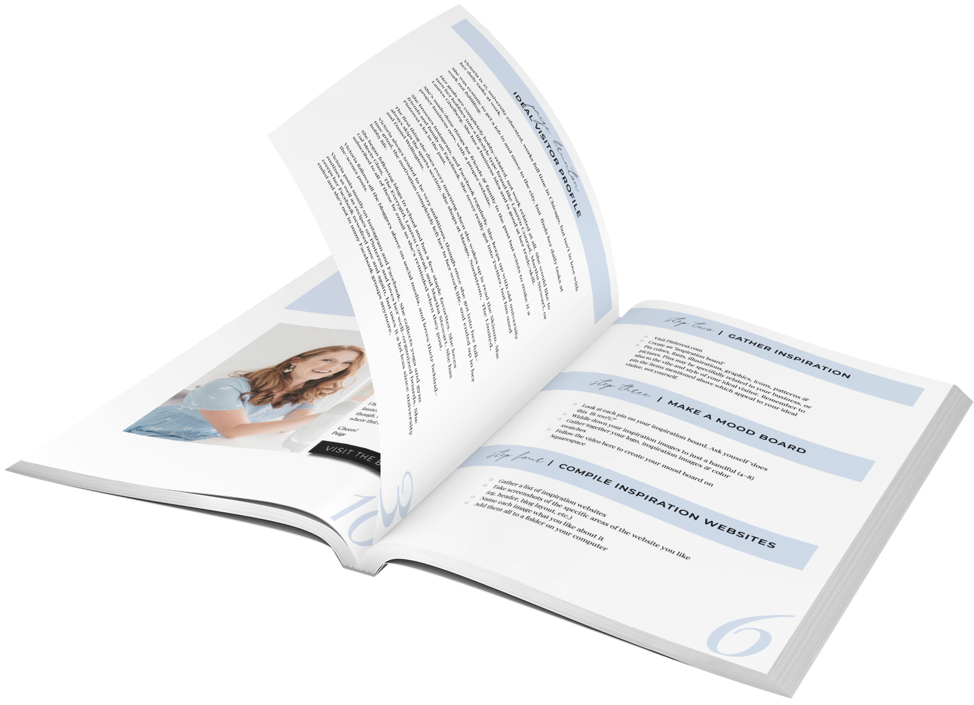
The next step in preparing for your site design is to gather inspiration. (The fun part!)
While completing this step, think back to your ideal visitor. Remember you’re not gathering website inspiration based on what you like, it’s what your ideal visitor likes.
Their style, their look, and their vibe.
It’s possible you and your ideal visitor fit together to a T, but it’s also very probably that that is not the case.
So with them in mind …
I like to compile my inspiration in a Pinterest board, so that’s what I’ll be advising you on. It is however possible to do it the old fashioned way (on an actual pin board), the choice is yours.
Regardless of method, what we’re trying to get at here is creating the feeling and style of our ideal visitor in one place.
Basically, create your ideal visitors perfect world in a board.
Make it so they want to jump into your board, live in it and never leave!
Your inspiration board isn’t just pretty pictures. It can (and should) also include, colors, fonts, illustrations, graphics, and patterns that represent the vibe of your ideal visitor.
You can add pins to your inspiration board of what your ideal reader looks like, clothes that are their style, photos which have the textures, patterns and colors that would appeal to them.
You can pin fonts and logos that appeal to their sense of style.
You can go to town pinning products they like and bits from the brands they love (which you know from step 1 already!).
You can also get more specific about your industry, but keep in mind not ALL your images need to be your industry-specific.
Run a yoga studio? Perfect, get pinning photos that portray the look & feel your studio gives off, and the style of the space. If you have photos of your business, of course feel free to use your own photos too.
Don’t however get so stuck in exactly what your business does that you only pin those things.
Just because you run a yoga studio doesn’t mean every photo on your board needs to be someone namaste-ing or downward dogging. 🧘♀️
Create the world in which your ideal visitor lives. Make your board portray a style, and feeling.
When compiling your inspiration, be intentional in pinning pins that compliment an overall color scheme.
Stop & take action: Create an inspiration board using the guidance provided above.

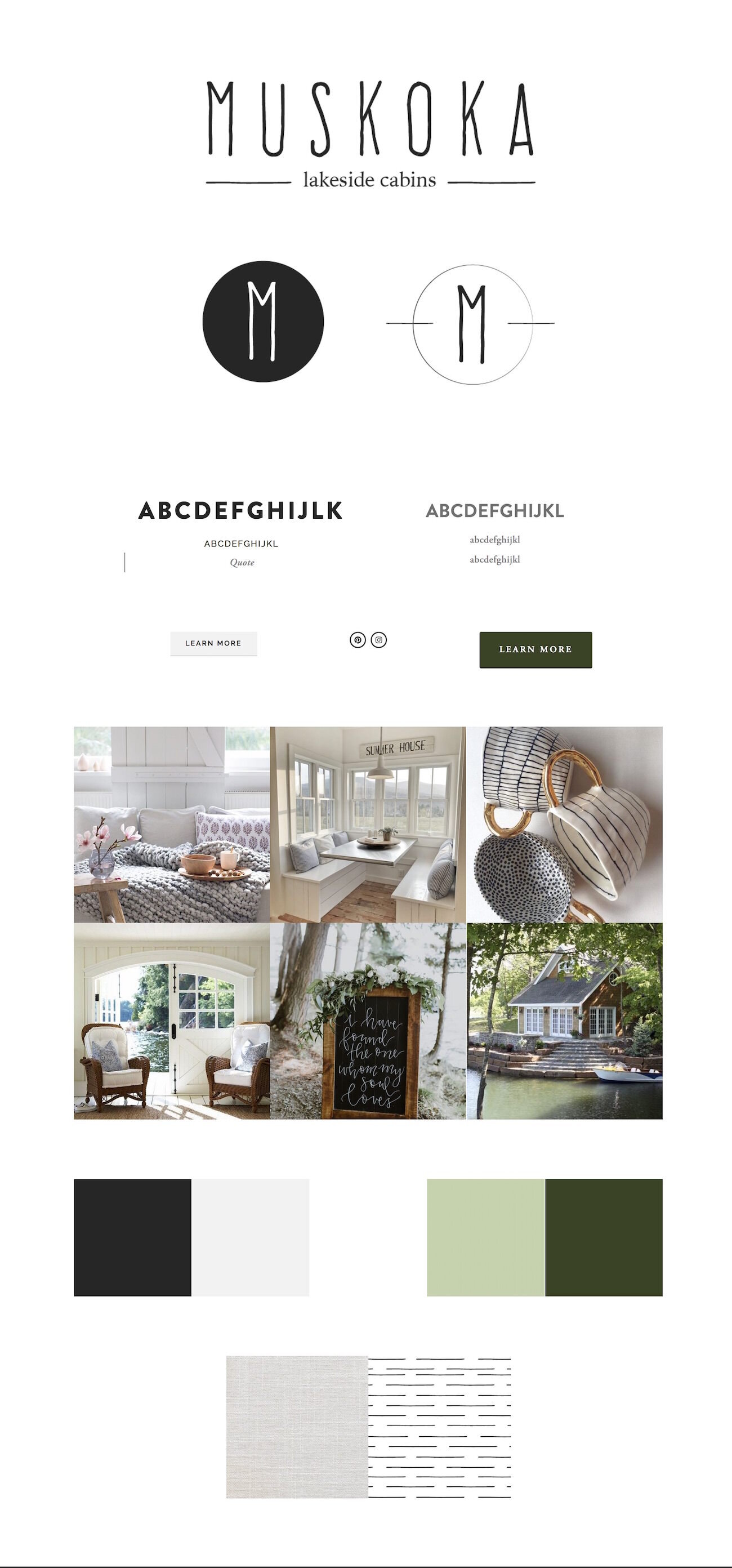
Now you have your inspiration all gathered together, it’s time to make some tough decisions on what makes it to your final mood board.
A mood board is a visual representation of your brand, which will then guide your decision making when it comes to styles on your website.
You’ll want to keep this mood board handy as you create your website so you always have in mind the look you’re creating, and are able to compare your final product back to your original idea and see if it aligns.
If seeing an example or two would help you figure out this whole mood board thing, here’s a look at my mood board from back in the day of thepaigestudio.com (the name of my web design studio before moving from 1:1 design to teaching 1000’s of students to build website and web design businesses they love through my online courses!) or this Pinterest board is also FULL of fab mood boards.
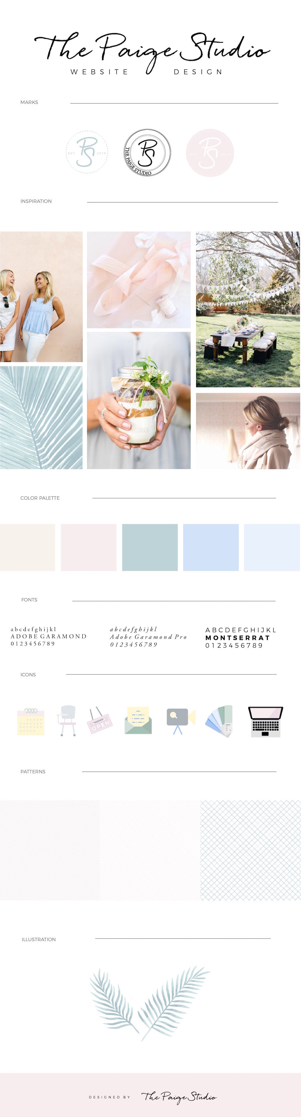
Bits you will want to include on your mood board include:
Logo
Color swatches
Fonts
Social icons
Graphics
Textures
Patterns
Social icons
Buttons
Inspiration images
You’ll see I mentioned inspiration images, those, of course, come from our previous step!
Now, you don’t want to take every single inspiration image and slap ‘em on your mood board. That thing would be a giant, and not very refined.
So, before you go to create your mood board, it’s time to get very tough with your inspiration images. When you look at your inspiration board, which images represent 10/10 what you have in mind for your vision? Are there some that are only partially there but not quite fully what you envisioned? Select a handful (4 – 8) images that 100% encompass what your brand is.
Within these images, you’ll also want a balance of your color scheme. (With the exception of you say want a primarily pink color scheme with hints of green, then ensure our inspiration images reflect this balance of color).
I know you’re starting to think ‘well I don’t have/know how to use fancy programs like Illustrator or Photoshop,’ how do I actually put this thing together?
Not to worry.
This video shows you exactly how to create a mood board with just Squarespace and a little help from the free online program Canva!
Here's the final mood board created in the video above.
Stop & take action: Watch the video, follow the steps in the video to make your mood board, take a screen shot & save it.

Now you’re style and vibe is locked down, we need to get to website specifics. This step helps guide you in the layout you’re looking for and determining your website necessities, which will help when you’re actually going to choose a template and build out the website.
When picking your template, the work you produce from this action step is going to help greatly.
The best way to get started is to find inspiration websites and critically analyze them to determine exactly what it is about them that you like.
Create a list of a few websites you love. They can be from similar areas of business, or completely unrelated ones.
Then, take screenshots of the areas of these websites that you really like. Create a folder on your desktop. Call it ‘inspiration websites’. Add the screenshots to it, and name each screenshot exactly what you like about that aspect of the website.
Don’t just say you like the ‘style’. Get specific.
Do you like the navigation layout?
The unique display of portfolio images?
The rotating banners with clickable buttons to other areas of the site?
Name the images accordingly.
Stop & take action: Create your folder of inspiration website screenshots & name them accordingly.

Instead of going into building out your website and coming up with the pages and content on the fly, we’re going to take a more intentional route. This will lead to a much quicker and more enjoyable web design process.
We’re going to get clear now on 3 things:
What content will be on your website
Where said content goes
How your visitors are intended to navigate through your website
I’m sure you understand the importance of knowing what content goes on your website. If you have a website with no content, then what do you really have? A useless page online that benefits no one, and just costs you money.
The other two might not be so immediately clear.
Where your content goes is vital. If people head to your website and are clicking around aimlessly, not able to find what they want, they’re going to high-tail it out of there real quick.
Remember in Step 1 we talked about what the most vital info on your website is?
Now is the time we’re going to ensure that vital info is accessible quickly & easily.
We’ll also figure out where all your less-vital, but still relevant content should go.
Lastly, we’re going to map out an intended website navigation route. People often get onto websites and there’s so many bells, whistles, large headings, a zillion links & images, they don’t know where to start.
Overwhelm can kill your websites user experience, so we’re going to avoid that by mapping out a website navigation route.
This way we’ll minimize the decisions website visitors have to make, and get them to where they need to be quickly. (Ahem – also get them on the pages you want them to be on most – like say, your sales page – where you make the $$$!)
Okay, so, how to do this (the low-tech, inexpensive way with stuff that’s already kicking around your house).
First you’ll want a pen, a piece of paper and sticky notes.
Each piece of paper represents a page on your website.
Write the name of the page on the top left hand side of each piece of paper.
Then write your ‘vital info’ determined in step 1 on sticky notes. (No need to write your full list of actual office hours, just instead write ‘office hours’.)
These sticky notes just act as placeholders, you don’t need to write the actual content itself on the notes.
Now you see your pages, and you see your vital info, begin placing the sticky notes on the pages.
Keep in mind, you want your vital info accessible in 1 click or less.
So that means it needs to be on the home page, in the footer, or findable through 1 click in the navigation. (With this vital info its fine to have it be repeated in multiple places on the site.)
At this point, you can begin to determine what the best titles for your navigation are. Ensure the navigation titles get people to your vital info in 1 click.
Pro-tip for design: There is a growing movement towards minimizing the navigation options, and this is a GOOD thing! You should do it too.
9 navigation items and drop down menus are wayyy too many decisions to be made, all right up at the top of your website, let alone all the options on the home page itself.
Minimize the decisions. Keep the links in your navigation as minimal as possible.
How do you decide what gets the prime real estate in your navigation? It’s based on your website goals.
Example, my thepaigestudio.com website had just 3 options. ‘Blog’ ‘Work With Me’ and ‘Course’.
I either wanted people to hire me for a website design project, take my courses which help them build their website, and/or build out a fully-booked web design business, or read my blog so they learn what an expert (and ahem – hilarious) person I am, love me dearly, and then hire me for my services or take my courses.
My about page, contact page, FAQ, etc., were of course important pages to have available on my website, but these weren’t about to grow my business anytime soon in the ways the others would, so they were linked down in the footer, and from links within the page content on my site.
Also note, you can take your ‘home’ page out of your navigation. Everyone these days knows to click on your logo to get back to the home page, so it’s just wasted space and clutter really.
You’ll then want to continue adding sticky notes with the other content & info you want on your site. Stick them on to the appropriate pages.
(Best part of the sticky note method, as you’re about to quickly realize, is that you can easily think through what content goes where, and move them around easily without lots of messy cross outs and erasing when you change your mind).
Lastly, to really take your website to expert level, I want you to think up your preferred website navigation route.
This is basically where you decide, ‘Okay, if I could hold my visitors hand and walk them through my website in exactly the route I want them to visit it in, which route through the pages would I take them?’
Example. You run a wedding photography website.
First, you likely want to wow visitors with your portfolio so they know you do great work.
Then they probably want to see you’re legit and run a trustworthy company. So next they’ll want to see reviews.
Then, of course, the question of ‘can I afford their work’ is going to pop into their mind, and after that you want them to contact you to get the ball rolling on a sale.
To implement this, think through your preferred route. Arrange your pieces of paper on your workspace in the order of that route.
In order to get visitors to browse through your site in our determined route, we implement ‘Call To Actions’ (CTA).
A CTA may be a button, a link, a photo that acts as a link, etc. Basically some sort of super noticeable thing that clicks through to the next page in the route.
On the bottom of each piece of paper in your route, place a sticky note with CTA > page name.
Tip for design: Not every page on your website needs to be in your route.
I actually created a whole super in-depth video on this mapping out your website topic, so I'll just leave that here too in case you find it helpful.
Stop & take action: Get our your paper, pen & sticky notes! Using the instructions above, map out the content of your website, determine your pages, and navigation titles.

Are you getting excited? I hope you are, we’re getting close to the whole creating part! So our next action step is to pick a template.
(Using Squarespace 7.1? Watch this video, then go ahead and skip to the next step!)
Picking a template in Squarespace 7.1
Using Squarespace 7.0? Read on!
To ensure you fully understand what templates are and how to pick the right one, let’s chat about what exactly a template controls.
Templates control the basic structure of your website. Here are examples of some common aspects your template will control:
Existence of a sidebar or not
Navigation set horizontally to the top of the page, or being set vertically on the left or right
Having or not having a secondary footer navigation
Banner images spanning the width of the page or having no banner images
Site content spanning the width of the page, or being banded by site borders
How the blog page is designed and posts previews appear
Having or not having a footer, or a differently colored footer
Availability of parallax scrolling or not
Now, all Squarespace templates make use of a feature called the Style Editor.
The Style Editor enables you to change say the size, color and type of font of your body text and headings. You also input your brand colors here, say coloring your newsletter block, your navigation background, announcement bar and site buttons to match your brand.
The Style Editor can be found under Design > Site Styles

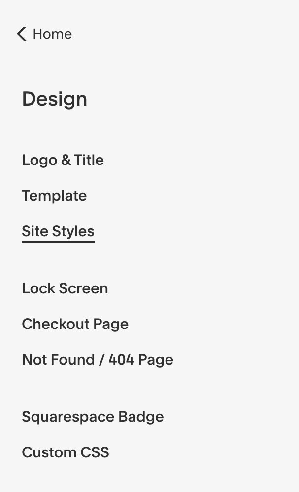
Then each template (for Squarespace 7.0 users) produces template-specific Style Editor options. The Montauk template is banded by borders on all sides and the footer doesn’t look like most, it doesn’t span the full width of the bottom of the page. As such, there is no option to change the footer color, whereas most templates would have this option.

The Style Editor lets you change the height of the banner images on pages and the width of borders on templates that have them. Again, if your template does not have banner images or is banded by borders, these options will not exist in your Style Editor.
In short, templates control the basic structure of your site and the Style Editor controls, of course, the style of the template that you’ve chosen.
Another way to think of it is the template is like the frame of a house, and the style editor is the painting and interior decorating.
No amount of painting and interior decorating is going to suddenly add a second floor to your house if you built a bungalow, to begin with.
So if a second floor is mandatory to you, you better choose your house frame (or template) to have one.
Get the idea?
Alright, now you understand templates and the style editor, moving right along to your list of website necessities which we determined a little bit in step 4.
In your workbook under Step 6, write in what the things are that you must have in the house frame/template of your website.
(That would be things like a sidebar, scrolling banner images, a footer, a pre-footer, one navigation menu or two, social media and search functionality in the navigation or not).
Next, visit the Squarespace 7.0 templates page.
As you browse through the options, don’t get distracted by pretty colors, a template that has your style or photos you really love. (You can take great photos and style your site to have the same pretty colors and styles as any of them.)
Focus on the layout, and the structure as that’s really what templates are; “housing structures.”
How do you do that exactly you ask?
Click on the template and scroll down to the example sites made with that template. If they all have something very consistent in their design (a grid of images on the home page, wall-to-wall banner images, two navigations, etc), you know that’s set to the template.
If you love that something, good! Favorite the site with the heart icon. If you don’t love that something, keep browsing templates.
Once you’ve favorited a handful of templates (3-5), the next step is to really see what each one can do. Visit a Squarespace template comparison chart to learn for sure what functionality each one does and doesn’t have.
Was a rotating banner image one of your website necessities, but one of your favorite templates doesn’t have that? Decide you’re okay without it, or take that template off your favorites list.
If this work has now gotten you down to one template, great! If not, there’s one more area you can check to help you make a final decision. Squarespace has in-depth guide to each Squarespace template ‘family’. (A family is a bunch of templates with the same underlying structure.) Visit this page and select the template you’re interested in from all the options to read an in depth guide on it.
Know whatever decision you make now isn’t permanent. In the future if need be, you can always switch templates.
So now I know you’re wondering, well how much of a pain is it to switch templates in the future?
Actually switching takes just a couple clicks and doesn't cost anything extra.
However, I would equate switching to a new template to basically be re-creating your website, so just know it's definitely a time investment. Once you switch, you'll restyle the site, and make a number of edits which depends both on which template you came from and which you're moving to.
Example, say your old template didn't have banner images and your new one does, you'll need to upload a new banner image for each page.
When you’re choosing between templates now, it might be best to consider choosing a template with a L or XL Scale of Control (noted on the template comparison chart). The more flexible your template is, the more likely it will grow with you over time, and the less necessary it will be to switch in the future.
Need a bit more help and explanation with this step? This video has you covered!
Related posts:
Stop & take action: Go through the Squarespace template options and narrow down using the above methods to find your perfect template.

We’re almost there! So close to getting started, wahooo! This last, and vital step is going to help make our actual design process quicker & ensure our content is SEO-friendly.
We have 3 points at which you’ll have to stop & take action in this step.
First, we want to determine, what it is your, ideal visitor, is searching for on Google to find what you do?
Determine the keywords you want to “rank” for. Often times, this can be pretty simple. Say you run a yoga studio in Brooklyn. You likely want to rank for ‘yoga studio Brooklyn’.
If you maybe run a bakery in Brooklyn however, people might be searching for ‘custom cakes Brooklyn’ as opposed to ‘bakery Brooklyn’.
So now and again you need to think this through a little further.
Instead of just guessing, there’s a few online tools that can help you with finding the best keywords. I like KeywordTool.io.
Type in what you think people are searching for you by, and inspect all the results that come below.
While some things might just be slightly off, they can make a big difference to your site being pulled up.
Example, I write blog posts with Squarespace inspiration websites to help people see what’s possible with Squarespace, and the different templates being used for each site.
I was titling my posts ‘10 Squarespace websites for inspiration’.
Turns out, people were searching for ‘Squarespace website examples,’ not ‘Squarespace inspiration websites’.
As such, I changed the titles.
Suggested reads:
10 Squarespace example websites for inspiration • feminine edition
10 Squarespace example websites for inspiration • photographer edition
10 Squarespace example websites for inspiration • blogger edition
Stop & take action: Write out the keywords your ideal visitors will be searching for you by
Once you’ve got your keywords down, we’ll move right along to your tagline.
Every business (and therefore website) should have a one-liner that describes what the business does, who it serves, and (if location-specific), where it’s located/the area it serves.
Example. “Wedding & family photographer in Chicago, Illinois. Serving Chicago, Orland Park, Evanston & Naperville.”
Or
“Yoga & meditation studio in Lincoln Park, Chicago. Offering hot, aerial & maternity yoga”
Or
“Helping expats from around the world complete expat taxes and multi-national tax returns in the USA”
Here’s the formula for making a super-effective business/website tagline.
Make it super-clear exactly what you do. What’s the service or product you offer?
Use the words people would Google to find your business (search keywords)
If you’re location specific, list your location, or the larger area you serve
If you help a niche or segment of people, add that info in. The more specific you get, the stronger the attraction those exact people will have to your business.
Keep it short. 1 line is preferable, 2 lines are the absolute max you get for this
It doesn’t need to be in complete sentences
When writing this tagline be sure that when it comes to the decision between writing a clever tagline or a clear tagline, you go with clear, every time!
If you can make your tagline both crystal clear and clever, you hit the tagline jackpot. (Congrats!)
When you go to create your website, ensure this tagline is on your homepage, right up near the top of the page.
People land on a website and give it a matter of seconds to judge whether or not they’ll stay. One of the fastest ways to ensure someone will leave your website is for them to be confused.
It’s vital that from the split second they land on your website, they understand what your website is for, and what your business does.
Not to mention, Google takes the content of headings & things near the top of the page as an indication of what the page is about. This is especially true for the home page.
So having your keywords in the tagline on your homepage is kinda, sorta… really freakin’ important.
Stop & take action: Write out your website tagline using the tips & advice above.
Okay, once you’ve gotten your keywords determined, and your fab, crystal clear, tagline down, it’s time to get to the rest of your content.
Your content includes your website images, copy (fancy, industry term for text), and (possibly) videos ready to go in one place.
If you’re DIYing this website, writing out your website copy in a Word doc is just fine.
If you are doing this as a collaborative effort with a designer, or a team of some sort, Google docs is the way to go so you can share your copy around and have team members edit and update the doc.
Similarly, pull together all your images into a folder on your Desktop or Google Drive.
Then, we need to get to naming & optimizing all of those images!
The main thing you can do (without getting into confusing code stuff) to ensure your website loads quickly, is to optimize your image sizes.
Related post: Myth: SEO with Squarespace sucks. Here’s the facts.
Not only does a slow website annoy your visitors, it actually hurts your Google rank too. (Double whammy).
Yep, the all-knowing Google is well aware of how long each of your pages takes to load.
And if your pages move at the pace of your Grandma with a walker crossing the street, Google will show your website less or lower down in search results.
(And if there’s one thing you don’t want to do when building your new website, it’s to annoy the Google Gods.)
So, what size should your images be?
Squarespace suggests between 1500 – 2500 px wide.
If you’re using an image as a banner image, go closer to 2500, if your image will be used just on the page, and won’t be spanning the full width, go closer to 1500.
However, more important than the image is image file size. You want all images (banners & on page images) to be 500 kb or less.
What if you have professional photos or you’re a photographer (so hellah-crisp pictures is kinda important)?
I use JEPGmini when myself or my web design clients have massive photo file sizes. JPEGmini works its compression magic, decreasing the file size while keeping image quality almost exactly the same.
You can either JPEGmini your photos on the JPEGmini website, or download their free program, where you can mass import many photos to be compressed at once. (Totally worth it if you have a bunch of images to resize!).
Keep in mind, once JPEGmini works its magic, it will name your images ‘whatever-your-image-name-was-plus-the-word-mini’. You’ll want to take out the word ‘mini’ that it will add to all of the images.
Depending on how big your image was, to begin with, JPEGmini might get it down to be small enough, or it might not.
To check what file size your image is (on a Mac) preview your photo, click Tools > Adjust size. Check what the file size is there.
If it’s still larger than 500 KB change the width of the image until you get it down to 500 KB or less.
Now, a quick guide to naming your images. Back in the day if you were a wedding photographer in Boston you’d name your images:
‘wedding photographer Boston, wedding photographer Boston, wedding photographer Boston, wedding photographer Boston’
You get the point.
This is a practice called ‘keyword stuffing’.
Turns out Google has gotten smarter over the years and penalizes websites that do this.
You want to name your images whatever the image actually is. Google isn’t smart enough (yet) to ‘see’ your image. So it relies on you to name your image to tell it what is going on in the photo.
If you can naturally include a keyword in the name of your image, perfect. If not, no worries.
Lastly, for videos, upload them to YouTube or Vimeo, your choice, and keep a list of links to them handy. (I suggest copying & pasting the links into a notes app).
Stop & take action: Name all of your images and compress them down so they meet the Squarespace image best practice guidelines. Gather them all in a folder. Also, write out all your copy in a doc & if you have videos, keep a note of all the links to them handy.
To finish off our prep for design, I like to write all my color codes and font types down in my notes app, so they’re quick to access. My note looks a little like this.

I’m often in need of this info when designing, so I like to have it easily accessible. Do this now, and save yourself time in the future.
Not sure what your color codes are?
The HTML color code (a # sign followed by a string of six numbers & letters) is the unique code that tells the internet the exact color and shade you want something to be.
When you start creating your website, in the Squarespace Style Editor you’ll paste these HTML color codes in to change the colors of your headings, buttons, background, etc.
By using these codes, as opposed to just eyeballing ‘yeah, that looks like about the right pink,’ you’ll ensure all your colors are exactly the right shade, so everything looks consistent.
To find your color codes, take the image of your mood board, upload it to this website, click ‘show image’ hover over your colors, click on them. Then copy the color codes, and paste them into a notes app.
Stop & take action: In the notes app on your computer write out your ‘Brand Essentials’. That is your color codes & names of your body & heading fonts.
You're all done! Congratulations! *Pops bubbly* Now the next step is to actually create that fab website.
Dive into my course - Square Secrets!
Are you ready to build a site that actually converts visitors into clients?!
If you’re thinking, "uh, yes please!" then it's time to take the leap and join my course Square Secrets!
Inside the course you’ll be guided through step-by-step video lessons and click-by-click tech tutorials to help you launch a site you love!


YOU'LL ALSO LOVE...
50 example Squarespace websites built by Square Secrets course students
How to use Squarespace tags and categories to organize your site
How to make sure your Squarespace website is set up to convert
Do this one thing to ensure your website will appeal to your ideal clients
Squarespace image sizes: Tips & tricks to know when designing your website
