

How to choose colors for a website using the 60-30-10 color rule

Prefer to watch?
Here’s tHAT VIDEO FOR YA!
MENTioned in the video:
Rather read all about it?
Here’s what we chatted about in the video...
What is the 60-30-10 color rule?
How does it apply to you as a website designer and the way you build your client's websites?
Fabulous question!
That is exactly what we were talking about in today's video!
What is the 60-30-10 color rule?
Design principles state…
in order to have a harmonious, appealing-to-the-eye design, you need to have three main colors in varying frequencies
What happens when you nail the 60-30-10 color rule?
You will effectively be using color to lead people to the exact action you hope they will take on your website (A.K.A. to your CTAs or Calls-To-Action), simply by the way you’ve chosen to lay out the colors.
This rule originally came from interior design, but it makes perfect sense on websites, apps, or really anything visual you plan on creating!
Understanding the 60-30-10 rule can seriously elevate your designs, so let’s first look at a few examples to give you an idea of what it is before we talk about how to apply it to the websites you’re designing.

60-30-10 color rule examples
Example #1:

So here is an example in interior design with this beautifully designed room!
You'll notice the primary color—the one that serves as our sort of background canvas for the whole room—is the soft white color.
It is present in the walls, the ceiling, the rug, the furniture, the decor…the white is very present in this image, making up at least 60% of the design.
Then I would say the secondary color—or the 30% color—is the brown, or the wood tones that is very consistent in the beams, the ceiling, the floor, the coffee table, and the artwork above the fireplace as well.
This leaves our 10% color, which in this case is the green we are seeing, primarily in the plants and greenery both inside and outside the room!
So we have a perfect example of the 60-30-10 rule making for a harmonious design, where white is our 60% color, brown is our 30%, and green is our 10%.
Example #2:

Now this room here has taken the whole 60-30-10 color rule to the next level!
This is a bit harder to pull off because in this case, their primary 60% color is actually green!
And so it's a full-on ‘color’ color…not a blank canvas like our white example above.
You'll notice the walls, the plants, the carpet, the artwork—all incorporating some green.
So green is def our dominant or 60% color in this image.
Our secondary or 30% color is this yellowy-gold.
It’s present in the floor, in the side table, the lamp, the frame of the artwork, and in the bar cart…
Then our 10% color I would say is pink, present really only in the statement piece—the chair.
So again, perfect example of 60-30-10 in the interior design world, only done in a much more bold way!
Ok, one last example to make sure it sticks…
Example #3:

Back to a more neutral example, we have this lovely, minimally-designed kitchen!
Any guesses what the primary or 60% color is?
Yep! White!
Then similar to our first example, we again have our brown wood tones as our 30%.
Only this time, the 10% color, or the ‘accent’ I guess you could all it, is not really a color at all! More of a high contrast neutral - black!
You see that in the lampshades, the stove, the stairs, and also on the faucet.
Get the idea?
Okee dokes, now let’s look at how that applies to web design!
How to pick colors for your website design
Using the 60-30-10 color rule
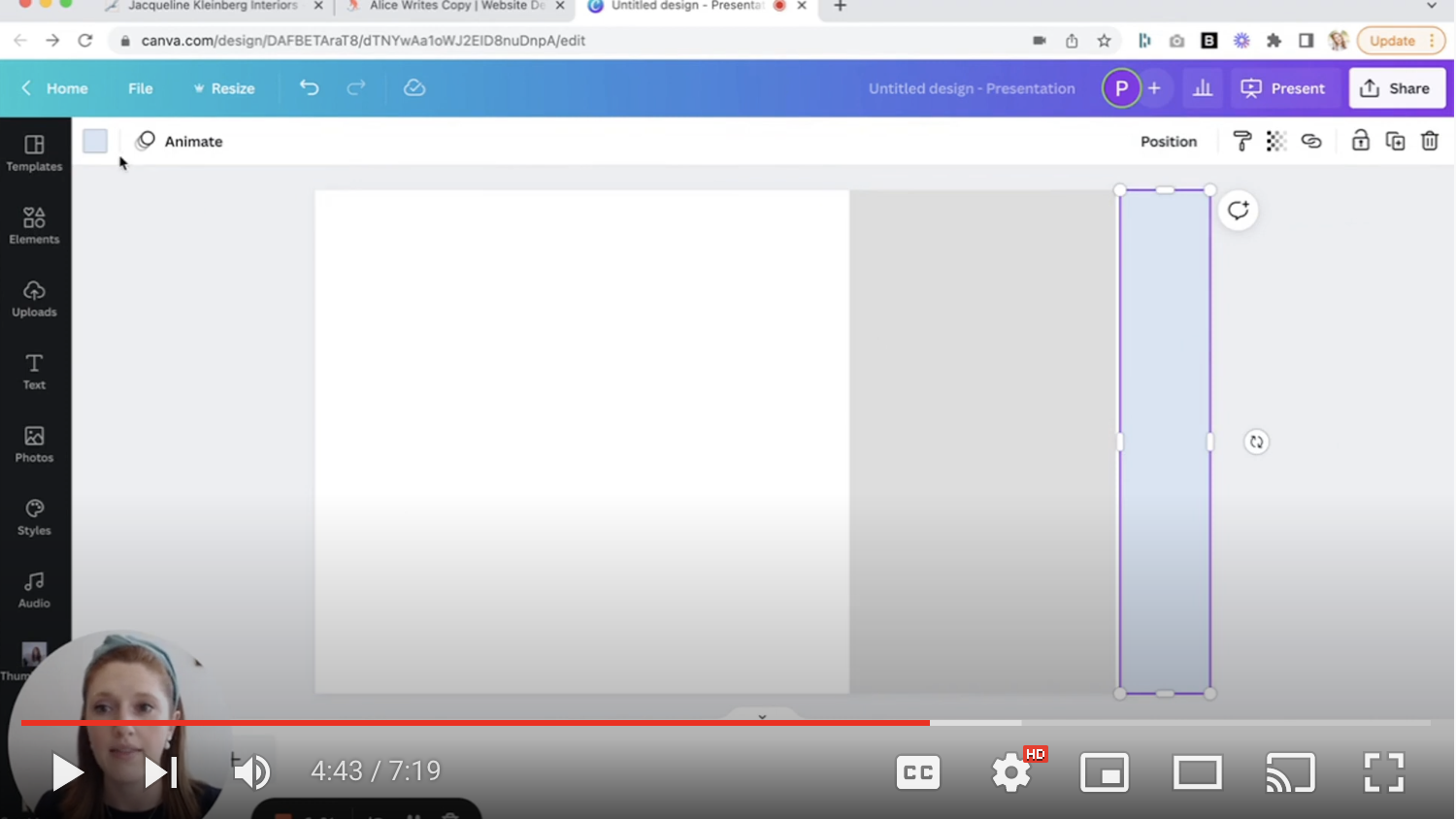
So here I have a blank canvas set up in Canva. 👇
It is broken down into three rectangles that represents 60% of the space, 30% of the space and 10% of the space.

I'm going to go ahead and change the colors here to give you a bit of a look at how this breaks down when you’re designing a brand.
Some shade of white is definitely the safest choice for your 60% color when you are first getting started in design. That, or something extremely neutral.
Then, as you get more confident with designing, you can begin playing around with using bolder shades for your primary 60% color like you saw in example #2 above!
Now for the 30% color!
Let's say you have like two primary brand colors…
You want the 30% to be the one that's a little bit less eye-catching (and I'll explain why that is in just a second)
But as an example, using the colors in my brand palette, we’d want the 30% color to be the beige, as it’s a bit less “stand-out” than the blues in my palette!
We’d want to save the blue for our 10% color, or the accent color we will use to draw the eye where we want it on the page, usually to wherever our calls-to-action live (like buttons or important bits of text!)
website DESIGN examples Using the 60-30-10 color rule
Website Design Example #1

*Disclaimer: When you have images in a website, it does make it a little bit more challenging to be using just 3 colors.
But generally, I would say this first website nailed it! They did an incredible job of not having the images take away from the harmoniousness of the design!
You can still very much tell what the main three colors are, the 60% being the white, the 30% being gray, and the 10% is our very standout orange color.
(Which you’ll notice they’ve reserved for all their CTAs!)
Ok, so there’s an example using a neutral color as the primary, but what about when it comes to using bold colors for your site?
Website Design Example #2

So this next example actually comes from a very talented website designer and past student of my Square Secrets™️ & Square Secrets Business™️ courses!
Alice of Alice Writes Copy! (She offers copywriting in edition to her design services!)
So let’s look at how she’s incorporated her brand colors into her website design using the 60-30-10 rule!
What’s her 60% color? That bold blue! Awesome, right?
Then her 30% color is the sort of whitish-grey she uses for most of her text to contrast the blue.
Then the 10% is that brilliant sort of corral-y orange color in her logo, buttons, and any text she really wants to make pop!
