

20+ best example Squarespace websites • web designer edition

Feeling a little stuck for where to start on your site design?
Maybe you’re a first-time DIY’er who’s just learning Squarespace and haven’t yet discovered what the platform is capable of…
Or a total pro-level designer who’s designed so many sites that you’re feeling like maybe your creative design reserves have all dried up, and everything has been done before!
Whatever your story, there’s nothing like a fresh bout of inspiration to keep creativity (and morale) high!
Enter: the top Squarespace website example & Squarespace template design inspiration series!
So far in the Squarespace inspiration series, we’ve looked at some killer Squarespace website design examples for bloggers, photographers, small businesses, and service-based businesses.
But if you still haven’t had the creative revelation you’re looking for, why not go straight to the source!
Squarespace designers!
Each one of these websites was DIY’d by the owner of the design biz, and while you may not be a designer yourself, the inspiration can be carried with you to any industry!
New to Squarespace?
You can sign up for a free trial of Squarespace here and I also got ya a little off the price, use code PAIGE10 for 10% off your first year. (Yes, that's an affiliate link!)
SQUARESPACE WEBSITES & TEMPLATE INSPIRATION • WEB DESIGNER EDITION
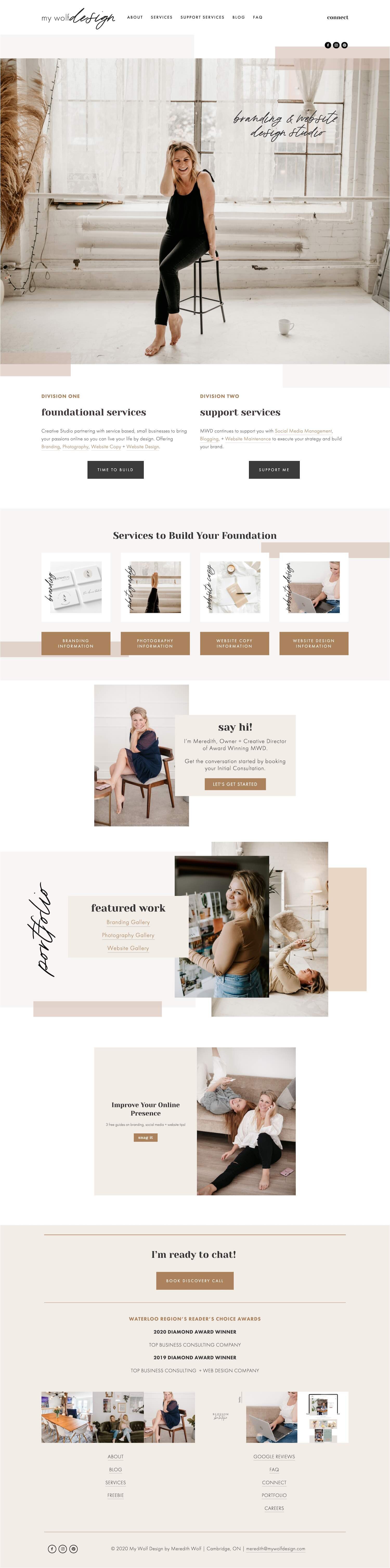
Live site: My Wolf Design
Template: Brine Family
Squarespace designer Meredith’s site is the perfect example of letting your niche inform your design decision for your business’s website!
Her portfolio is overflowing with clean and light, ultra-feminine designs, which only makes it easier for future potential clients to are also loving that vibe to envision what it would be like to say yes to working with her!
This is true for absolutely any service-based business. If you have a particular type of client or project you want to attract, make dang sure that they can “see” themselves in your current portfolio pieces!
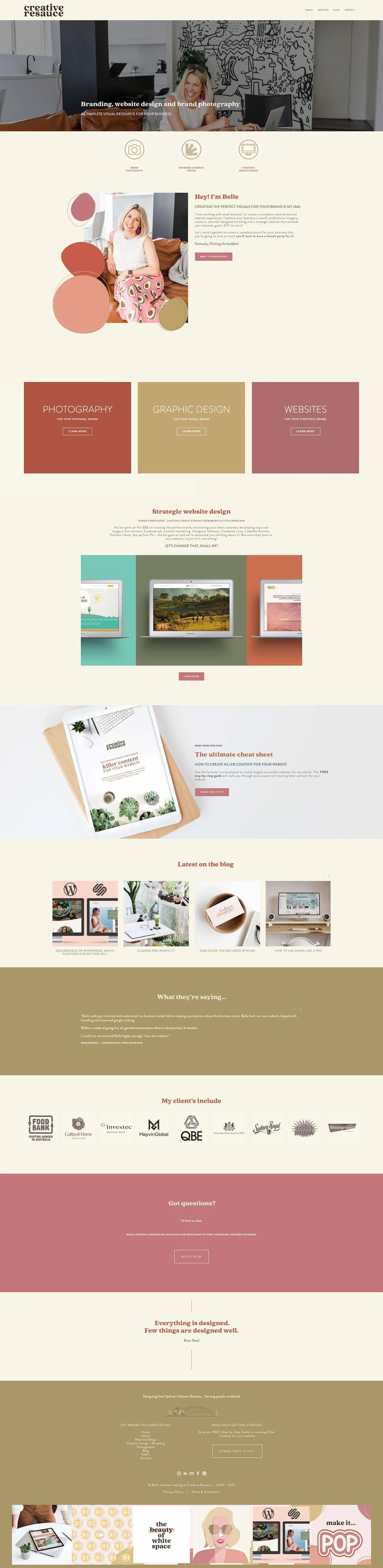
Live site: Creative Resauce
Template: Brine Family
This gorgeous site was created by past Square Secrets & Square Secrets Business student, Belle!
What I love about this design is that while it’s got lots of fun little designer touches, there’s also very little going on in each section.
Each section has a very specific goal, and keeping it simple will help visitors stay on the path you’ve laid out for them without getting overwhelmed or distracted as they scroll through your site.
You never want a design decision to draw attention away from the most important areas on your site (like your book now button!)
P.S. If you’re looking for more Squarespace Designer Website Inspiration as well as a ton of other business owners from other industries who have successfully DIY’d their site, check out: 50 example Squarespace websites built by Square Secrets course students
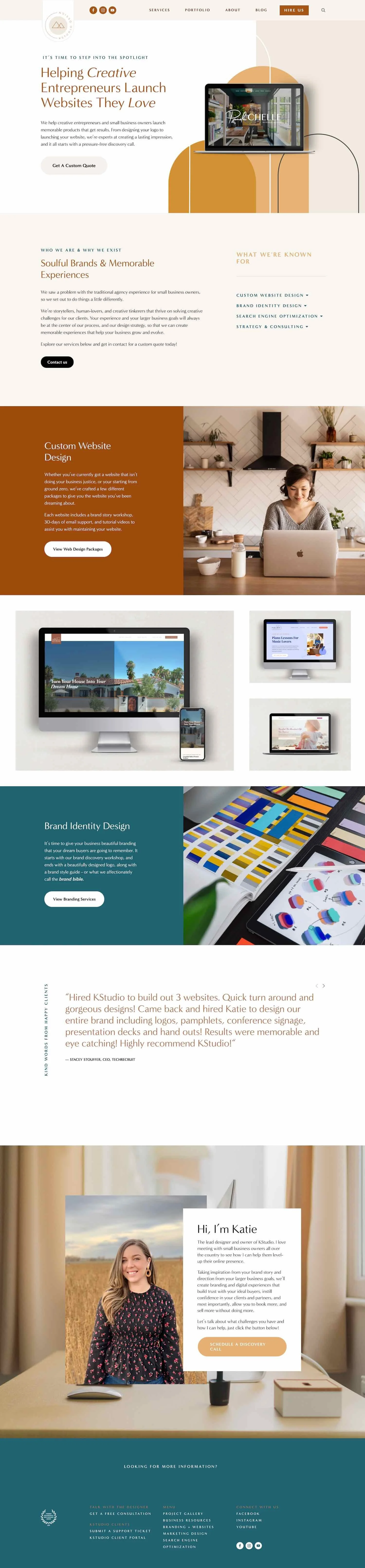
Live site: K Studio Design
Template: Brine Family
This next design might look super cute and playful, but it actually packs a lot of punch, too.
You guessed it!
I’m talking about all those CTAs (call-to-action).
What’s a CTA?
A CTA is when you invite your site visitor to take the next best step on their client/customer journey. And you want at least one of these bad-boys at eye-level no matter where your visit is on your page or site.
You can’t assume that if they are interested enough in your service that they will scroll allllll the way back up to the top of your site in search of some sort of buy or book now button. Or that if they like your vibe they will be compelled to seek out your “subscribe” button.
You have to be intentional about leading your site visitor by the hand towards whatever goal you’ve set out for them on your site.
This is why Katie has included some sort of reminder to move on to the next step in every last section of her home page and throughout her site.
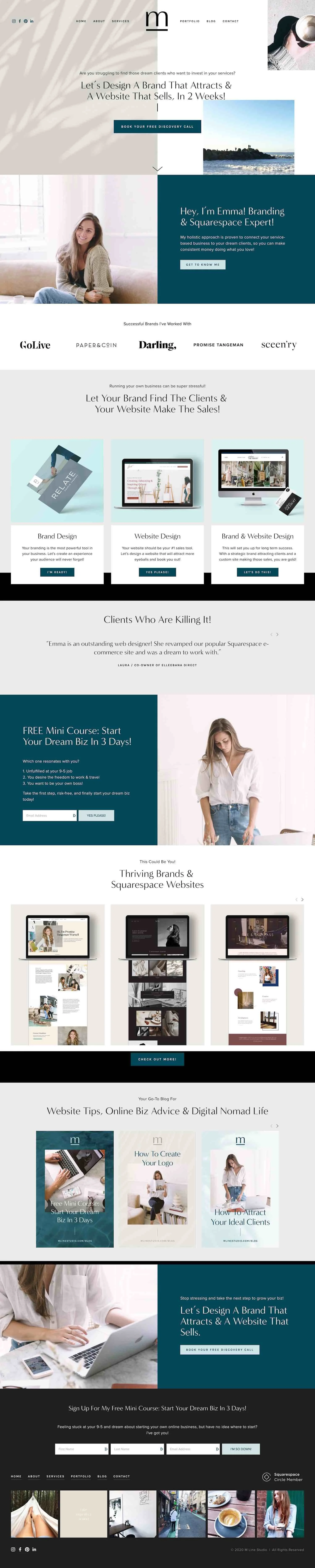
Live site: M Line Studio
Template: Brine Family
So obviously the gorgeous design speaks for itself, but what I really want you to notice with this site is how Emma uses every section to speak to common pain points, problems, and goals that her ideal client would have!
By speaking to where they are at now, and how a new website (and brand, in her case) could change that, she’s helping her site visitor to dream about how much easier life will be after they cross off this major to-do and hire Emma to do it!
In one section, she literally say “This could be you!”
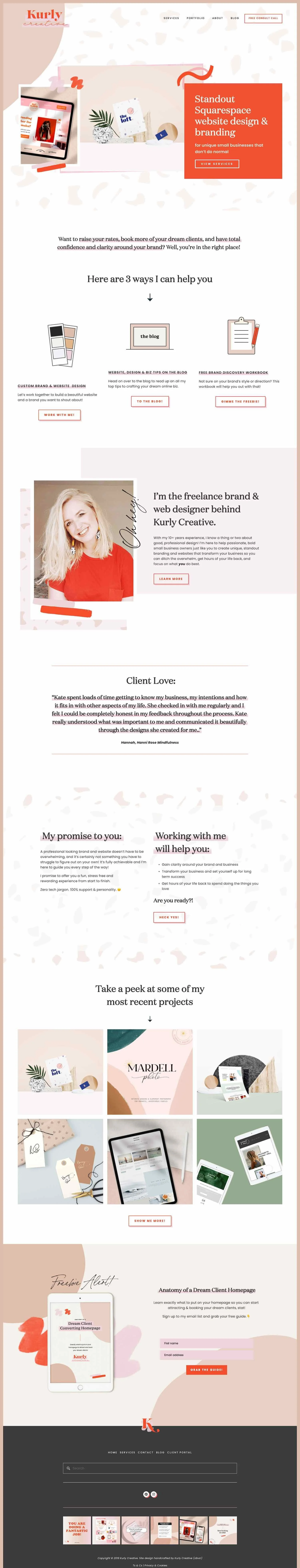
Live site: Kurly Creative
Template: Unknown
“Standout Squarespace website design & branding for unique small businesses that don’t do normal.”
How’s that for a tagline!
The business owner who thrives on doing things differently and never bows to trends would read that and think “heck yes! She gets it!”
Whoever your target audience, the first few words that they read on your website (A.K.A your tagline) should let them know you “get” them too.
Oh, and check out how little text she’s got going on in each section!
She’s giving site visitors the TL;DR version of what she offers and where they should go on her site next, with lots of white space and design interest to balance it out and keep visitors present and scrolling.
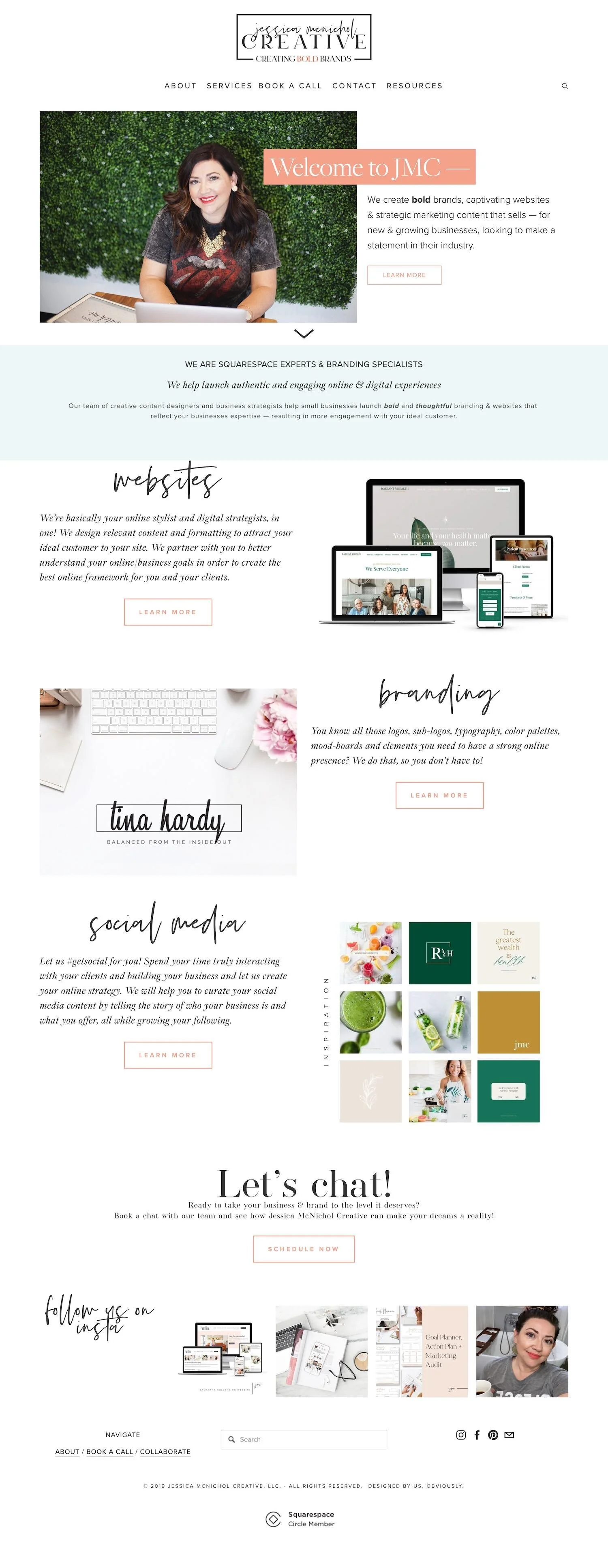
Live site: Jessica M Nichol Creative
Template: Brine Family
Let’s talk alternating sections!
If you have a lot of info to share, and need a way to keep it tidy while still keeping it interesting, try alternating matching layouts!
This is especially helpful if you want to keep your site on the minimal side, without having to use a contrasting background color to indicate the start of every new section.
Oh, and those simple, one-word titles for each section make this site easy to navigate, even for the skimmers out there!
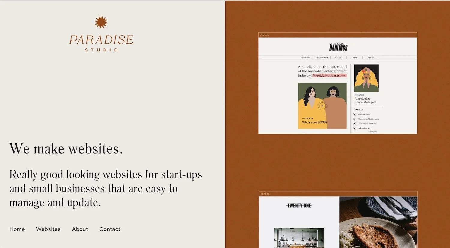
Live site: Paradise Studio
Template: Built on Squarespace 7.1
Ok, so there is so much more to this site than what a screenshot could capture, but thanks to some fancy CSS footwork, Dana has created this magical split layout design were the content on the left side stays put while the content on the right just scrolls and scrolls and scrolls!
A very neat way to keep her main navigation accessible to visitors at all times, while allowing visitors to binge-sample her portfolio right from the home page.

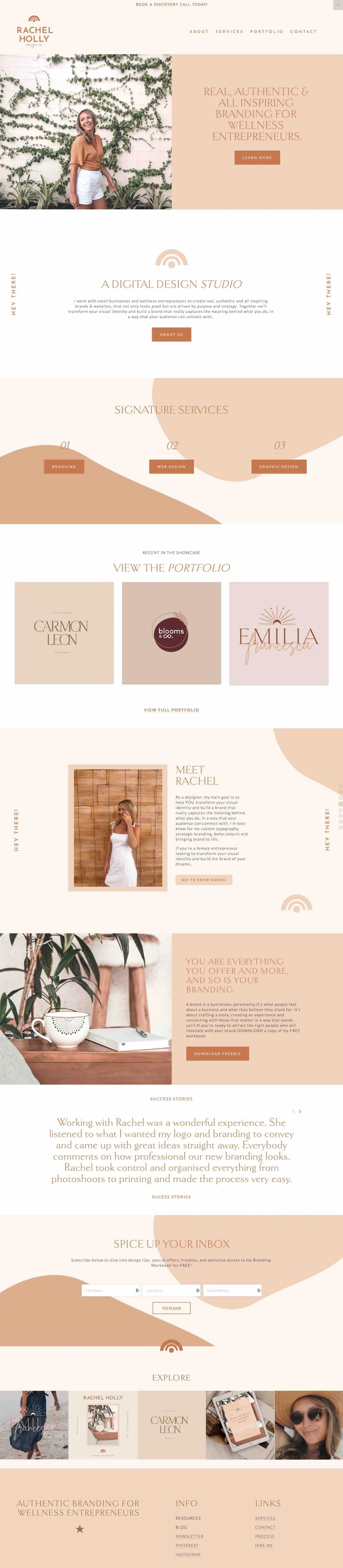
Live site: Rachel Holly Design Co
Template: Brine Family
Here’s a cool use of Squarespace’s built-in announcement bar feature!
She’s set her announcement bar background color to match her header so that her “book a discovery call today” CTA looks like it’s part of the main navigation.
There’s so much to love about this site, but what deserves special attention is that first testimonial!
As well-meaning as they are, testimonials that say “Rachel is the best! I loved working with her!” doesn’t really offer up much information to other people considering your services.
People want to hear from people who were clearly in the same shoes as them, who had the same fears and doubts and problems that they do, and how working with your business specifically lifted that burden.
Need help getting more meaningful testimonials from your clients?
Check out: An inside look at collecting sales-winning testimonials
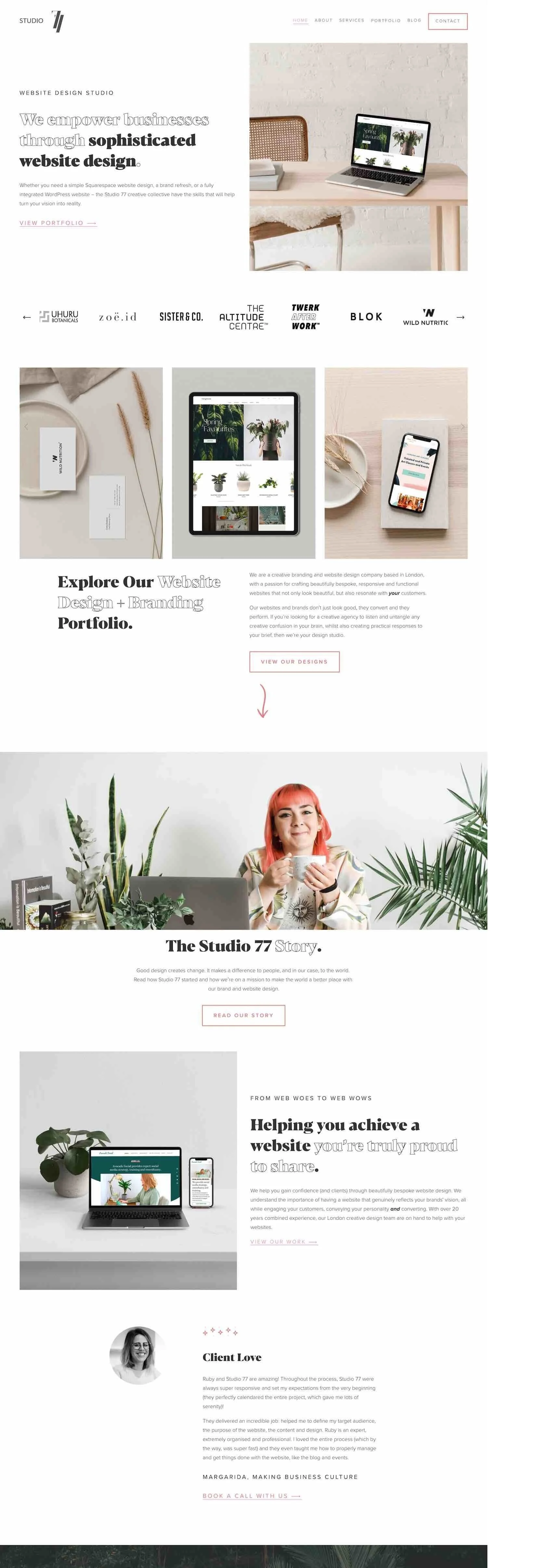
Live site: We are studio 77
Template: Built on Squarespace 7.1
This gorgeous design is the perfect place to talk about fonts and why they matters!
You can have the exact same layout, words, colors, etc. but the minute you swap out your font, the entire vibe of your site changes!
A font choice can take your site from corporate, to quirky, to elegant, to minimal and back again!
A few things to think about when you’re choosing fonts for your site:
Think of the websites, online shops, and magazines your target audience are likely to be frequenting. What kind of fonts are they using?
Choose one accent font, then let the rest of your fonts be a little more simple and subdued to avoid overwhelming visitors.
Save “louder” fonts for short sentences and titles, and use something cleaner and easier to read for your longer snippets of text.
Want to make sure your branding is consistent, no matter where you show up online?
Here’s a complete list of all the fonts found in both Squarespace and Canva so that any branded resources or graphics you make down the road will match the look of your site! 👯♀️
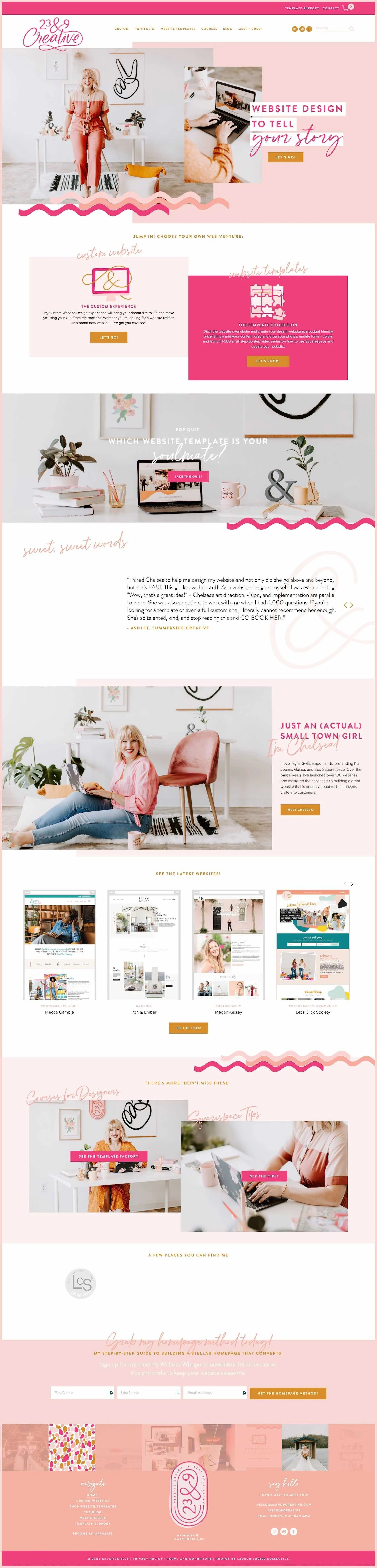
Live site: 23 & 9 Creative
Template: Brine Family
There’s no missing this bright & sunny site in a line-up of web designer online homes!
You could visit 100 sites that all start to feel the same and blend together, but this design demands to be noticed!
It’s unapologetically peppy and girly, just like the ladies it’s meant to attract.
Another perfect example of designing your site with your tribe in mind, rather than trying to please the masses!
(Because by trying to reach everyone, you reach no one!)
Oh, and you’ll notice how intentional she was about planning her photoshoot props, outfits, and set around her business’s unique brand and vibe too!
Live Site: Make Your Mark By M
Template: Built on Squarespace 7.1
What does this lovely site by Maya teach us?
Minimal doesn’t rule out color!
You can still have a very sleek, refined looking design while making use of strong colors.
Choosing one high contrast color, on an otherwise simple design is the perfect way to create a bit of brand recognition, especially if that color is found in your logo.
Alternating it with your more subdued tones from your palette allows your most important sections or buttons to really pop.

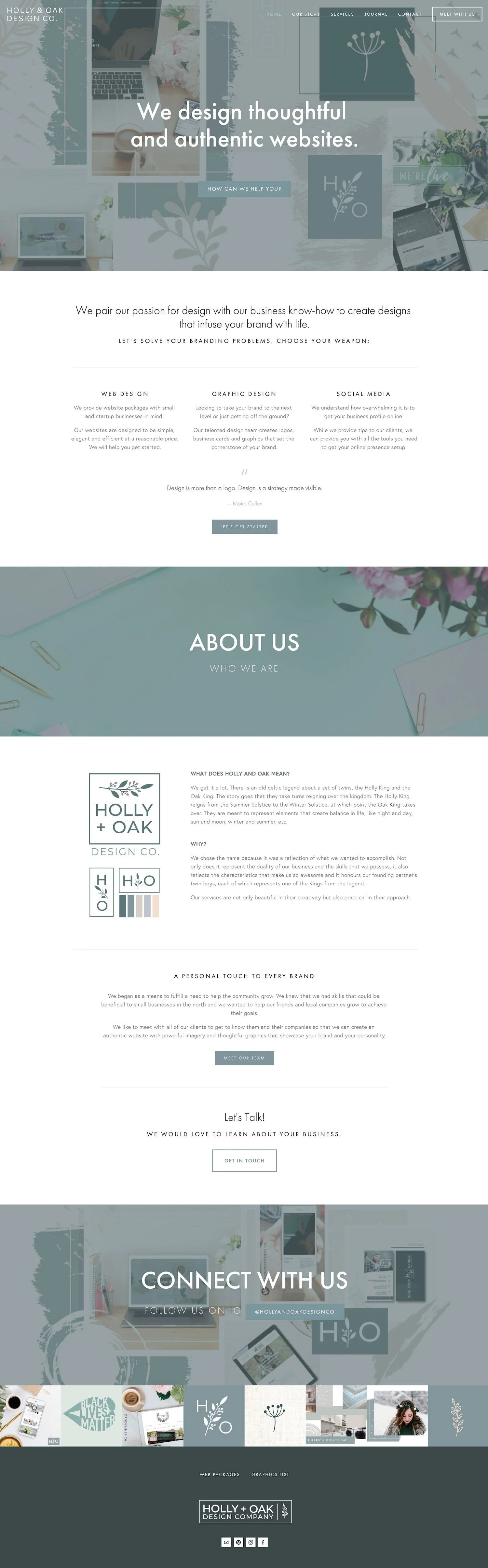
Live site: Holly & Oak Design Co.
Template: Bedford Family
Need your stock photos to look a little less like, well…stock photos?
Use a photo overlay in your brand’s colors!
Rather than just sticking a big wall-to-wall photo in her banner, Kaleena has created a scrapbook-style collage of photos that speak to the lifestyle of her target audience.
She’s layered them together with lots of other dainty design elements, and then finished it off with a “filter” or overlay in her brand’s pretty blue hue!
There’s no end to the way you could adapt this concept for your own/your client’s industry and vibe!
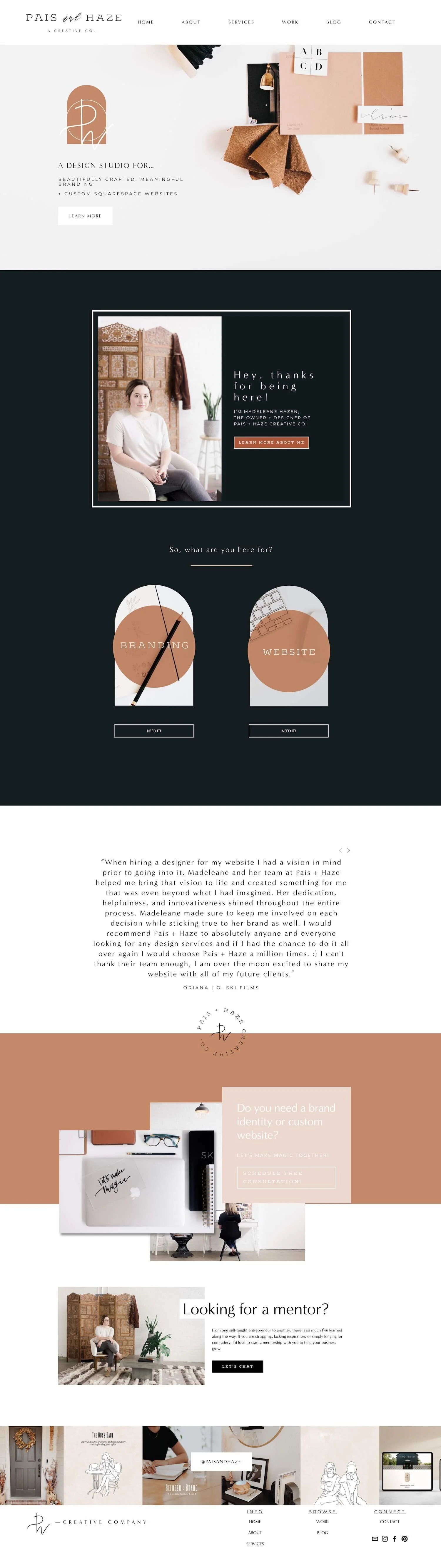
Live site: Pais And Haze
Template: Brine Family
Before you scroll down and take in the rest of this gorgeous site, be sure to notice just how simple and clutter-free that main navigation is.
I always tell students of my Square Secrets Course to avoid getting too cutesy or creative when naming your CTA buttons or main navigation links.
Even though you don’t want your site to look anything like the competitions, your main navigation area where it doesn’t hurt to stick with the standard.
For example, rather than “musings” or “journal” just name your blog “blog.”
Visitors will appreciate knowing exactly what to expect when they click on a link, and you won’t risk the chance of confusing any site visitors!
(And you’ve heard me say it before…“confusion kills conversion!”)
Save your creative flexing for the actual design! 💪
Ok, now you can admire her work! 😍
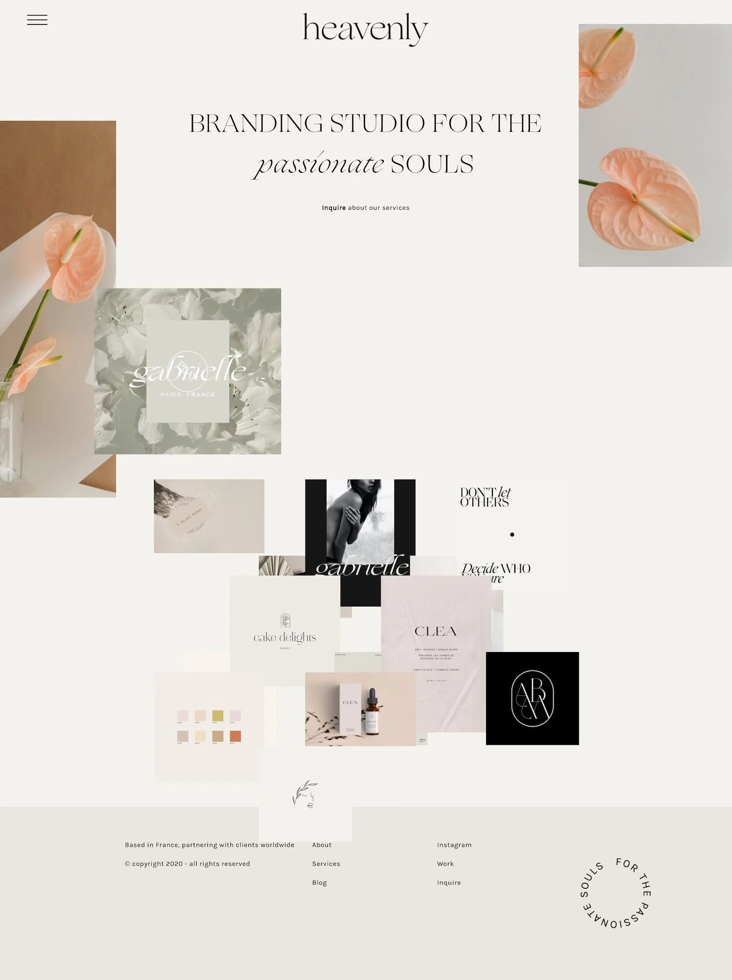
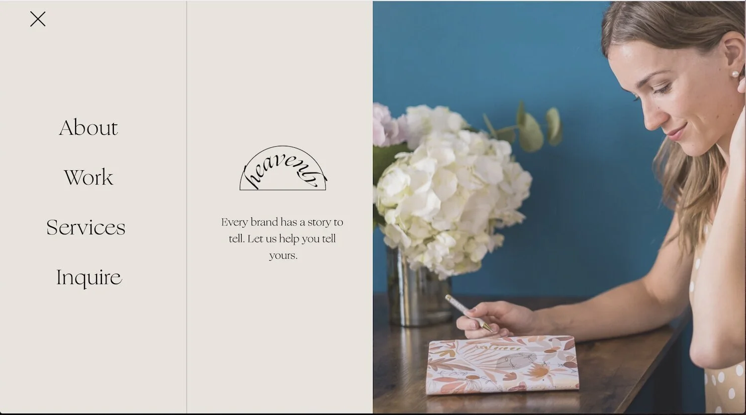
Live Site: Studio Heavenly
Template: Unknown
This is another site that looks anything but cookie cutter!
You would never know this is designed on Squarespace!
If the thought of having to “stay in the lines” lines is causing your soul to die just a little, check out my recent CSS roundup series for page after pages of copy and paste CSS to help you get the job (whatever the job) done.
I also wanted to include her fancy mega menu design! You’ll find that snapshot below as well!
HOME PAGE DESIGN
Mega menu design
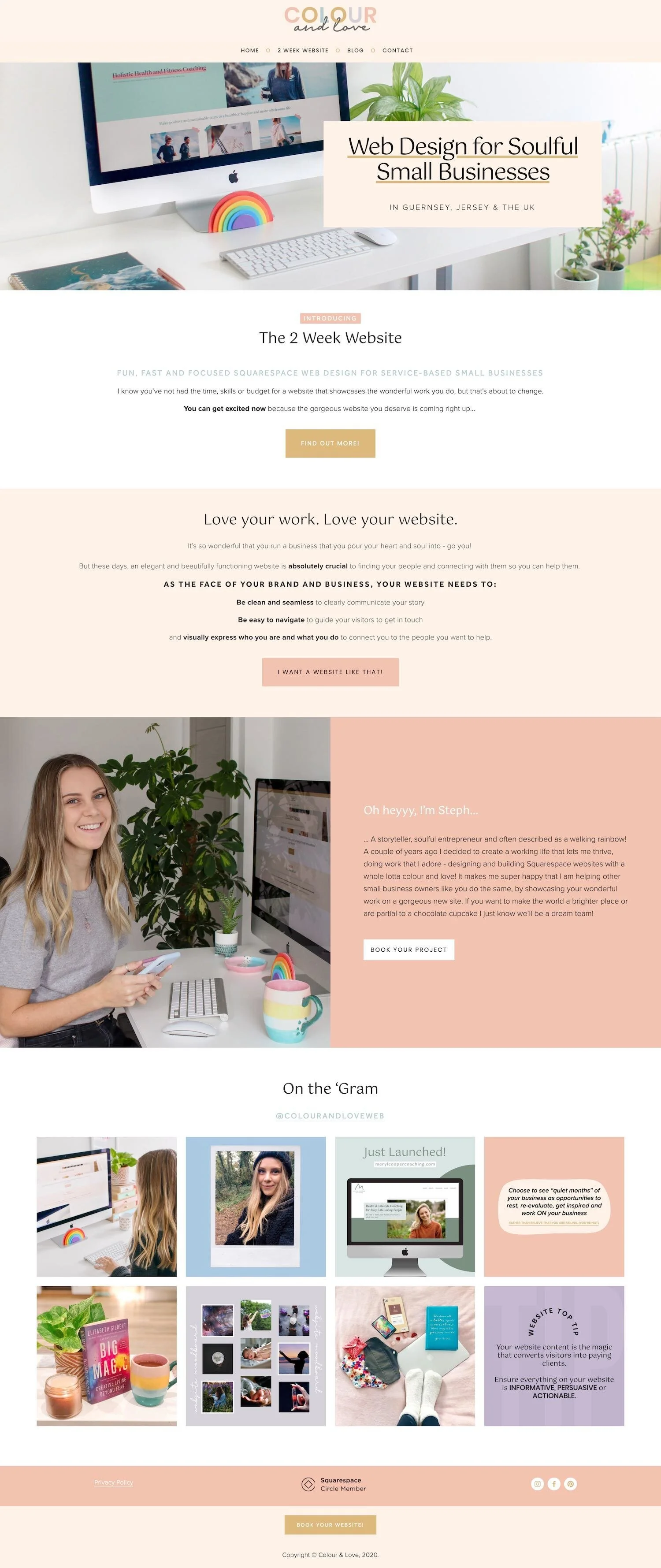
Live site: Colour and Love
Template: Brine Family
This sweet little design caught my eye, not just for how darling it is, but also for it’s double taglines!
You have the first one that let’s you know who she is (designer), what she offers (websites), who she serves (small, service-based businesses), and how she’s different (she’ll do it in only 2 weeks).
But then you also have the “why you need me” type tagline just below!
And while I literally justttt finished mentioning how a CTA button inviting them to work you needs to be super super clear, in this case, “I want a website like that” works.
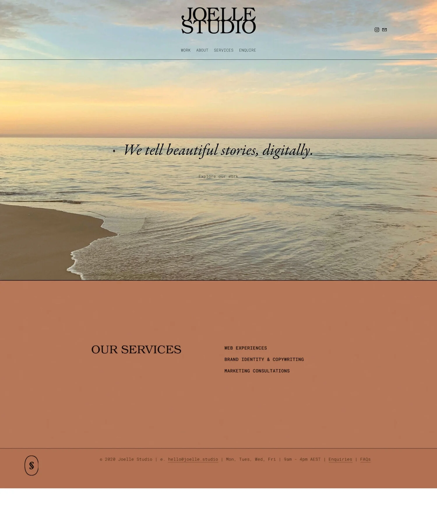
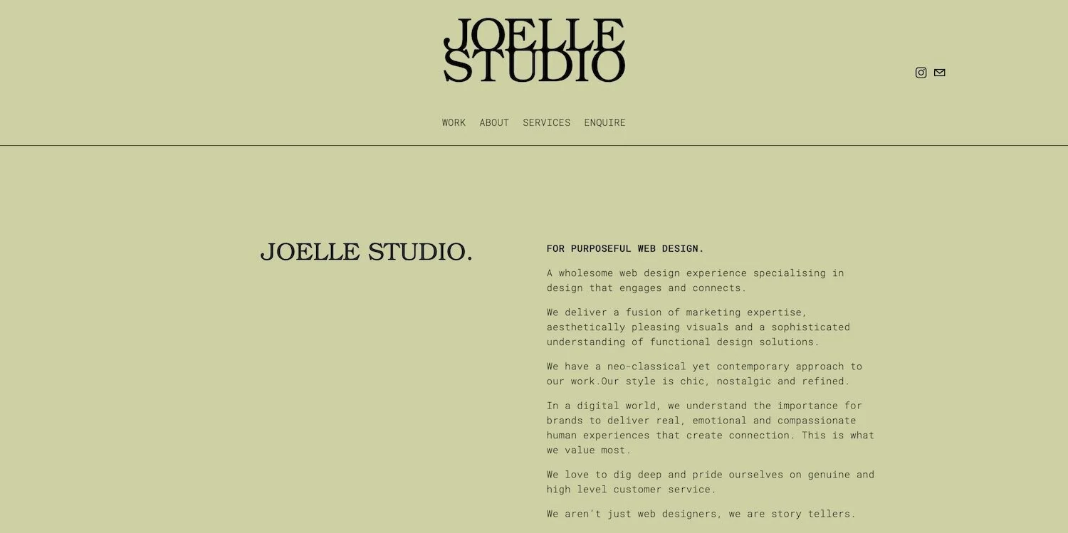
Live site: Joelle Studio
Template: Brine Family
Ok, so we’ve seen a lot of highly detailed designs jam-packed with all the extra little bells & whistles and custom branded elements which is super creative and fun!
But for the minimalist client, (or the one who just can’t do pink) it might all start to feel like a little too much.
This is where Joelle Studio’s breathtakingly simple design comes in.
And how about that circa 1970’s color palette?
These mega vintagey vibes will make choosing her a no-brainer for the right type of client!
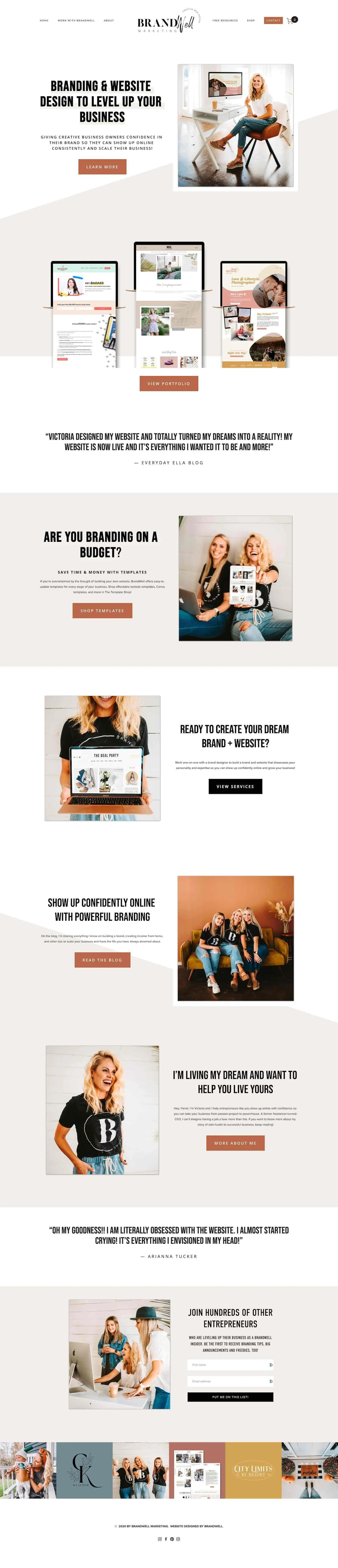
Live site: Brand Well Designs
Template: Brine Family
Bringing it back to the modern end of things, this design just screams bubbly, yet efficient!
And when I think of the type of person I’d want to help me level up my business, that’s the kind of person I’m picturing!
I love that her testimonials are just as bold as her section titles, and once again she uses very little text to get the job done!
Those angled backgrounds are a fun way to break up longer sections of content, and her best work is featured right there below the fold so you can’t help but dream of what it’s like to say yes to working with her.
Oh, and you’ll also notice from her IG feed embedded at the bottom, she’s keeping her brand consistent with her site and cohesive across all platforms to establish better brand recognition. 👏
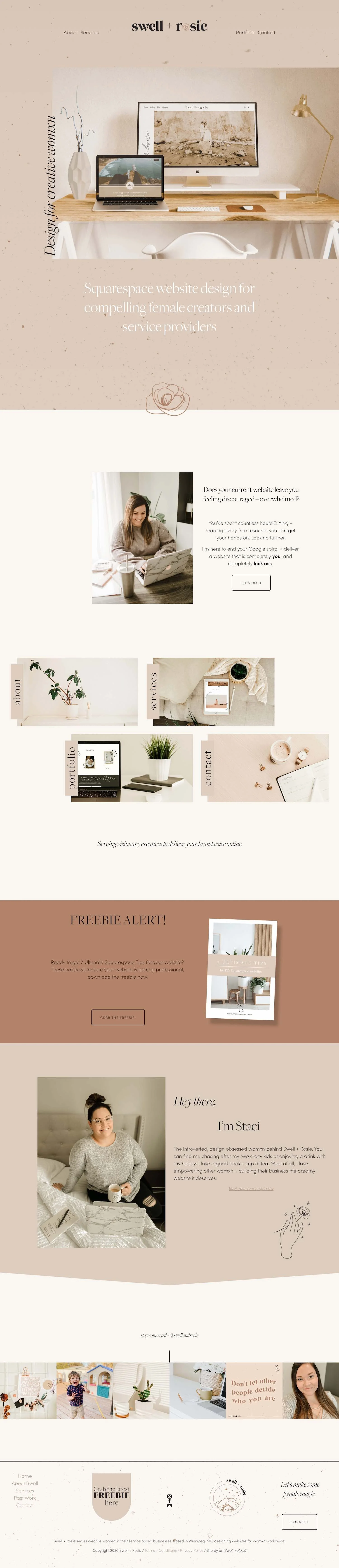
Live site: Swell + Rosie
Template: Built on Squarespace 7.1
The subtle textures happening in this design is everything!
And 100% it mimics the colors and textures you’d find in the home, wardrobe, and lifestyle images her dream client is already busy pinning on Pinterest.
This is a perfect example of getting to know your ideal client’s lifestyle, or at least the lifestyle they aspire to, and then finding ways to work that into your design.
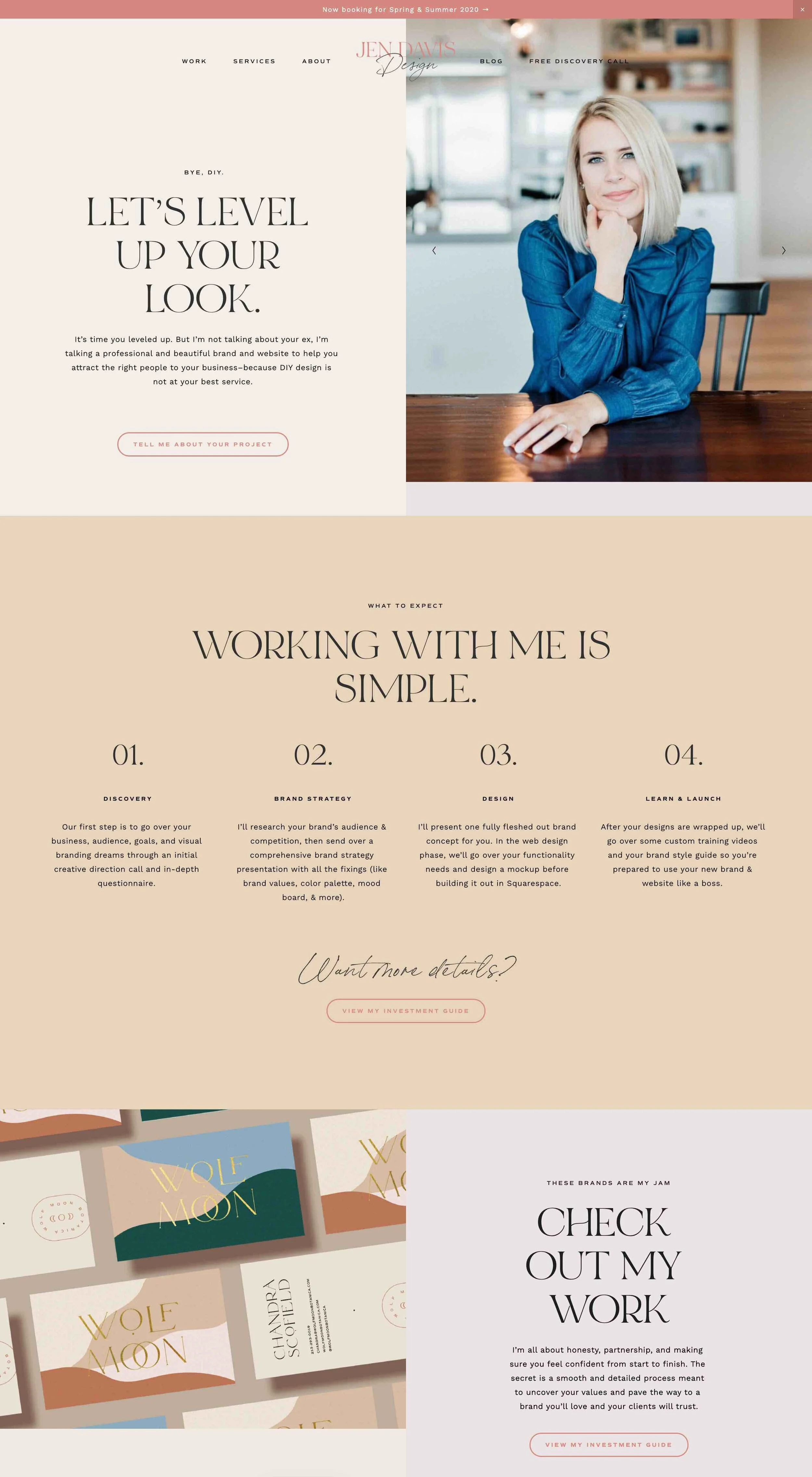
Live site: Jen Davis Design
Template: Brine Family
This next design is proof that your copy (A.K.A your website words) help set the tone for your site just as much as your colors and fonts do!
Jen’s copy is downright cheeky, and oh-so-relatable to the ladies she’s trying to attract.
She’s speaking directly to her ideal person, and no one else, meaning she’s likely to repel a few not-so-ideal-for-her clients along the way. 👍
Oh and check out her first call-to-action on the page:
“Tell me about your project.”
She’s made the invite to work with her not about her at all - it’s all about her potential client!
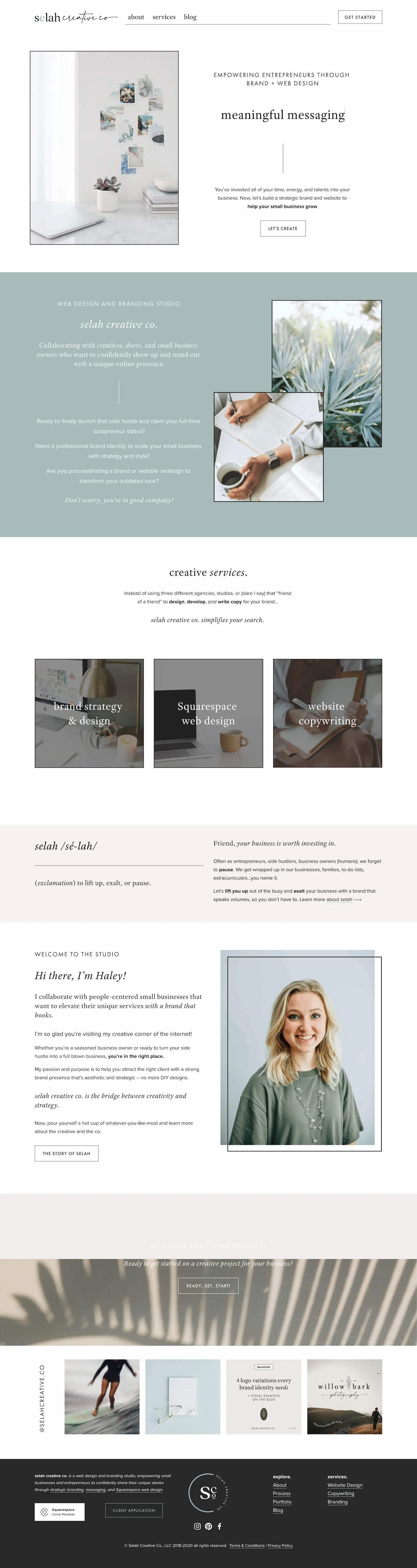
Live site: Selah Creative Co
Template: Built on Squarespace 7.1
This is another site that you just have to see in person to truly get the full effect.
Why?
Because that “meaningful messaging” line is actually part of a bigger message!
Past Squares Secrets Course student Haley has used some super clever coding to create a carousel typing effect where each title vanishes and a new one is typed out before your eyes.
I’m all about function and ease of navigation first, but so long as it doesn’t distract from your site goals (A.K.A the action you want visitors to take on your site) then it never hurts to wow site visitors with fun little interactive designs!
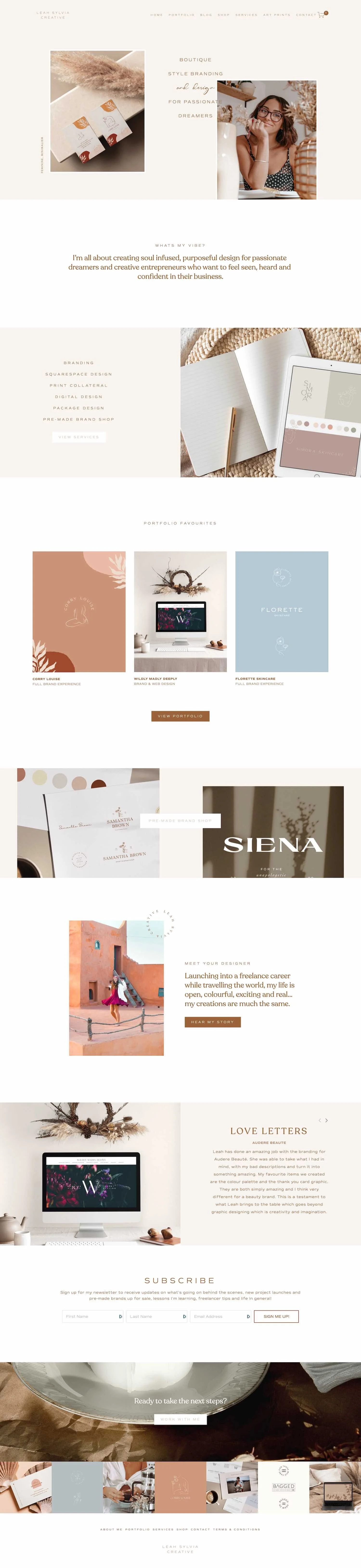
Live site: Leah Sylvia Creative
Template: Brine Family
“Boutique style branding and design for passionate dreamers…”
Dreamy is exactly the word that comes to mind when you see this next design!
When I think of a boutique, I think of cozy, lovely, little hidden gem shops with super curated one-of-a-kind pieces.
And that’s exactly the vibe I get from Leah’s design.
Whatever you offer, and no matter your industry, your aim should always be to make your site your ideal client’s happy place, and somewhere where they feel like they could stay and browse for hours.

YOU’ll also love...
50 example Squarespace websites built by Square Secrets course students
20 best example Squarespace websites • small business edition
10 best example Squarespace websites • clean & modern edition
How to make sure your Squarespace website is set up to convert
How to update your Squarespace website while keeping your current site live