15 best example Squarespace websites • coaches & consultants edition
Who’s ready for another round of absolutely gorgeous Squarespace website design inspiration!? 👀
We’ve covered several “broader niches” in our search for the best in Squarespace website examples (you can find those posts here)… 👇
20 best example Squarespace websites • small business edition
20 best example Squarespace websites • service-based business edition
20+ best example Squarespace websites • web designer edition
15 best example Squarespace websites • health & wellness edition
But if you’re a:
coach
consultant
therapist
counselor
speaker
educator
instructor
… basically, anything where you’re pretty much having to sell yourself just as much as you are your service - you may still be scratching your head about what needs to live on your website and where!
So whether you’re here to peep the aesthetic, or to get a feel for the functional bits to include on your site, this hand-picked collection of high-end Squarespace websites is sure to deliver! 👌
New to Squarespace?
You can sign up for a free trial of Squarespace here and I also got ya a little off the price, use code PAIGE10 for 10% off your first year. (Yes, that's an affiliate link!)
SQUARESPACE WEBSITES & TEMPLATE INSPIRATION • Coaching & consulting Business edition
Live site: On A Heal
Template: Brine Family
Designed by: Brandwell Designs
Can we all just agree that Victoria from Brandwell Designs absolutely nailed this website for Physcotherapist & Coach Ida of On a Heal!? 🙇♀️
So obviously the visual design itself is actual #goals but if I’m being honest, it’s that oh-so-simple main navigation that has me giddy!
There’s a lot of noise on the internet, and about a million directions for users to go, so when they do end up on your website, you want to make it super simple for them to decide where to go next, so that they don’t get hit with information overwhelm and end up bailing on your site before they ever even get started.
I’m also really digging that eye-catching, contrasting colored “what are you looking for?” page in her navigation, because if they aren’t sure which of your packages they need, or even if you really have something that could help them, this is a perfect way to get their eyeballs on your offerings right away without sounding salesy!
Live site: Aries Made Health
Template: Designed on Squarespace 7.1
Designed by: Aika Designs
Talk about branding photography to die for! 😍
These images could very well be stock photos, but they are chosen with such care to match the vibe and colors of the business’s branding and logo, and the result is a hella-cohesive (and honestly soothing) aesthetic!
Now, the actual layout of this site is quite simple, leaving room for the super powerful, even intimate copy to do its work in drawing the visitor in!
So the big takeaway here is to think about how you would want your client to feel when they are in your presence (or after wrapping up a session with you), and then emulate that with your design!!
Live site: Myst Studio
Template: Brine Family
Designed by: Retro Events Marketing
Another fabulous example of how imagery and colors can really set the tone for your website!
If you look at the very first example in this post, it screams playfulness, energy, confidence, and motivation!
Now compare it to this equally as stunning but incredibly different design! 👇
The images inspire calm, quiet, stillness, and reflection.
And the soothing blue-green overlay the designer used helps bring 3 very different photos (no doubt shot with very different settings) together.
I also love that they’ve included featured blog posts right there on the homepage, even though they have a blog page in their main navigation.
Meditation and therapy is so very intimate, so if someone has never heard of you or your business, it’s highly unlikely they will be purchasing a session with you the first time they visit your site.
So providing free valuable, legit helpful content (A.K.A content marketing) is a perfect way to gain the trust of those you are hoping to work with!
Live site: The Refined woman
Template: Brine Family
Designed by: Go Live HQ
Now, we talked about the importance of your website imagery being cohesive with your other branding elements on your site…but does branding photography always mean photos of you?
Like you saw in the example above, the imagery clearly showed the way that visitors can expect to feel when working with them, so no need to plaster every inch of the website with self-portraits! (Though, I’d definitely recommend a quality on-brand photo of yourself or your team to appear on your “about page” so people can put a face to the name!)
But when you’ve opted to create a personal brand like the example below (read: named your business after yourself) then you better believe that people want to see pictures of you living the lifestyle you claim to be selling! 👏
And a little “as seen in” section never hurt to make you seem like the real deal!
Live site: The Diary of an Empath
Template: Brine Family
Designed by: Revamp Design Studio
You’ll notice that pretty much every single website in this post was built using a template from the Brine Family.
And this is because of all the template families, Brine has the most flexibility in what it can achieve both design and function-wise.
(Not sure which Squarespace templates fall under the Brine family? I talk about it in my complete template comparison chart for Squarespace 7.0 & Squarespace 7.1 here!)
But like any drag-and-drop site-building platform, Squarespace does have a few limitations, which means if you want super fancy custom features, you may find yourself reaching for custom code or CSS.
One of those super fancy features is the sticky “connect” CTA (call-to-action) you see on the right as you scroll down on this live site.
Need a little help getting started with CSS? I have an entire series on CSS for beginners, as well as 70+ free copy and paste code snippets you can check out here!
Anyway, besides being absolutely gorgeous, this design by Revamp Design Studio also makes excellent use of white space! This is especially important if your branding elements (fonts, colors, etc) are on the daintier side!
Also, check out the use of transparent blue backgrounds and borders to add color and help certain images and text to stand out from the page without feeling too harsh or bright! 👏
Live site: Recovering from reality
Template: Brine Family
Designed by: M line Studio
I love everything about this next site!
And it’s no surprise coming from M Line Studios!
You’ll actually see several of Emma’s designs throughout the Squarespace Website & Template Inspiration series for her creative ideas while keeping with site-building best practices!!
One thing that really sets this site apart is that it feels 100% loud, 100% fun, and 100% relatable, which perfectly fits with the cheeky business name.
There’s no mistaking who this design is meant to speak to (hint: it’s probably not your Grandma 👵 …unless she likes to drop F bombs. 💣 )
Even the font choice is loud!
Which just goes to show you how much something as simple as font size can really impact the feel of a design.
Obviously your first goal when choosing a font is that it’s super clear and readable by anybody (even Grandma) but after that it’s all about the way that font makes visitors feel!
Need help finding a font that is free in both Squarespace AND Canva so that everything you create is cohesive and on-brand? Check out my post: Complete list: All fonts that are in both Squarespace & Canva
Live site: Coincide Life
Template: Brine Family
Design Collab by: Drop Cap Design & Made By NF
There’s just so much to love about this design!
It’s super minimal which is a perfect fit with the lifestyle that Coincide life is promoting, and the site is totally brought to life with movement, thanks to the beautiful background video halfway down the page! (which of course my screenshot tool totally butchered). 🤦♀️
Speaking of video, if you’ve ever wondered how to create an instant warm welcome for your site visitors and how to explain what’s unique about your business without writing novel-length amounts of text, then a video explainer like Courtney Jay has in her “Our Mission” section is absolutely the way to go!
P.S. This is a membership site built using Memberspace and Squarespace together! But Squarespace recently announced their very own built-in Member Area feature which I’m excited to dive into! So be sure to check back on the blog for more on using this new feature!
Live site: Happy Strong Healthy
Template: Brine Family
Designed by: Hello Magic Studio
Ok, so I may be a tad biased 💁♀️ but I think can we all agree that past Square Secrets and Square Secrets Business student Sinead of Hello Magic Studio is an insanely talented designer!
A few strategic design decisions I’m crushing on:
that rotating social proof section (A.K.A testimonials!)
the can’t-miss-it CTA to grab her super relevant and valuable freebie (a major step up from the ol’ “subscribe to my newsletter” standby)
the super warm invitation to join Happy Strong Healthy’s Facebook group
So you’ve probably heard me say before that I don’t recommend creating super obvious links to things that lead away for your site (because that’s most likely where the selling is going down and once a visitor clicks off your site, the chances of getting them back are slim!)
BUT (Because there are always exceptions to design best practices, and once you know the rules you also know when it’s ok to break ‘em)…
If you are a coach, or some other sort of 1:1 service provider that needs to be able to build up a lot of connection with potential clients prior to purchase…
Or you are looking for ways to ramp up how much you are viewed as the authority on your niche topic…
Then creating your own Facebook group and being super active in it, is a great way to fast track that!!
Live site: Heidi Stevens
Template: Unknown
Designed by: Drop cap design
Okie dokes, so everything about this design is just super warm and inviting right?
And even though she is offering similar services to many of the business you can tell just by the design choices she and Kadie over at Drop Cap Design have come up with that she has a totally unique personality and vibe to the other examples we’ve seen!
So even though they could be viewed as “competitors” in the industry, the super gentle language she is using to describe her approach, and her soft, warm colors are going to attract a completely different client than someone who’s website features bright colors and louder copy!
What is going to be super compelling and inviting to one person can be a downright turn off to the next!
This is why getting super clear on exactly the type of client you want to spend every day working with is so important because it really will make making those designs decisions so much easier when you aren’t worried about attracting people are just aren’t your tribe.
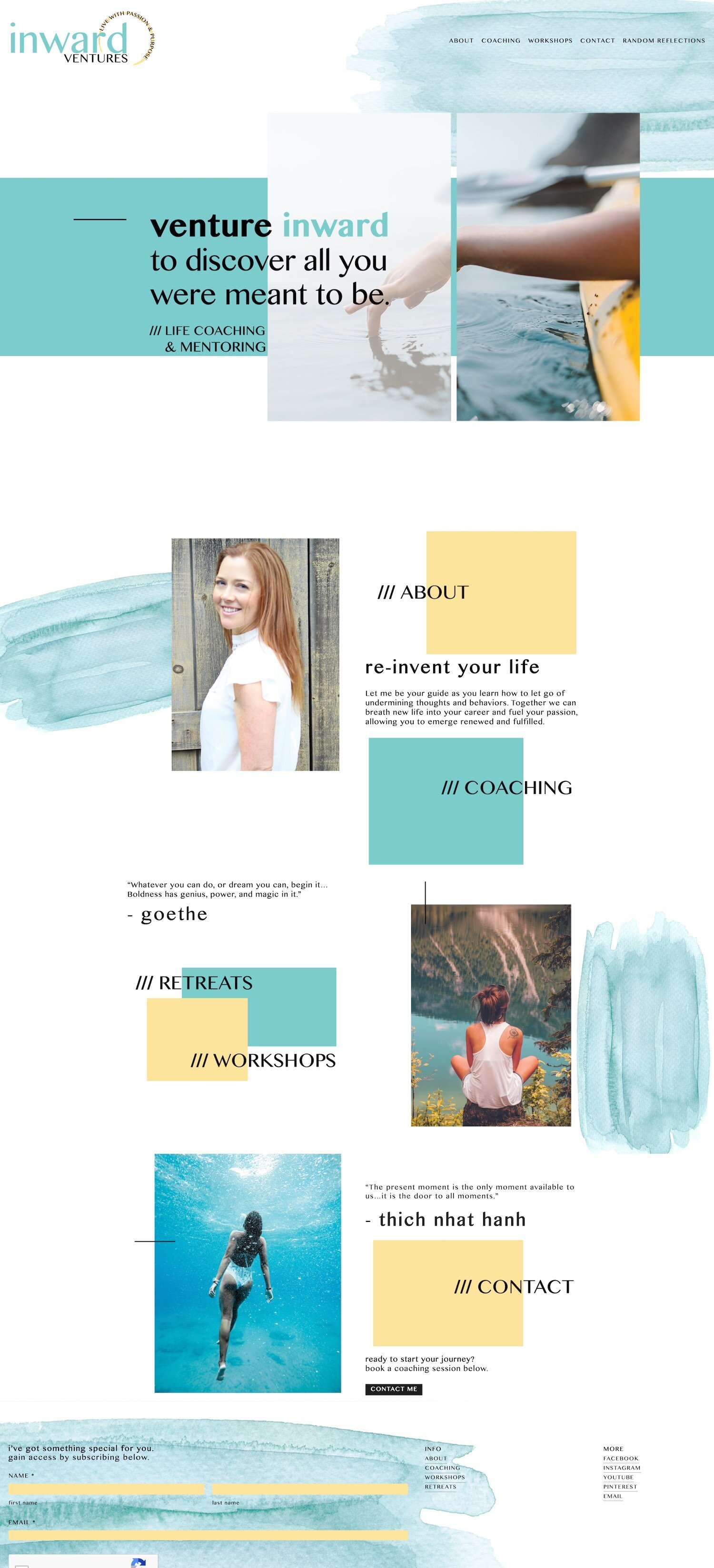
Live site: Inward ventures
Template: Brine Family
Designed by: Unknown
Just like I mentioned in the above example, the colors and fonts you choose for your design makes all the difference in whether your website will immediately appeal to the people you are most hoping to work with.
Here’s a whole post I wrote on making sure your website vibe appeals to your ideal client, btw!
So while the colors are still soft and calm, there’s a little bit more of a playful feel to this website!
And I love how the imagery used perfectly aligns with the word “venture” in the business’s name!
One myth I hear often in my inbox is that “all Squarespace websites look the same.”
But this is proof that even if you use the exact same template as every other website out there (because like 99.99% of Squarespace users are reaching for something from the Brine family) you can wind up with a totally unique design just by getting creative with backgrounds, layering in unique textures that feel on-brand, using color overlays on photos (see their banner area at the top!) and playing around with off-centering your elements!
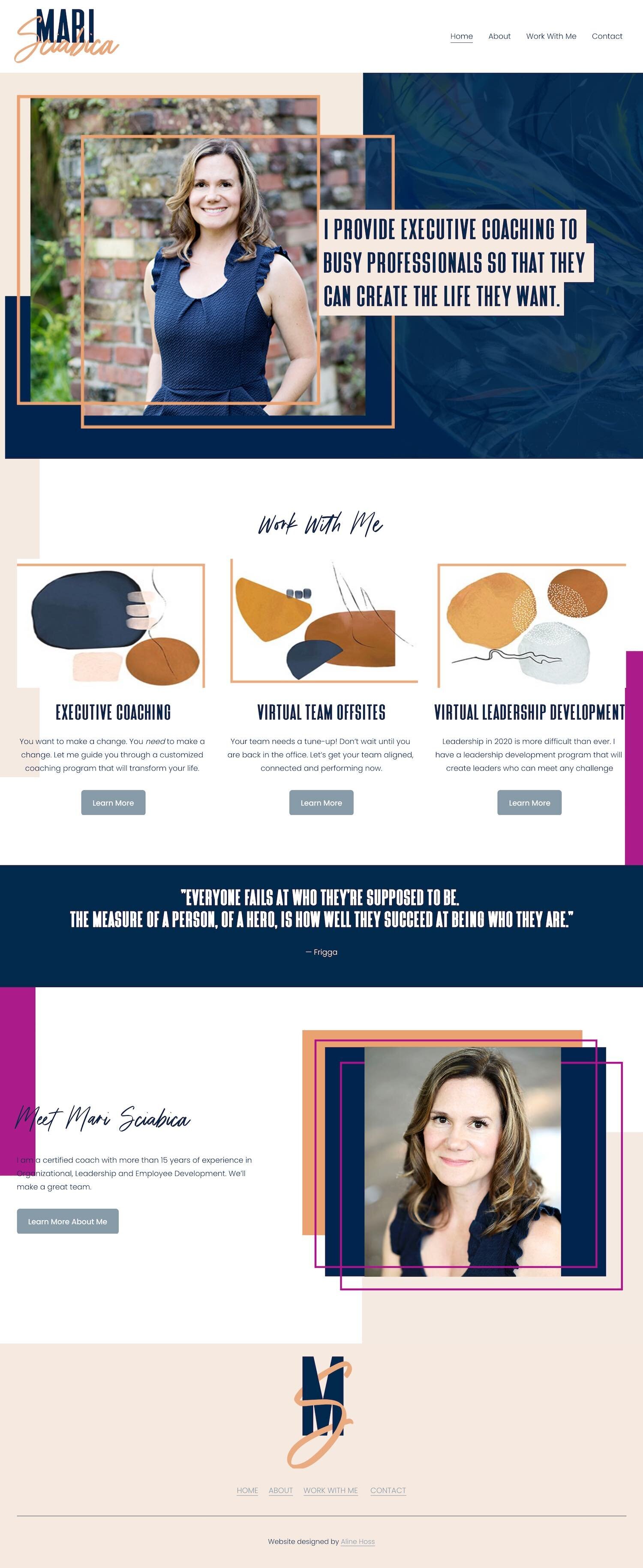
Live site: Mari Sciabica
Template: Designed in Squarespace 7.1
Designed by: Aline hoss
You’ve heard me mention the importance of “white space” in a design, but that doesn’t necessarily mean that it has to be white!!
“White space” is really just space where there isn’t too much happening design wise, and it gives site visitors room to breath before moving on to the next bit of content!
But like you’ll see in the example below, it’s 100% ok to use dark backgrounds, and even subtle textures as your “white space!”
One other thing I wanted to point out about this site that totally makes it stand out is the creative use of borders! It adds interest, color, and contrast to the page without distracting from the actual content!
And the colored text backgrounds make the copy pop right off the page!
(Seriously, just try to picture this same website with all the same images and copy but without all the perfectly placed borders and backgrounds! Would feel kinda blah, right?)
Live site: Nicole Faria
Template: Brine Family
Designed by: My Wolf Design
One of my favorite ways to land on design decisions for a new site-build is to imagine what that business’s ideal client might be busy pinning on Pinterest!
What sort of colors, fonts, textures etc. are flooding their feed?
That’s what is just so perfect about this next minimal design! I can actually see the outfits, homes, and other high-contrast yet warm lifestyle photos that her people are probably pinning on the reg!
Again, similar service to many of the other coaches featured in this post, but a completely unique vibe!
Live site: the game changer company
Template: Brine FamiLy
Designed by: Unknown
There’s just so much to celebrate about this next design, but I want to specifically draw your attention to one thing…
This site is super interactive!
Meaning that every single section has some sort of clear, clickable CTA inviting visitors to take the next step on their buyer/subscriber journey, or to take advantage of their valuable free content (which will also contain CTA’s for the next step!)
Nowhere is there a giant wall of text or images with nothing for the visitor to interact with.
Even the testimonials involve clicking to view the next slide in the carousel! (Here’s a fun hack for creating rotating testimonials in Squarespace, btw!)
So this is the perfect way to keep visitors engaged and sticking around your site.
Live site: Yes & Leaders
Template: Brine Family
Designed by: M line studio
You’ve heard me mention at least once in every single post throughout the Squarespace website inspiration series about the importance of a super tidy, clutter free main navigation.
Meaning you only include your top 3-4 (maybeeeeee 5) absolute most important, highest-priority-for-where-visitors-should-go-next links.
But what if your business is sort of split in two. Like, you have two distinct audiences you serve?
It’s not easy making sure that both audiences are super clear where they need to click on your website to get started! But Emma from M Line Studio has made perfect use of Brine’s built-in top and bottom header feature to create a double header for this site!
One with all the links that every visitor will need, and one that leads specific visitors where they need to go!
Live site: Mike Foster
Template: Brine Family
Designed by: GOLIVe
Want to know the easiest way to get people to stick around your site? Keep them scrolling!
Long-scrolling websites have definitely been a trend for a while now for how they mimic some of the fav apps that audiences are reaching for (think: Insta, Pinterest, etc.)
But besides just adding more and more content down the page, another fun way to keep visitors interest piqued from one section to the next is to use something as simple as an arrow to draw their eye on to the next bit of content!!
YOU’ll also love...
50 example Squarespace websites built by Square Secrets course students
9 reasons people are bailing on your site before they buy or book!
What to do & when to do it: A step-by-step guide to building your Squarespace site
How to change the content background color on one individual page or section in Squarespace






.jpg?format=300w)
.jpg?format=300w)