15 best example Squarespace websites • health & wellness edition
Welcome back to the Squarespace inspiration round up series! 🎉
If you’re just joining us, we’ve already looked at some pretty fabulous examples of Squarespace sites done right!
ICYMI, we’ve covered:
20 best example Squarespace websites • small business edition
20 best example Squarespace websites • service-based business edition
20+ best example Squarespace websites • web designer edition
But if you’re stilling having trouble getting those creative juices flowing, or you wish there was a way you could see just a few more examples before committing to your site build, you’re in luck!
Enter: the top Squarespace website examples & Squarespace template design inspiration • health & wellness edition!
While it’s true that this post was specifically put together with my health & wellness peeps in mind, there’s no end to the ways that these concepts can be tweaked and reshaped to fit pretty much any industry out there!
New to Squarespace?
You can sign up for a free trial of Squarespace here and I also got ya a little off the price, use code PAIGE10 for 10% off your first year. (Yes, that's an affiliate link!)
SQUARESPACE WEBSITES & TEMPLATE INSPIRATION • HEALTH & WELLNESS
Live Site: Well Born
Template: Brine Family
Designed by: Knapsack Creative
Where to begin!? 👀
I know we are here to talk about website design, but can we take a minute to appreciate just how dialed in Well Born is on their exact ideal client? This is possibly the most niched business I’ve come across in my little Squarespace example site search!
Now, let’s talk about how this influences design. 👩💻
The fabulous thing about zeroing in sooo so closely on your ideal client is that you don’t have to worry about your design decisions appealing to anyone but that one single person.
It makes choosing everything from fonts, colors, imagery etc. wayyyyy easier than if you have a broader audience to consider.
Oh, and see that “Take Quiz” button right there in the main navigation (and then repeated in almost every section down the page?)
That’s a list-builders dream!
People love quizzes, especially if they can help answer real questions they have about something they’ve been busy researching or planning for! 👏
LIVE SITE: I AM Oils
Template: Brine Family
Designed by: Rare Bird Creative
This simple, serene design by past Square Secrets & Squares Secrets Business student Julie Parker of Rare Bird Creative is the perfect reminder of:
A) just how important high quality imagery is if you wan’t to come across like a legit biz, and…
B) how the banner image sets the tone for everything else on your site!
By including images that speak to the kind of lifestyle your ideal clients are aspiring to, you’re helping site visitors to dream about how buying or booking your thing could help them achieve the same!
Oh, and I love seeing a stand-out call-to-action section that invites visitors to shop your main categories rather than just including a “shop” button in your header and hoping visitors make it over to your shop on their own.
Live site: Fruits & Roots Holistics
Template: Brine Family
Designed By: My Wolf DesigN
Here’s another example of how to include an “shop now” CTA section, only rather than stopping at categories, Fruits & Roots are calling out specific featured products most likely to catch site a visitor’s eye!
And they’re using their handy little announcement bar to offer a savings that just might make those fence-sitters get off the fence and fall in love with their products!
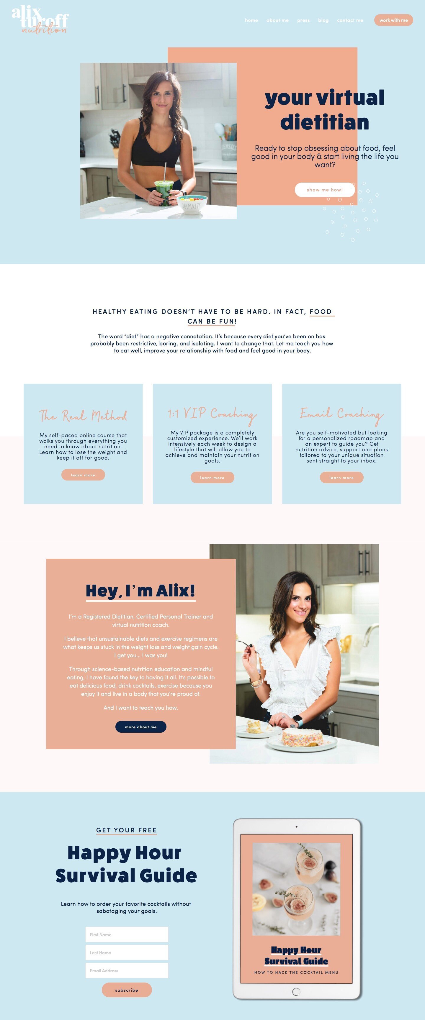
Live site: ALIX TUROFF NUTRITION
Template: Brine Family
Designed by: Hello magic Studio
This site was recently featured in our 50 example Squarespace websites built by Square Secrets course students post, but I couldn’t pass up the opportunity to show off past student Sinead’s totally fun and inspiring design just one more time!
Setting aside how stinking gorgeous this site is, let’s talk about why this site makes me crazy proud…
And that is that every 👏 single 👏 section 👏 has an enticing CTA just begging to be clicked!
This design does not leave things to chance, and if you’re a site visitor who’s totally resonating with the super honed in site copy there’s no way you’re leaving this site without clicking at least one of those invitations to find out more about how you can work with Alix.
And there’s no way site visitors are going to pass up on a freebie that teaches you how to make delicious health-conscious cocktails. 🍸
Live site: Diana Matuszak
Template: Brine Family
Designed by: The Busy BeE
This next Squarespace site is all about creating your dream life through building a healthy body & mind, and even though the focus of the business is food & fitness, Diana is showing visitors she’s the real deal by living (and documenting) the lifestyle her clients are dreaming of.
Being a personal brand, she wisely invested in a high quality branding photoshoot to create images that that perfectly support her site copy (“finding the most happy & confident version of you”).
She clearly outlines her main offerings right there on the home page, and includes some hype from past clients (A.K.A testimonials) in a stylish little carousel to seal the deal. 🤝
Live site: Vive Medispa
Template: Brine Family
designed by: My Wolf Design
When you think of a Medispa, you think luxury, right? Well, the colors & font choices for this next design definitely feel luxurious, wouldn’t you say?
I love that big spacious header, making the next steps in the clients site journey super simple to find.
But what I’m most excited about in this particular design is the section right under the banner area that starts with “you look tired.”
A perfect example of how site copy is just as important as the design choices you make when it comes to winning over potential clients and customers. 🙌
Rather than just talk about their business, they’ve used super relatable scenarios to draw the reader in and making it about them!
live site: Kimbritive
template: brine family
designed by: Revamp Design Studio
Ok, so this next design was already featured in our small business edition of the Squarespace inspiration series!
But I think you’ll agree it’s just too gorgeous not to bring up here in the health & wellness site round-up as well!
And just like I said over in the small business post, this site is the perfect response to any doubts you might have that “all Squarespace sites look the same!”
Live site: The pilates club
Template: Brine Family
DESIGNED BY: LEAH SYLVIA CREATIVE
This next wellness-based site for The Pilates Club is just another example of how stunning simple can be!
The color palette and clean lines are a perfect match for their business’s brick & mortar space, and you can see by their gorgeous Insta feed they’ve embedded at the bottom, that everything they do is “on-brand” and speaking to their one ideal customer.
But this is more than just a pretty website, friends. 💁♀️
What I really want you to see is little snippet of text right below the fold that immediately lets site visitors know exactly what sets them apart from the competition!
“The Pilates Club is a small, home-based studio, therefore I am able to offer more personalized classes to my clients.
With a maximum of 2 clients per class, you will get full attention to form for the whole class, as we work together to help you reach your goals.”
Live site: Avalon Psychotherapy
Template: Brine FAMILY
Designed BY: Olivia Design
Ok, so obviously I do love me some blue! I pretty much built a brand around it!
But besides being slightly biased towards the color palette, the real reason this site makes the best Squarespace example site list is that unique mood board style banner area!
I’m definitely a fan of the big bold hero image that Squarespace is known for, but sometimes one image just isn’t enough to convey the feel & vibe of your business!
The mood board on a white background gives a softer and more airy first impression!
Also loving that map section for making it easy for potential clients and customers to find you if you’re a sticks and bricks location!
Live site: Alchemy of Plant & Sol
Template: Brine Family
Designed by: Paradise Studio
This next bit of inspiration comes from design in it’s simplest form: blank space!
Yup! What you leave out is often just as important as what you leave in, and the right amount of “white space” on the page can really set off the other elements in your design.
But this blank space is anything but boring…
Together with Paradise Studio, Alchemy of Plant & Sol has chosen to incorporate super minimal branded graphic elements in her background, rather than adding extra colors, images, or textures where they might feel overwhelming!
This is one of those design concepts that really could be tweaked for any industry!
Live site: AZ Juniper
Template: Brine family
Designed by: Made By NF
I’ll say it again: Imagery is everything!
Imagine the exact same design, layout, colors, fonts, etc. but then swap out the banner image for a bit of generic stock photography.
It would kind of lose it’s edginess, right?
You can include text for days about how you are the right fit for your ideal visitors, but in the end, they need to be able to “see” themselves in your photos or portfolio!
With one image, Juniper has let you know that this is not your grandma’s skin care!
Live site: Push Power
Template: Brine Family
Designed by: The Busy Bee
Need something that’s a little more grit than girly?
This high contrast design with it’s super clean fonts is the perfect neutral palette to speak to both the ladies and the gents out there hoping to get their hoping to get their fitness on!
The custom icons give it a slightly trendier feel, and help to break up longer bits of text into shorter more easily digested sections.
They’ve also turned their website into a handy online portal for current customers!
Live Site: Sarva Center
Template: Brine family
designed by: June & Mango
When choosing background images for your site, it’s best practice to go with something that isn’t super sharp or busy, which could make any text overlay you have difficult to read!
June & Mango has nailed this in this design for Sarva Center by choosing soft blurred images where the subject of the image is off centered, and not competing with the text!
And even though they’ve chosen a more intricate heading font, they’ve chosen only to use it for short 1-3 word text snippets, reaching for cleaner fonts for those longer paragraphs!
Live site: Heart Lotus Health
Template: Brine Family
designed by: Upala Design
Look at that super clear & clutter-free main navigation! Only the most important links made it in there, and all main navigation pages are named exactly what site visitors are expecting they would be (services, about, blog, etc.)
That’s right! Simple really is best when it comes to helping visitors to navigate your site!
You can save the creativity for the rest of your design like this talented designer clearly did!
Oh, and while we’re here, I love the secondary logo worked in partway down the page. Repeating your logos or branding elements frequently helps to establish more brand recognition, and in this case, it’s just a super pretty way to break up the sections a bit!
Live site: The Collective Studios
Template: Brine Family
Designed by: Delilah Creative
Speaking of logos, check out this creative bit of CSS worked into this next site’s header to get the logo to overlap onto the banner area!
And what I love about this site is the refreshing color palette!
This super rich green definitely could be overwhelming in the wrong hands, but the ladies behind Delilah Creative knew just how to balance it out with subtle background textures and plenty of “white” space as well as choosing an outline button style over solid!
Each section contains a super clear CTA letting visitors know exactly where they should be headed next!
YOU’ll also love...
How to make sure your Squarespace website is set up to convert
How to update your Squarespace website while keeping your current site live
Squarespace SSL: the settings to know to keep your site secure
Complete list: All fonts that are in both Squarespace & Canva
My fav Squarespace 7.1 features that help you build your website faster


