
High-End Website Design Tips : How to Make your Website Look Expensive

Prefer to watch?
Here’s the video!
Mentioned in the Video:
*those are affiliate links - my Margarita fund thanks you kindly in advance!
Rather read all about it?
You know when you land on a website and you think, "Wow, this looks luxurious."
What if I told you that creating that high-end feel for your own website is totally doable, even if you don't have a design degree?
Mm-hmm, it's true. There are some very specific web design rules, which, if you follow them to a tee, will make your website give off that elegant, polished, expensive look and feel. Here are 6 high end website design tips, guaranteed to make your sites look expensive!
And of course, it doesn't take a rocket scientist to know that a better-looking website is going to lead to a better-looking bank account balance for your business.
So read all the way until the end for all six design rules of expensive-looking websites, and then trust that your website is about to turn heads for all the right reasons.
High End Website Design Tip Number One:
just enough flair.
Think of your site design like how the elegant Parisian women prepare to leave their apartment in the morning.
They get fully dressed for the day, and then they take off one item before they leave the house.
More is not always more if you want your website to look elegant and expensive.
This makes me think of the trend of gold jewelry right now. Some women will wear gold bracelets and earrings and a necklace or four, and then also have a ring on every single finger.
That's the style equivalent of getting this one wrong.
Here's a website that technically gets all of the other rules that we're going to speak about, correct. But it's just too busy. There's too much of a good thing.
So take some of the items away, and then you'll have that expensive-looking website.
High End Website Design Tip Number Two:
Timelessness.
Basically, avoid trends. Let me give you an example of a design trend that was around a couple of years ago. Melissa Griffin retired from her business a few years ago, and therefore her site has stayed the same for the past few years so it's actually a perfect example of this.

Let me just say, I love Melissa and her work, but this website is a perfect example of following a trend from a few years ago.
There are sort of blobs of a variety of color all over the website, which was a trend. It was sort of like this imperfect, childlike, casual feel.
Now you'll notice that there's a variety of colors. There's no one primary color, or even just a choice of two colors. There's really quite the mix.

And at around just the same time, Jenna Kutcher also had this trend in her branding. Again, sort of like childlike, with these stylized paintbrush strokes in a variety of colors.
So that's just an example of one design trend in websites and branding. Now the next trend won't look like this. It'll be different, but when you notice everyone changing it up and really seeing new branding and websites, don't feel pressured to follow the crowd.
Stick to timeless design principles, and that's the thing that's going to make it look the most expensive.
Now, let's also chat timelessness in terms of color.
What is timeless here?
Neutral colors, subtle tones, and shades that you would naturally find in nature, specifically in the seasons of summer and fall, and less so in the seasons of spring and winter.
The difficult aspect for some non-designers to really distinguish is that it's not that blue for example, or red are non-expensive looking colors, and pink and yellow are.
Different shades and tones of blue can look expensive, while other shades and tones of blue don't.
And so on the opposite end of the expensive-looking spectrum, what you want to avoid is those shades that come one year and are gone the next, and that is often but not always colors that are a bit brighter and a bit more jarring.
So in choosing the colors for your website, remember to choose more subtle, found in nature colors, which often but not always are colors found in the seasons of summer and fall.
By the way, if you want to make your website look expensive so it sells more, this video will definitely help, but simply making your website look more expensive honestly isn't the entire story.
I put together a training, 4 simple steps to double your site sales, which goes through a number of different tips, which will be complimentary to what we're speaking about here, about making your website look more high-end. Check it out here.

High End Website Design Tip Number Three:
You likely knew something about images was going to come up in this video, but this is probably not what you're going to expect.
Design rule number 3 is intentional imagery.
Now don't think I just mean picking photos taken in expensive looking places. If you're doing that, you're actually getting it all wrong. Choose more artistic looking photos.
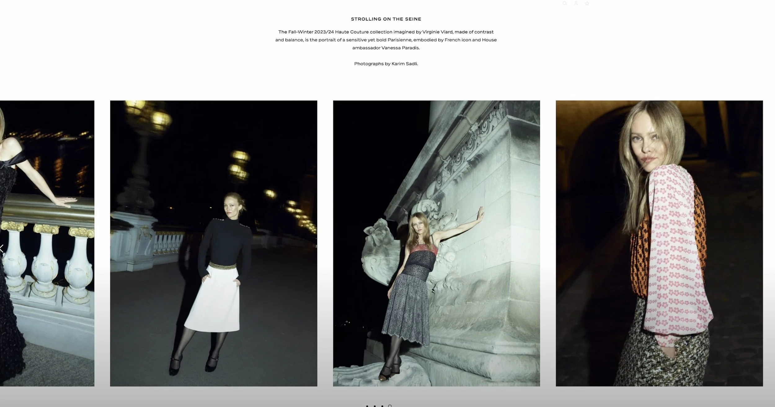
Here's two sets of photos that you would typically find on a website, which indicates female entrepreneurship and business. My question for you is which of these look more high end?
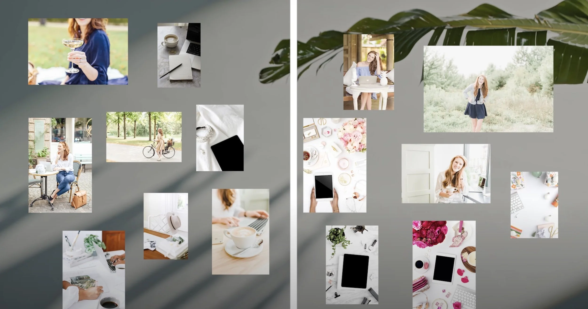
The ones on the left.
Why is that?
It looks more like the picture is taken of a real place.
The photo isn't shot straight on. It's sort of imperfect. It feels more artistic.
On the right, we have more staged-looking images. Bright colors too, which goes against something we just spoke about.
Note in a rule coming up, you can break these rules that we're going to talk about right now, so it is possible to have bolder colors and for your website to still look expensive, but it's got to be a hint here and there, not quite as present and sort of a primary focus as the examples in these photos here.
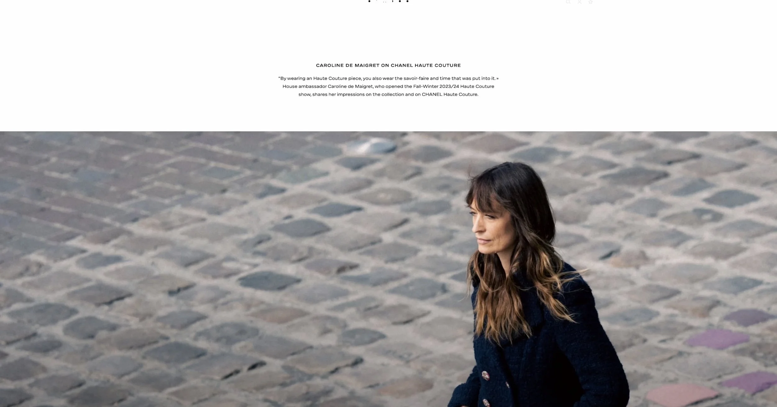
Now, let's look at some of my old brand photos and I'll roast myself too.
In the newer photos, I'm not posing for the camera as much. The shot isn't straight on. It looks like I'm just sort of going about the business and the photographer snapped a shot, unlike on the left, which looks like I'm sitting there waiting for the photo to be taken and smiling accordingly.
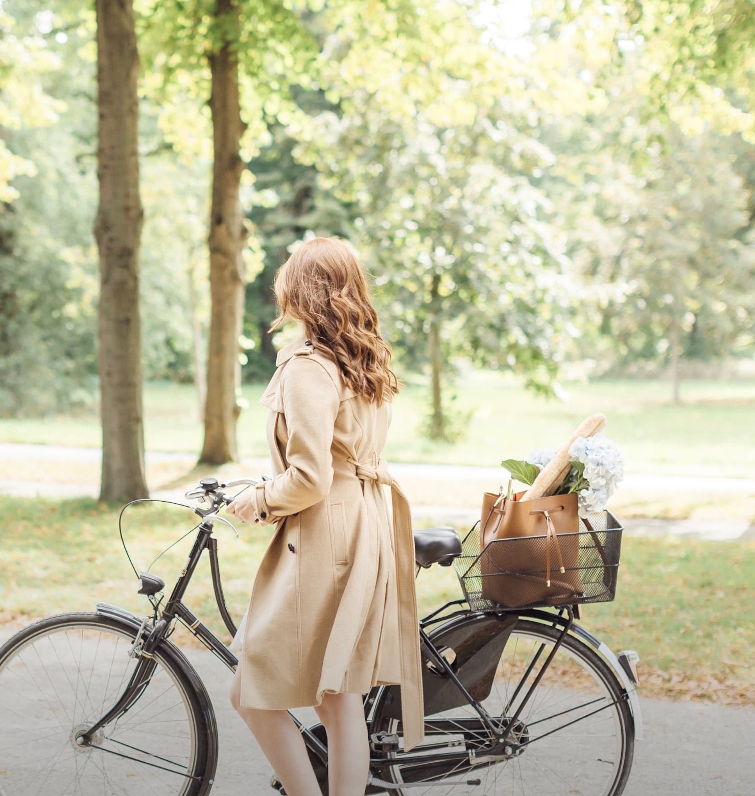


Photos taken with movement, with an unusual crop, with the subject not looking like they're posing, add to the website looking more expensive.
Now this is for most images on the website, but the exception for this one is of course the headshot.
Of course, also having the content of the photo itself look more expensive in terms of the style of the clothing on the subject and the location too does also help, but that is really not the be-all and end-all. So with photos, if the picture doesn't 100% add to the expensive look that you're going for, you're better off just without it and using more blank space.
Also, when it comes to photos, avoid all of the free stock photos.
They're too often used, and therefore they look cheap when you've seen the same photo used by a zillion other business owners.
Psst…looking for unique, quality stock photos to give your website that elevated feel? Elevae is my personal go-to for all stock photo and video needs.

High End Website Design Tip Number Four:
A liberal use of spacing.
You know when you walk into a high-end fashion store, there are only a few items of clothing on the racks. Each hanger has about an inch of breathing room between it and the next hanger with an item of clothing on it.
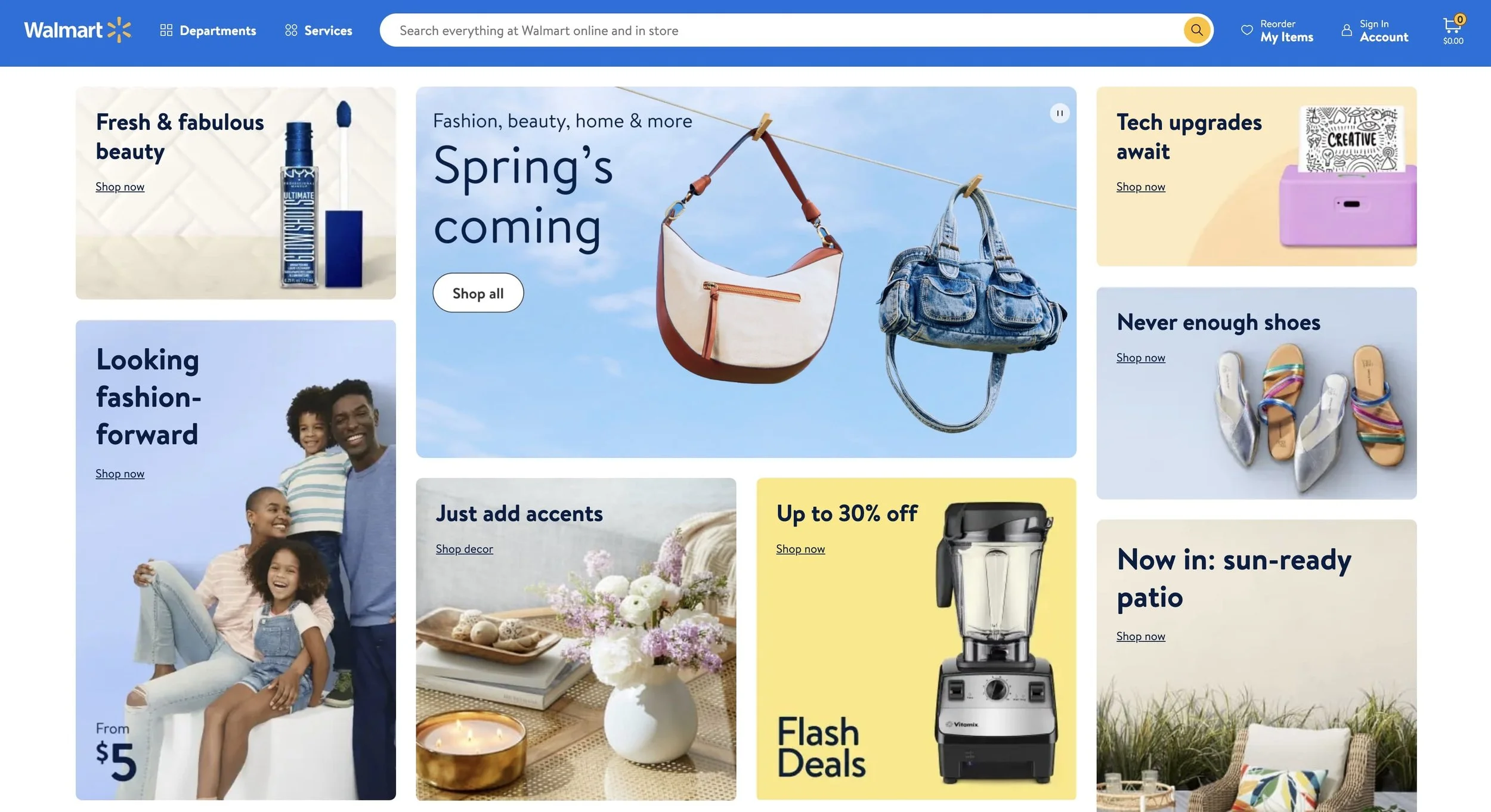
Whereas if you head into Walmart, it's how many items and sizes can you stuff onto one rack.
It's the same with your website.
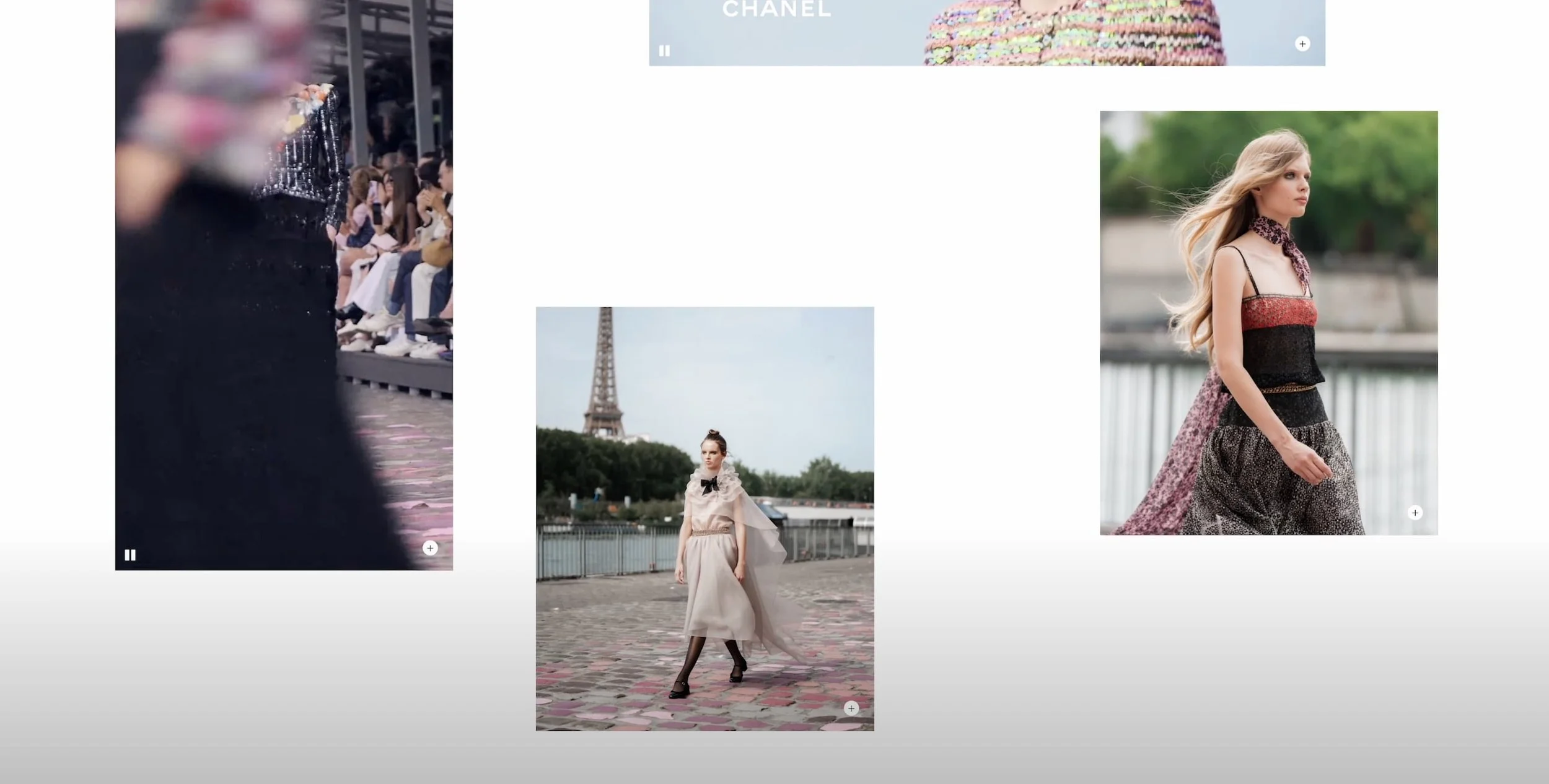
Here we have the website of Chanel, and you'll notice the content starts being contained to the center of the page, and the image gallery isn't just photos stacked side by side or taking up the full space on the page, they're sort of sprinkled throughout the page with plenty of blank space between them and to the sides.
Whereas on the Walmart website, it's wall to wall stuff stuff stuff on the page.
High End Website Design Tip Number Five:
Direct statements.
What do I mean by this?
If you want your website to look expensive, don't actually use the word luxury or high end or premium or expensive in the copy.
Think of the label of a wine bottle. They use their language to describe the wine, and they speak so beautifully in the description.
Never does the word luxury or expensive appear on the label of a bottle of wine.
Same with photos.
A person in the photo dripping in designer everything and having visible brand logos or a giant Chanel across the front of a shirt is way too much.
Subtlety is key, both in your language on the site and any other aspect of the website, including what's in your photos.

High End Website Design Tip Number Six:
And this is the one where you can break any rule we've previously spoken about.
It is having one element of creativity on your website.
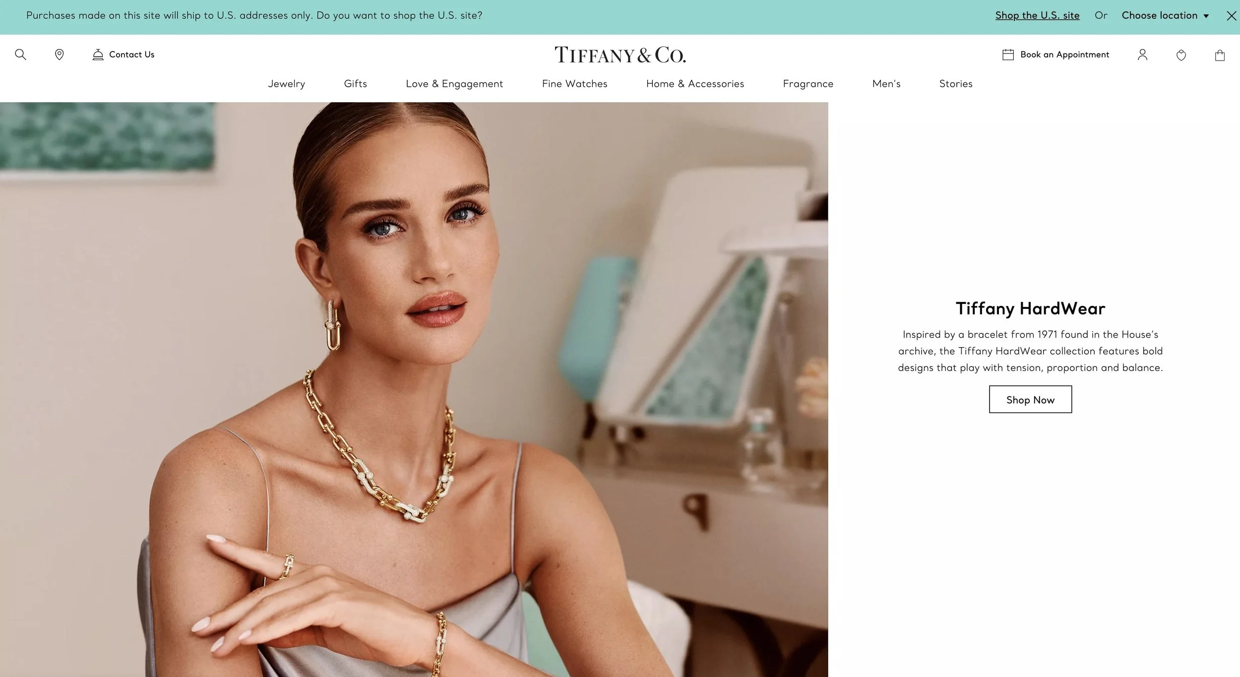
You can actually go for a really bold, non-natural-looking color, like Tiffany actually does with its blue. That's a very spring-feeling color, but it's one element of rule-breaking that Tiffany makes. They select their fonts, they do their spacing and their images, etc. All the rest plays by the rules.
So you can choose something else to break the rules with.
Maybe you go the exact opposite direction on spacing and you go to the other extreme of crowding everything, or maybe you do very staged, non-artistic-looking photos.
But remember, in order for the website to look expensive, it's one aspect of creativity. It's one aspect of breaking the rules. If you break all the rules at the same time, you won't have the expensive-looking brand perception that you're after.
So some touches you wouldn't normally find on an expensive-looking website could be things like hand-drawn elements or an extremely playful font. But with just a touch of it here and there, and not all of these items together, you really can make something appear both unique and expensive.
Now hearing all these rules is well and good, but it can be hard to just hear something. It's quite another to be able to see a transformation of a website from looking DIY-ed to high-end in front of your own eyes.
Which is why you should watch the video below where I give one of my subscribers' websites a complete redesign and makeover and implement exactly what we've talked about here.
You’ll Also Love...
How much does an online business cost to run? (My business cost breakdown)
Youtube vs Instagram vs Blog for Creative Entrepreneurs in 2024
Work-Life-Balance Advice from a 7 Figure Online Entrepreneur
How to start an online business in 2024: Complete step-by-step guide
Is it too late to become a Squarespace web designer in 2024?