
12 Outdated Web Design Trends & What to Do Instead
Prefer to watch?
Here’s the video!
Mentioned in the Video:
Rather read all about it?
Ever look back at your old photos and think
"What was I wearing?"
Just like fashion, web design trends come and go too. What was hot yesterday can make your website look kind of neglected today.
Today we're diving into the 12 web design trends that have gone the way of the flip phone and what you should be doing instead to keep your website looking fresh and functional in 2024.
Okay, so our first outdated design trend is full-width banners.
I love Nomadic Matt, but this trend on his website right now is a good few years old at this point. So here we can see it's just the top of the page, a whole going from side to side, wall to wall, one photo.
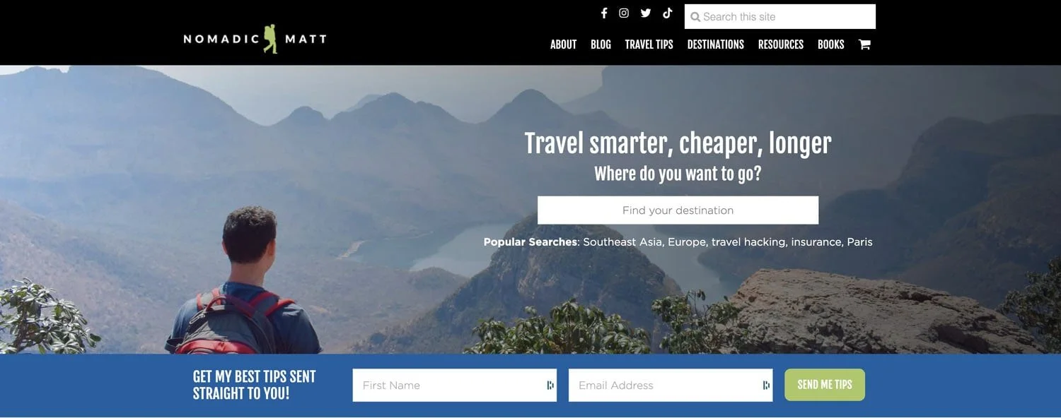
Typically there's some text over top and a button and everything and we can see that happening in Matt's website here or also in this Lady Nomad template, you can see just a full-width banner is at the top of the page.
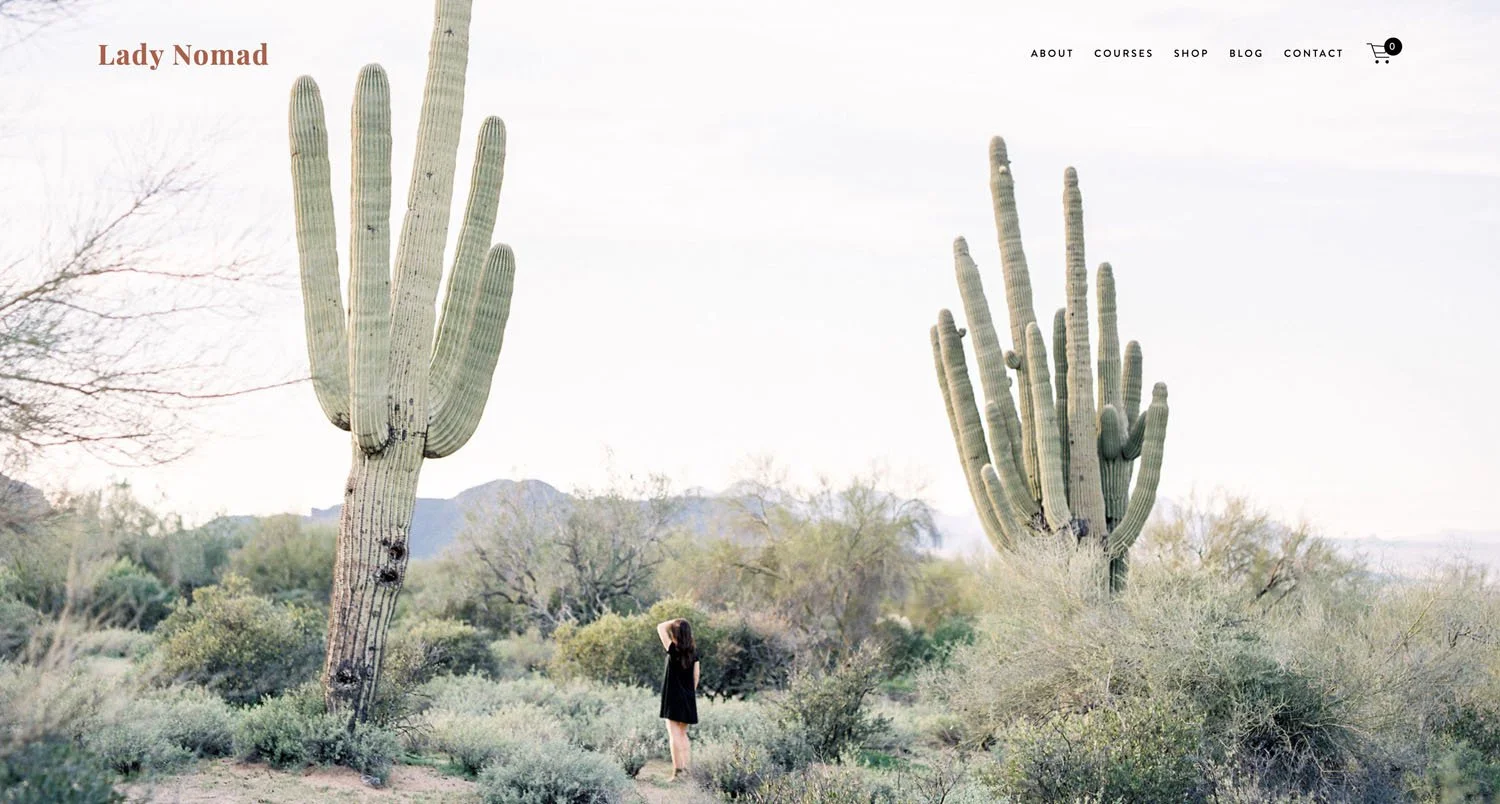
Now this is a little bit outdated so instead what is really on trend these days is sprinkled photos, smaller photos throughout your banners.
Here’s a Squarespace template from the wonderful Big Cat Creative (yup - that’s an affiliate link, the team at BCC creative some of the best Squarespace website templates out there!) that nails it beautifully. There's one main color background and then we have a few photos sprinkled throughout, not necessarily aligned or anything, a very unaligned look and it looks really fresh.

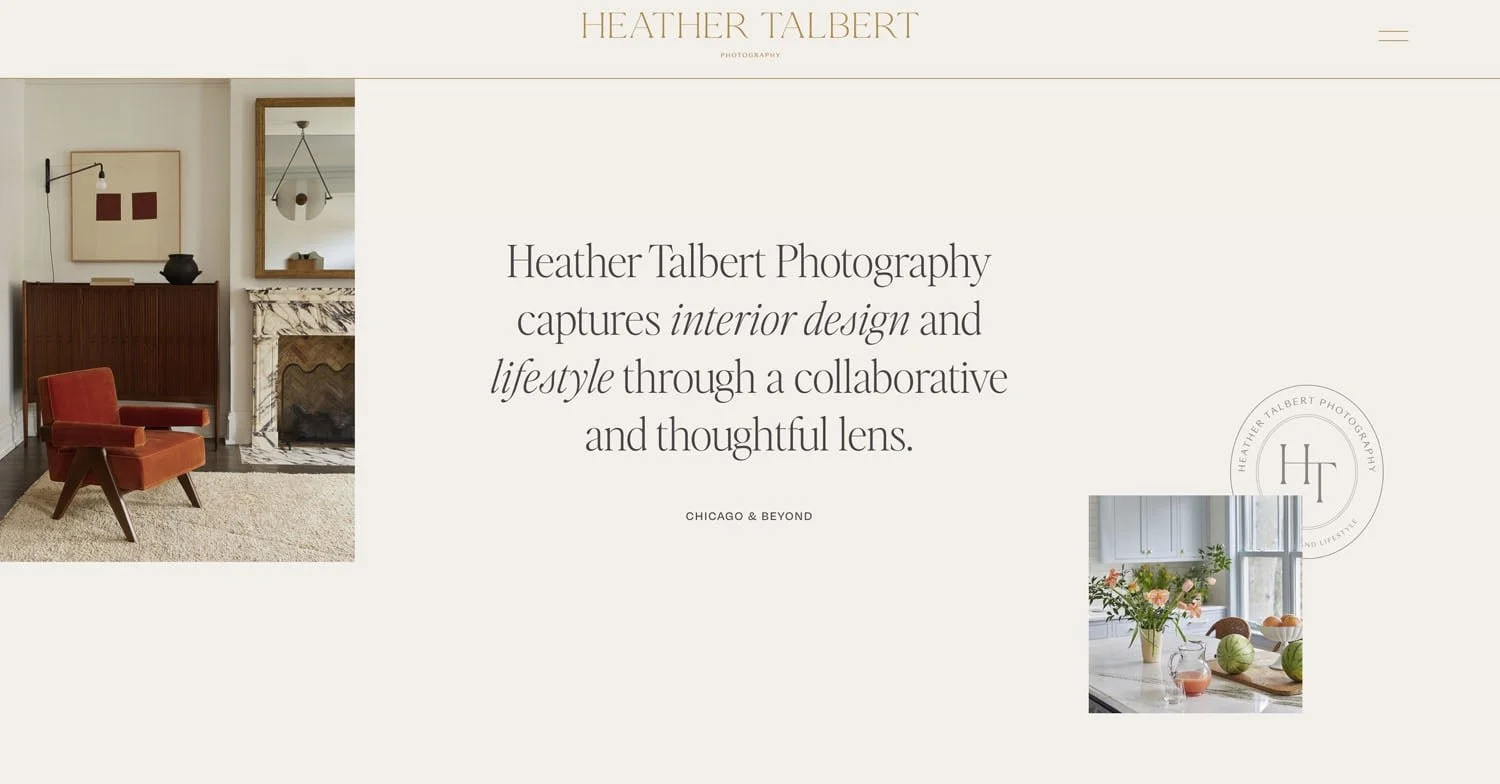
And we can spot the same thing here on Heather Talbert's website too. She has a few photos, text, and a solid color in the background - again nailing this website trend of sprinkled images.
Outdated website trend #2 - Sidebars
Over to Tim Ferriss's website, he has both the full-width banner happening and also the second outdated trend which is a sidebar.

Sidebars really have gone out of trend in the past few years. Yes they're good to show your bits and pieces and calls to action and books and all those things but to be honest it does make your website look a little outdated at this point.
So instead of the sidebar, what I would do at this point is just nothing.
Choose a nice white space or having your content fill up a bit more of the width of the page and just say adios to the sidebar.
Outdated website trend #3 - services layouts

Another thing that was very typical and trendy back in the day on websites was to list out your services or your offerings in a way where you have a graphic image and then the service below.
Here’s an example.
Having your services laid out in this way does feel a little dated to me and a much more modern way of doing things is over here on the philosophy of leisure website.

We have some images, we have some blocks of color, we have the details of the service but as you go down the page you see the different offerings and they're designed in a way that is a bit more elevated, a bit more creative.
They’re using a variety of different font sizes and types to keep it interesting. We also have an image, we have the blocks of color, some sideways text.
This looks a lot more modern to me as a way to lay out your services or your different offerings.
Outdated website trend #4
Another trend that is out is what I would call basic color backgrounds.
We can see on this website here we have a full-width brown background going on to the next section is a full-width gray background. This was used a lot a few years ago, but things have changed - although you won’t necessarily need to make a wholesale change to your site.
Something which is similar but just ever so slightly different and more elevated is when you have a border around your section.
So we can see on Marie Forleo’s site a one-color background, but there's also a white border happening around the edges and that looks really modern.
So as you can tell from this one sometimes your website doesn't need an entire redesign, just a few tweaks here and there can really make it look a lot more with the times.
Want to attract more of your dream clients so you can show off your on-trend design skills? A polished portfolio is the way to do it. Grab the mock client briefs to help you get started today!

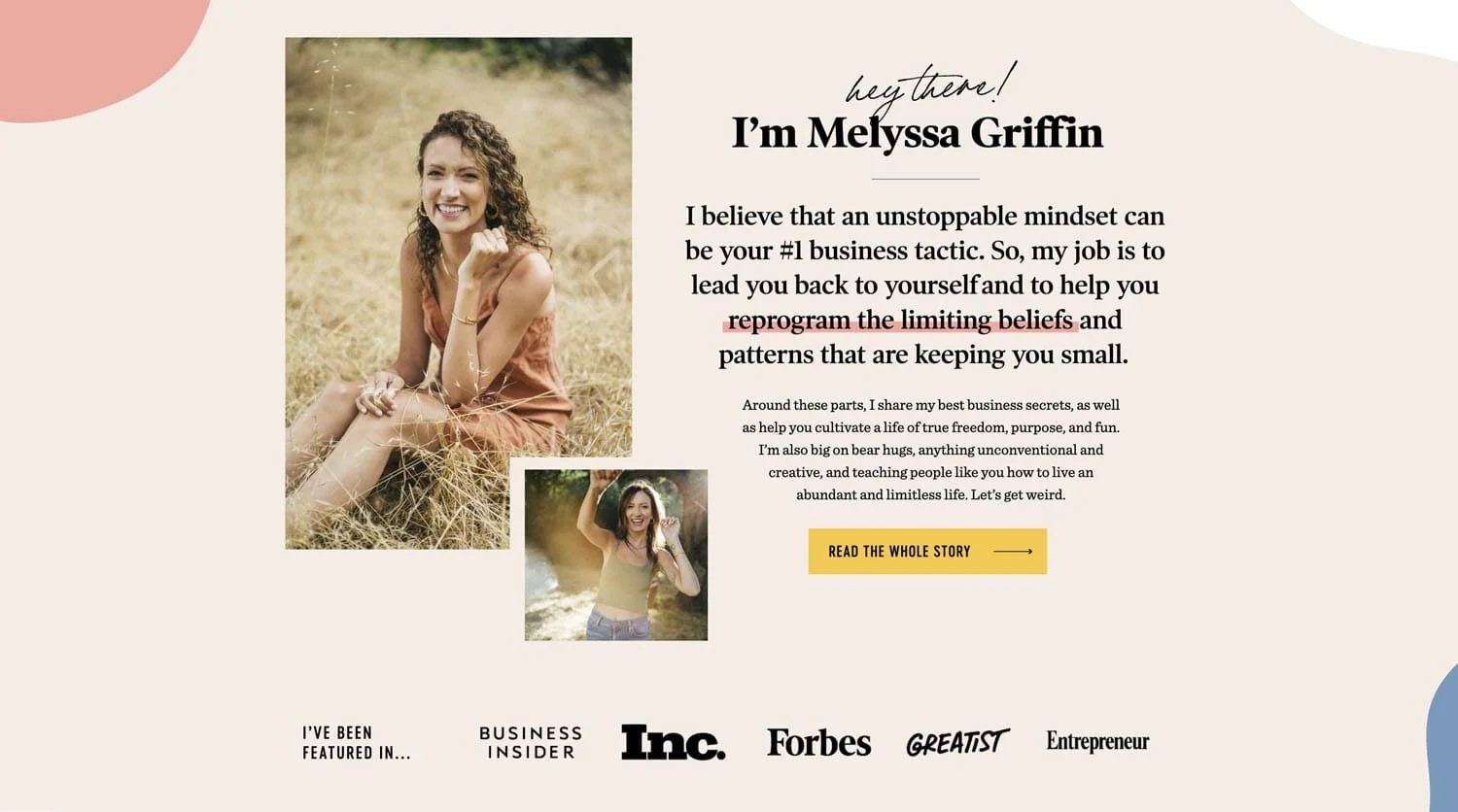
Outdated design trend number five is Scripty Fonts.
If we're here on Melissa Griffin's website you can see that her Hey There font looks handwritten and this is actually something which truly everyone and their cat was doing a few years ago but isn't as common now.
If we also head over to the Female Entrepreneur Association website there's also a sort of like hand-drawn scripty-looking font that says “to help you build a wildly successful business”.

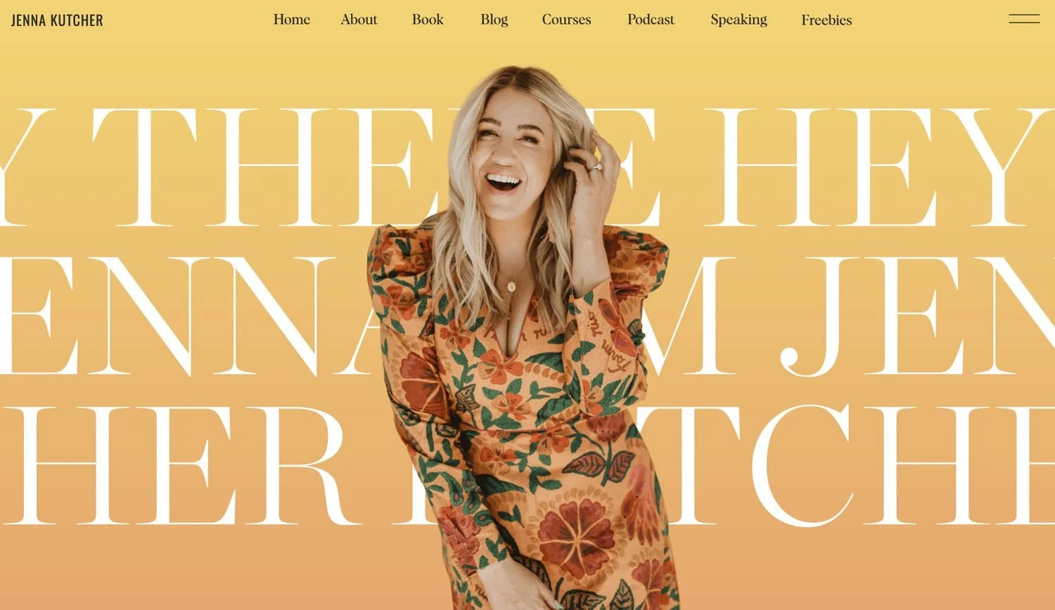
That would actually be really fabulous if they would switch it over for something like what I'm calling the Mega font.
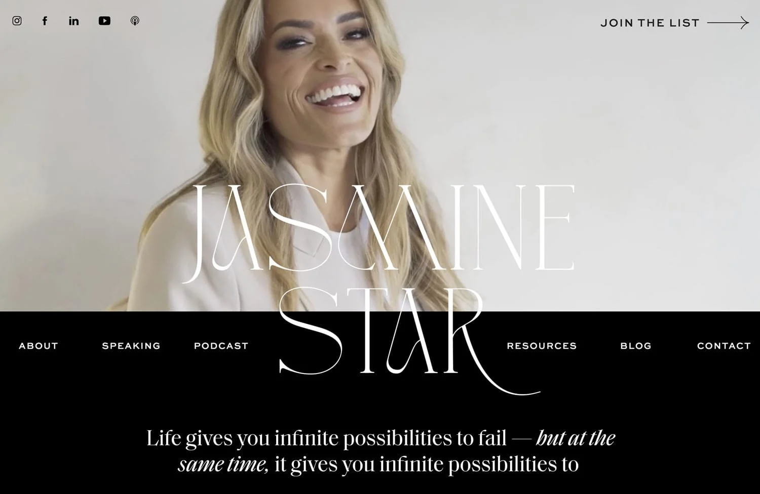
So here on Jenna Kutcher's website we can see her ginormous text.
Another great example of this is if we head on to Jasmine Star’s website. Here her name is in the ginormous text which is really something that is looking very modern right now.
If by the way you're thinking okay I know how to design the font on my website now but what do I actually write and where do I put what copy on the page then click below to download my homepage content planner!

It is the exact content planner that I use for every single website I build and it was also shared exclusively with students of my Square Secrets™ course. So be sure to grab your copy!
Design trend number six which is out is icons.
We can see here the
let's launch
let's manage
let's chat
With the little coffee and clipboard and light bulb.
This was super common a few years ago, but really makes your website look outdated at this point whereas here at the bottom of the page on Ashlyn Carter’s website we have a little what looks like an abstract sort of squiggly quickly drawn line. Something like these little abstract touches sprinkled throughout the website can really elevate your site & keep it looking modern & fresh.

Outdated design trend 7 - alignment
Out of all of the design trends which I think will give away the fact that your website was built five or six years ago the biggest is this one and that is alignment.
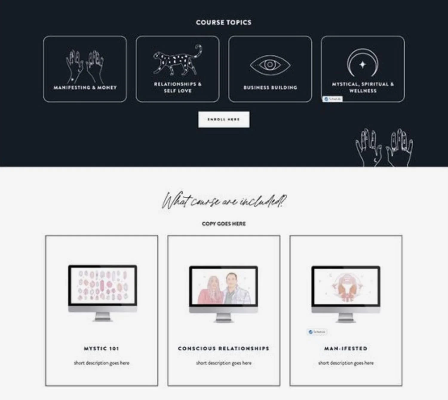
Having everything perfectly aligned is a dead giveaway your site was built a while ago.
So we can see here we have the different course topics which are all perfectly aligned side by side they're all the exact same ratio and everything when we go down to these sections here it all is perfectly aligned in a grid.
Having this look on your website is kind of a telltale sign that it hasn't been updated in a while because instead the vibe right now is all about unalignment and items sprinkled throughout the page.
So as we can see here we have two text areas one starts higher than the other one as we scroll down the page we have a vertical image beside a horizontal image they are purposefully unaligned
This look is a little bit harder to pull off but honestly if you follow the guides and look at some other similar websites and you decide to make a layout similar to one of their sections this can look really really good.
Design trend number eight which is out is staged photos
As we look at this image it looks like it was exactly prepared for this picture. It just looks very planned out and very staged.
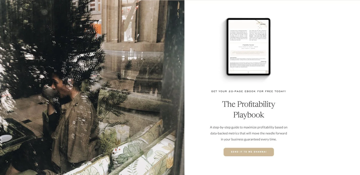
When we head over to Shanna Skidmore's website here on the left-hand side she has a fantastic photo it's a little bit abstract it's a little bit blurry it's a little bit hard to fully even understand what you're looking at but it also does look beautiful.
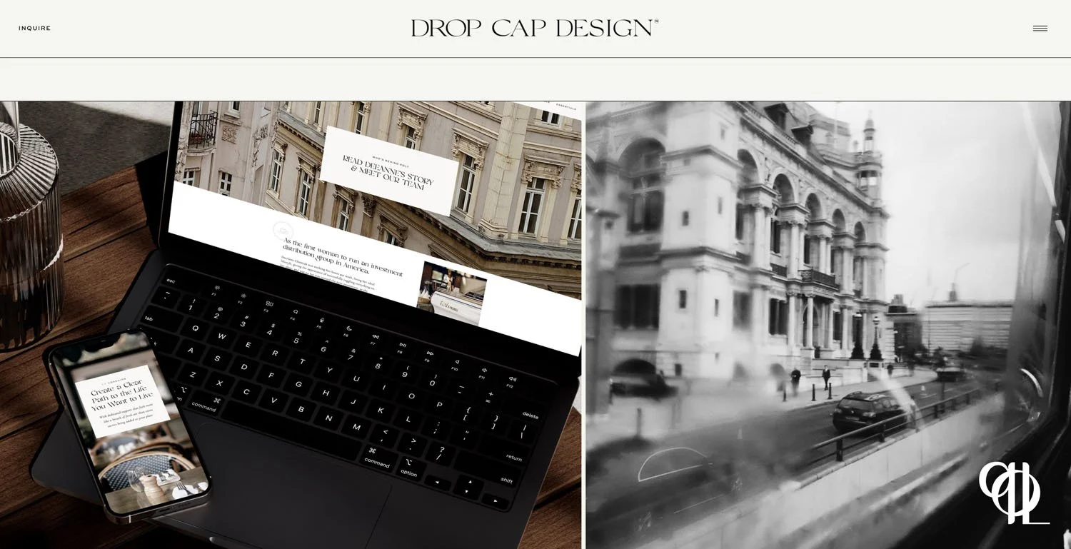
Here on DropCap design’s site the photo on the right-hand side we can see this image seems to be taken through some glass or window that may be a little foggy and that also gives it a very creative look and feel.
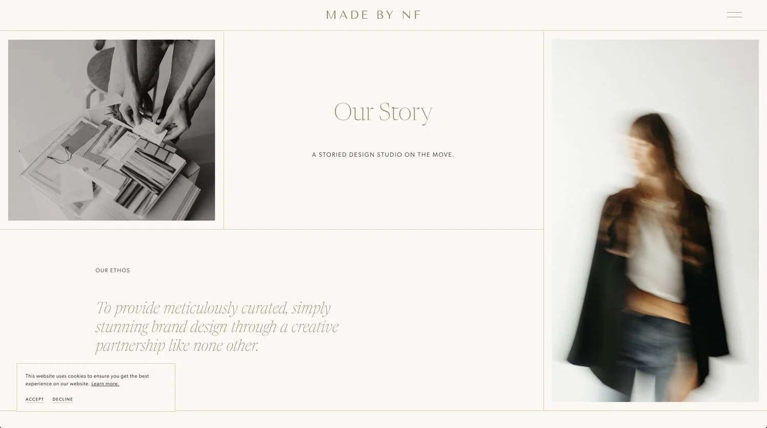
Coming over to the madebynf site there is an obviously very intentional blurry photo happening on the right hand side and over on the feathering twine website we have an image from a wedding.
These abstract creative more blurry or even grainy photos can actually look really really good when mixed in with some really well shot ones.
For these next 2 design trends you’re gonna wanna check out the video because they’re actually about moving elements on your site so it’s easier to get what I’m explaining there!)
Outdated design trend #9 - a lack of dynamic elements
This might be a video or a gif or series of images that slowly change - nothing too crazy, but something that just adds a little more visual interest than a simply static page. I love this example from madebynf (scroll down to the “meet nikki” section to see what I’m talking about).
The next design trend which is in is what I call “interesting movement of the page”.
What i’m talking about here is where elements on the page move differently to how you might expect when you scroll. That could be anything from a split/ sticky section where one part of the screen stays still whilst the other one scrolls, or even something a little more jazzy like this from tonicsiteshop.
Now this is a design trend that if overdone can be very confusing for your user so I would say to use this one but use it sparingly and just a touch here or there on your website.
Outdated design trend #11 is over the top girly websites
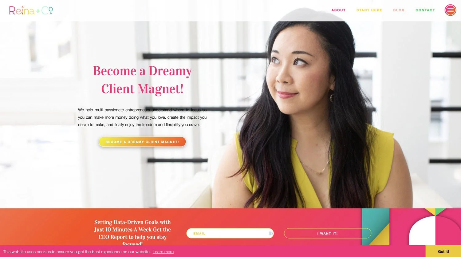
Another trend which is out in the female entrepreneur space is the sort of girly over the top pink type websites aka the ultra feminine look like these examples below.
Instead what's in is what I would call mature and minimal
There is a lot of beige happening on websites these days for female entrepreneurs and that seems to be the style direction that female creative entrepreneurs are taking. We can also see again this more minimalistic and mature look over on LexiHands website too.
Now while I love the design of this website and it is currently on trend I will just say that my prediction for the next website trend which is on its way out is actually the all beige background.
For the longest time we always had white backgrounds on websites, and it has more recently changed to all beige.
I feel like this has just been so so so done in the last one to two years that my prediction is that the all-beige background is going to be the first trend that we're talking about to actually make its exit.
I find that the harder and faster a trend comes the faster it also leaves because it is just too overdone. Sadly for the all-beige background i think that's probably the one that's exiting stage right next.
And just like that we've swapped our virtual shoulder pads for something a little bit more timeless.
Now one video on website trends is great and all but if you really want to be a successful website designer it's going to take a little bit more than just knowing how to follow trends.
You're going to need to know …
how to find clients
how to manage projects,
how to set your prices
and so much more!
Make sure to grab your spot at the Profitable and Productive Web Designer Bootcamp where for three days I'll be sharing all of the things that you need to know in order to start and grow your web designer business. I cannot wait to see you there live. You my friend are going to love it.

You’ll Also Love...
How much does an online business cost to run? (My business cost breakdown)
Youtube vs Instagram vs Blog for Creative Entrepreneurs in 2024
Work-Life-Balance Advice from a 7 Figure Online Entrepreneur
How to start an online business in 2024: Complete step-by-step guide
Is it too late to become a Squarespace web designer in 2024?