Creating a high-converting landing page for your list-building freebie
Yay! Congrats on creating your first (or next) freebie!
Phewf! That was a big step.
(So this is your permission to take a moment to feel super proud of yourself for following through!)
Ready for the next step in list-building success?
It’s time to set up a landing page for that bad boy!
Can’t I just stick a signup form on my homepage?
“Do I reallyyyy have to build yet another page on my site just to convince people to sign up for something that is literally FREE!?
Want my short answer?
Yep. You do.
The internet is chalk-full of “free” offers that people are constantly turning down, or simply scrolling right on by.
People do not want another person showing up in their inbox with super spammy, empty promises, and they’re frankly quite tired of being asked by every Tom, Dick, and Harry to hand over their personal contact info with nothing to show for it on the other side.
So how do you let users know you’re not just another nobody trying to extract what you can from the low-hanging fruit?
How do you convince them beyond a doubt that they want/need the thing you created? (And that it’s actually crazy-valuable even though you are indeed giving it all away for free?)
Your landing page!
The landing page for your free thing is the gateway to every paid offering on your site...So it’s worth putting a little time and attention into building it.
It doesn’t matter how fabulous your freebie is if it never actually makes it’s way into anyone’s inbox.
How your landing page different from your home page, about page, contact page etc.
Your landing page is like no other page on your site!
Visitors aren’t (usually) accidentally stumbling upon it, or being sent there in an organic search or by word of mouth like they might your business’ home page.
They aren’t there to find out general info about your biz (hours, location, and the like).
These people are direct traffic, and they are only here for one reason…because they saw your catchy call-to-action (CTA) in your ad, blog post, Insta post, etc. and they want to know more.
This is not the time to rehash your life story like you do on your about page, or to sprinkle in hints about your paid products or services like you might (and should) throughout all the other pages on your site.
Your one and only focus of this page is your freebie (and why they should be bothered to sign up for it.)
The #1 goal of your lead magnet’s landing page
Any guesses?
Increase conversion rates!
Translation: conversion rate is the total number of eyeballs on your offer, vs how many people actually end up taking you up on it!
If you’ve just finished pouring hours and possibly days into creating the perfect freebie opt-in gift, chances are the goal you have in mind is to build up an email list of loyal subscribers you can later pitch your paid thing to.
So the conversion you are looking for is increased sign-ups!
Anything that doesn’t make it more likely for a visitor to take that one exact action doesn’t belong on that page.

What’s considered a good conversion rate for my landing page?
There’s no magical number to hit here!
More important than any one figure is that the conversion rate you do have is constantly improving.
Each week, when you track your landing page metrics (a.k.a number of sign-ups vs. the number of people who view that page and saw your freebie offer) you should see it steadily growing.
Make little tweaks here and there (I’ll give you a whole bunch of tips for that in a minute) and track their effect on your landing page’s conversion rate!
Just be sure to change only one thing at a time so that if there is a massive dip or jump in results, you know exactly what to attribute it to!
Butttt if you want a hard and fast number to aim for (or totally blow out of the water…by all means!) my current highest-converting landing page is one I built for my Squarespace Pre-Design Workbook & Checklist…
And it’s coming in at right around 54%.
I’ll just preface by saying, 54% isn’t normal. Average landing page conversion rates are 2.35% while the top 10% of landing pages manage a conversion rate of 11.45%. (Source here.)
Why is mine doing so extremely well in comparison?
It has a lot to do with the type of traffic we’re sending there.
I get people to my site and landing page from the organic content on my blog. A lot of other businesses drive from an ad directed at cold traffic to a landing page, which obviously leads to a much lower conversion rate.
So remember, while the design of your page matters to the conversion rate, so does the source of traffic you’re sending there.
5 tips for freebie opt-in landing pages that convert
1. Your lead magnet should be the only thing that lives on your landing page
That means hiding your header & footer (which I show you in this blog post: My 4 favorite CSS tweaks I use on my Squarespace sites) and anything else that could potentially distract someone from pressing submit on that opt-in form.
This includes your site’s main navigation (yes, even though they aren’t *technically* leaving your site), as well as any links to your social media.
You might want them to follow you on Insta as well, but you don’t want to prioritize it over actual email sign-ups, or you’ll be back to square one with trying to get them as a subscriber.
There’s one exception to rule #1…ok two.
And that is that you can (and should) link your privacy policy & terms and conditions at the very bottom of the page, and you can (and should) include a quick little bio & photo of yourself.
Which brings me to my next point!
2. Let visitors know who you are (and why they should believe you)
I know, I know.
It totally seems like I’m contradicting myself when I mentioned earlier in this post that “this is not the place to rehash your life story” but bear with me.
Here’s why a quick little bio is 100% recommended…
There are two types of people who are going to be winding up on your freebie’s landing page:
Person #1: This person is a super fan.
They’ve read every last blog post or free resource under the *your business name here* sun, and they are literally jumping at the chance to get their hands on your newest free thing.
You’ve honestly helped them a ton on this topic in the past, so they have no doubt your latest guide, workbook, pdf, or webinar is going to deliver.
(This person is 10/10 already on your email list, btw.)
Then there’s the second type of person…
Person #2: This person doesn’t really know you from Eve.
They have zero to no brand loyalty or brand awareness, and honestly they are a bit skeptical that you know what you’re talking about. 🧐
They are only here because they saw your Pinterest ad, or Googled a question that you happened to provide answers to in a blog post, and they are hoping they didn’t make a mistake in clicking on your link.
These people do not already live on your list, which means they are priority numero uno in terms of who your landing page needs to speak to.
So what goes into your little self-plug to let visitors know you’re worth taking a chance on?
What goes in my landing page bio?
Your bio should be short and sweet.
…While also letting people know that you are in fact the authority on this topic, and that you’re the one for the job when it comes to teaching them about it.
Go ahead and brag on your achievements, or how you were once in the same (uncomfortable) shoes as the person currently visiting your site, and how you have since found the answers to all the problems they are facing.
Oh, and since this might be a first-introduction, it needs to be 100% on par with your brand messaging or voice.
This way, it matches the rest of what you do on the internet, and you can start to build some brand recognition with that person right out the gate.
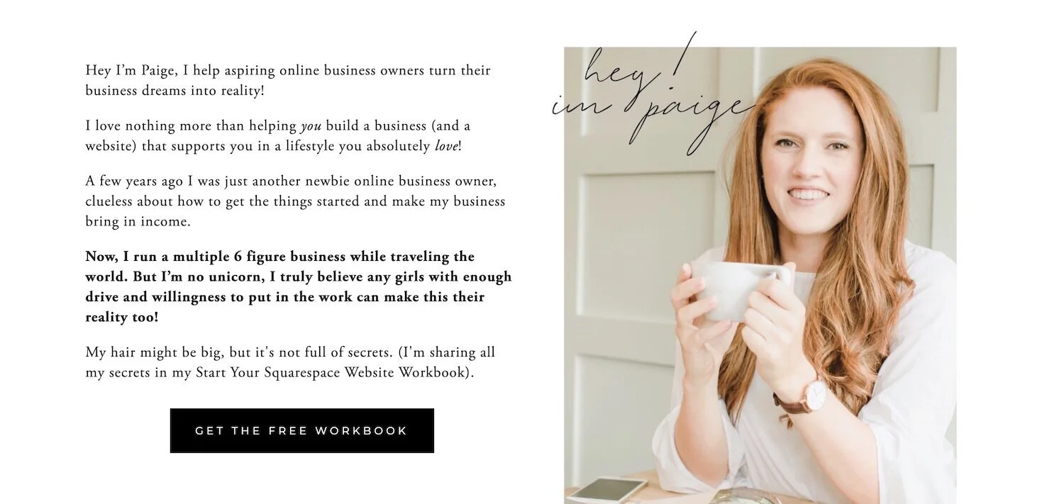
Example landing page BIo #1
Here’s a peek at a mini bio that lives on my landing page for my free Start Your Squarespace Site Workbook. (Feel free to snoop around on that full landing page by clicking that link!)
I’m basically showing that I know their struggle, but also know what it takes to get a business up and running online and your Squarespace website working as hard as you do to bring in those dolla dolla bills.
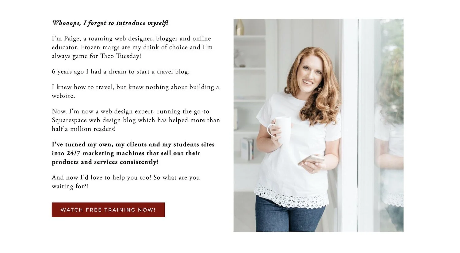
Example landing page BIo #1
Need a little more inspiration to get those gears turning? My landing page bio looks just a littleee bit different for my free training: Build a site that sells 101!
My visitor most likely already has a site, unlike those interested in the Start your Squarespace site workbook, but the problem they are facing right now is that their site is kinda tanking in the sales department.
Whomp, whomp. 👎
So while it’s still about introducing myself and putting a face (and the red hair) to my name, I’m also choosing language which speaks to where they currently find themselves in their journey.
(The struggle or pain point that probably brought them to my landing page in the first place!)
3. SPEAK TO more than just the features of your freebie
If you’ve ever shopped for a new car, you’ve no doubt met the salesperson who just can’t seem to shut up about the features.
We get it.
It has leather seats.
Awesome.
“But how is this car going to change my life??”
What problem does this exact car solve that ‘Bob’s Used Auto Sales’ down the street can’t?
The same is true when you go to talk about your freebie! You need to touch on the ‘what’ (the features), the ‘why’ (the benefits - what they can expect to achieve) ANDDDD the pain points (what they really really hope to avoid learning the hard way.)
Like we chatted about briefly in the bio examples above, it’s so so important to use the same language your ideal audience would use to explain that problem (and it’s solution) so that it resonates with the right people.
A giant list of the wrong people isn’t going to serve your business, and if you’re messaging speaks to them, chances are it’s not going to reach the ones you actually want to.
Oh, and bonus!
By spending a little time thinking about how your ideal client searches for your topic, and by speaking the way they do, you are basically covering your bases when it comes to SEO, because you will already naturally be including the keywords they would be searching for.
Important questions your freebie’s landing page should answer
Question #1: What specific problem does this freebie actually solve?
(Btw, if you can’t answer this, you mayyy need to take a second crack at creating your freebie...)
Question #2: Who is this freebie meant for?
What stage of their journey are they in? Are they a total newbie in need of some serious 101? Or are they slightly more experienced and seeking to level up their game?
Based on their most pressing goals at the moment, who is going to benefit most from your free resource?
Question #3: Why should they listen to YOU?
Again, those mini bios go a long way in warming up your audience to hear what it is you have to say! Why should they choose your free resource over some other equally random person Google also kindly suggested.
Question #4: What is your freebie already doing for others?
Got some social proof?
ie. a testimonial or a screenshot of super genuine thank you that went down in your DM’s? (Doesn’t have to be a long one!)
Maybe you have a before and after of someone who put your advice into practice and the transformation is stunning!
Even a quick note on the results others are achieving (or are on their way to achieving) after grabbing your opt-in gift can help your visitor dream about being next in line.
You’re going to be constantly improving and tweaking your landing page, so no sweat if you don’t have a super solid bit social proof when you first go to debut your freebie.
(Though offering exclusive early access or a beta test to a few people in your community is a great way to get ‘em!)
Starting to sound like a lot of info to have to include on one little landing page?
Bullet points are definitely best for communicating just how fab your freebie is, without boring your visitor with college essay-length copy. 👍
4. use design & Imagery to visually pique your visitor’s interest
Offering a free trial of your software to get people in the door? A video or GIF might be the easiest way to show just what’s possible when someone signs up!
Or maybe you offer some sort of free guide or PDF. Create a mockup to help people picture themselves flipping or scrolling through the pages and pouring over the wisdom that’s inside!
If you are going to include a picture of a person or of yourself, let it be one that highlights (not distracts) from your CTA!
This could look like someone pointing to the CTA button, or looking at your sign up form, or an intentionally soft-focused photo background to add color to that section of the page, without making your CTA hard to read.
Make use of contrasting colors, white space, and super defined sections to draw the eye exactly where you want it the whole time they are scrolling down the page.
There are people who will never read a single line of your “sales copy” and still sign up because they were seriously crushing on your presentation of that thing! We are visual creatures, so don’t forget to tap into a little of that good ol’ human psychology when coming up with your design!
Oh, and a word to the wise?
Keep it simple. You do not need eyes darting all over the page and possibly missing your CTA.
Too many things going on at once is also not great for your page load speed.
And if someone has slow-ish internet, and your page takes forever to load, that’s a whole handful of people that are going to get fed up and leave before they ever have the chance to sign up!
5. Make it stupid-easy to opt-in
Read: Include CTA’s everywhere.
People don’t like to be inconvenienced. (See slow internet example above).
And if you do not have a place for them to click to sign up on every single section of your landing page, you are losing subscribers (*ahem* future potential clients and customers!)
The most important CTA happens ‘above the fold,’ meaning it’s the first thing they see when the page loads, before they start their scroll.
Then repeat it again after every bit of info or imagery on that page!
Hint: It can look/sound a little different every time, but the final desired action you are asking for stays the same.
Here’s an example of my best-converting landing page for my Squarespace Pre-Design Workbook & Checklist.
See how many opportunities to opt-in you can count…
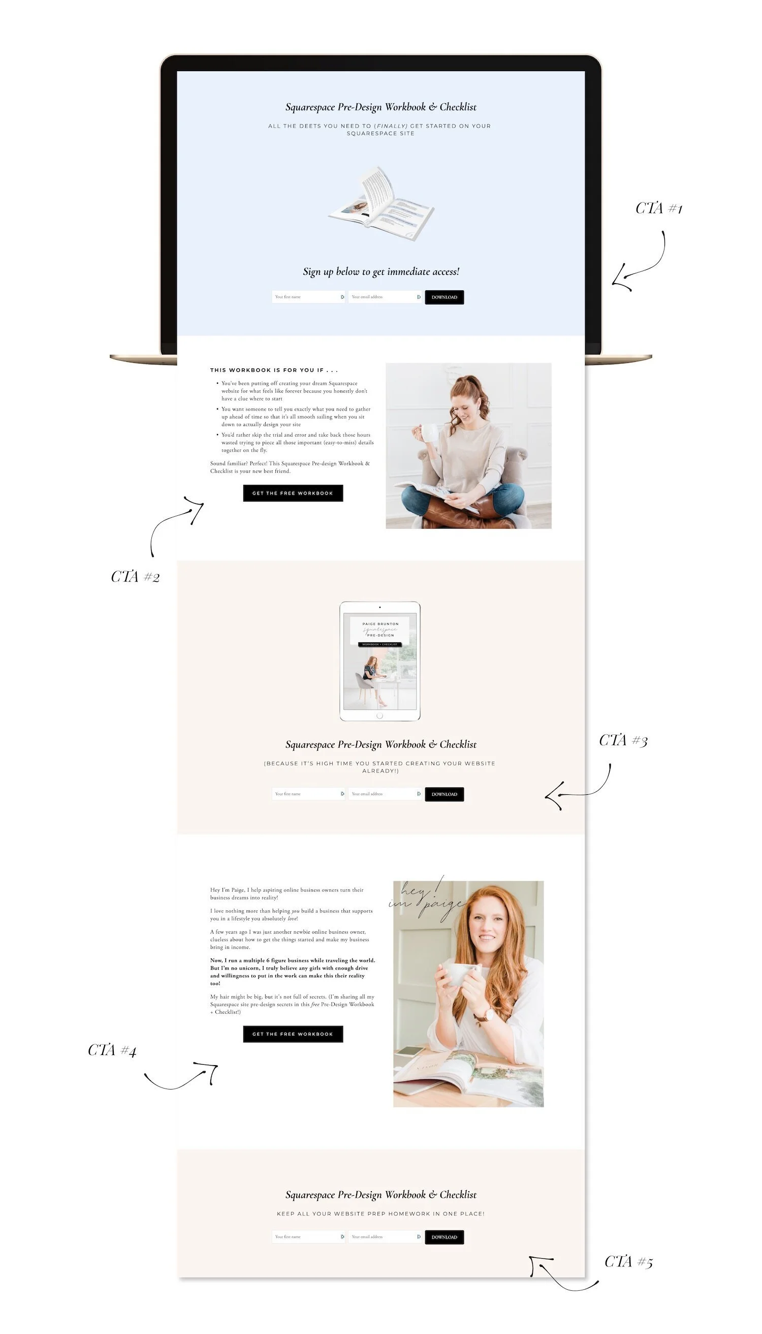
There’s literally nowhere someone could go on this page and not be reminded to sign up!
Keep your sign up form short!
Another way to make it stupid-easy to sign up for your lead magnet (and therefore your list) is to make the sign-up form itself super bare bones!
Don’t ask them for more than their first name and email address, because the longer the form, the more likely it is for them to abandon cart (yup, that’s still a thing…even for something that’s 100% free).
Save your questionnaires until they are inside the gate.
Those details can come later if you really need them, but most important is that you now have an actual way of keeping in touch with this person for future offers!
So there you have it! I’d love to hear what freebie you’re currently building out a landing page for! Be sure to share in the comments!