
Website Redesigns: Wellness Website Edition

Prefer to watch?
Here’s tHAT VIDEO FOR YA!
Mentioned in the Video
Squarespace - 10% off with code PAIGE10*
*That’s an affiliate link - my Margarita fund thanks you kindly!
Have you ever wondered what your website would look like if a professional redesigned the thing?
Well that is exactly what is happening in today's video.
I asked my email list to send over links to their websites to have the opportunity to have me redesign one of the pages on their website.
So I wanna say a big thank you to everyone who submitted their websites! Wanna be considered for a future re-design - make sure to jump on my email list to be in with an opportunity!
Now the one which I chose for today's video is from Amy.
Amy has a reiki business called Starlight Reiki and I'm going to be reviewing and tweaking and redesigning the website for her. It takes so much courage to put yourself out there like this, but as you know, it is fantastic for your business!
So without further ado, let's get into it.
I'm gonna show you the before and after of the website and then I'm gonna share exactly what it is that I changed on the redesign and why exactly I made those decision.
How did people end up on this website? Pro tip #1 - think about where visitors are coming from
Okay, so the first thing which I thought about when I was redesigning this website is how exactly is someone finding this website?
So the thing that I assumed is that someone who's probably typing into Google Reiki in Baltimore, Maryland and then they are going through the search results potentially finding the site on Google or Google Maps.
So I figured that someone coming to this website probably already knows that they want a treatment and they're just looking to figure out the specific details and deciding which center to use.
Like where exactly are you located
Is there parking & how do I get there
How much does it cost
What’s the place like - the vibe, style etc
Who’s the person or people that are running the place & what are they like?
Can I book an appointment online?
Then I figured the thing that the person is most likely looking for on this website is what the place looks like.
That's what I wanna know whenever I go to a spa or to get a massage or something, I'm like, ooh, what is this like ambiance and vibe that I'm gonna be walking into?
Anytime you have a physical location, it's kind of nice to show photos of that physical location so someone has sort of an expectation of exactly what they're going to get when they walk in the front door.
But when I went through the website I could tell immediately like okay, this seems to be like a very like one-person small business so therefore I probably would wanna know the person who is actually offering the service.
So working our way from the top down the page, I'm gonna talk about the different changes which I made, bearing all of that in mind.
Redesigning the top navigation
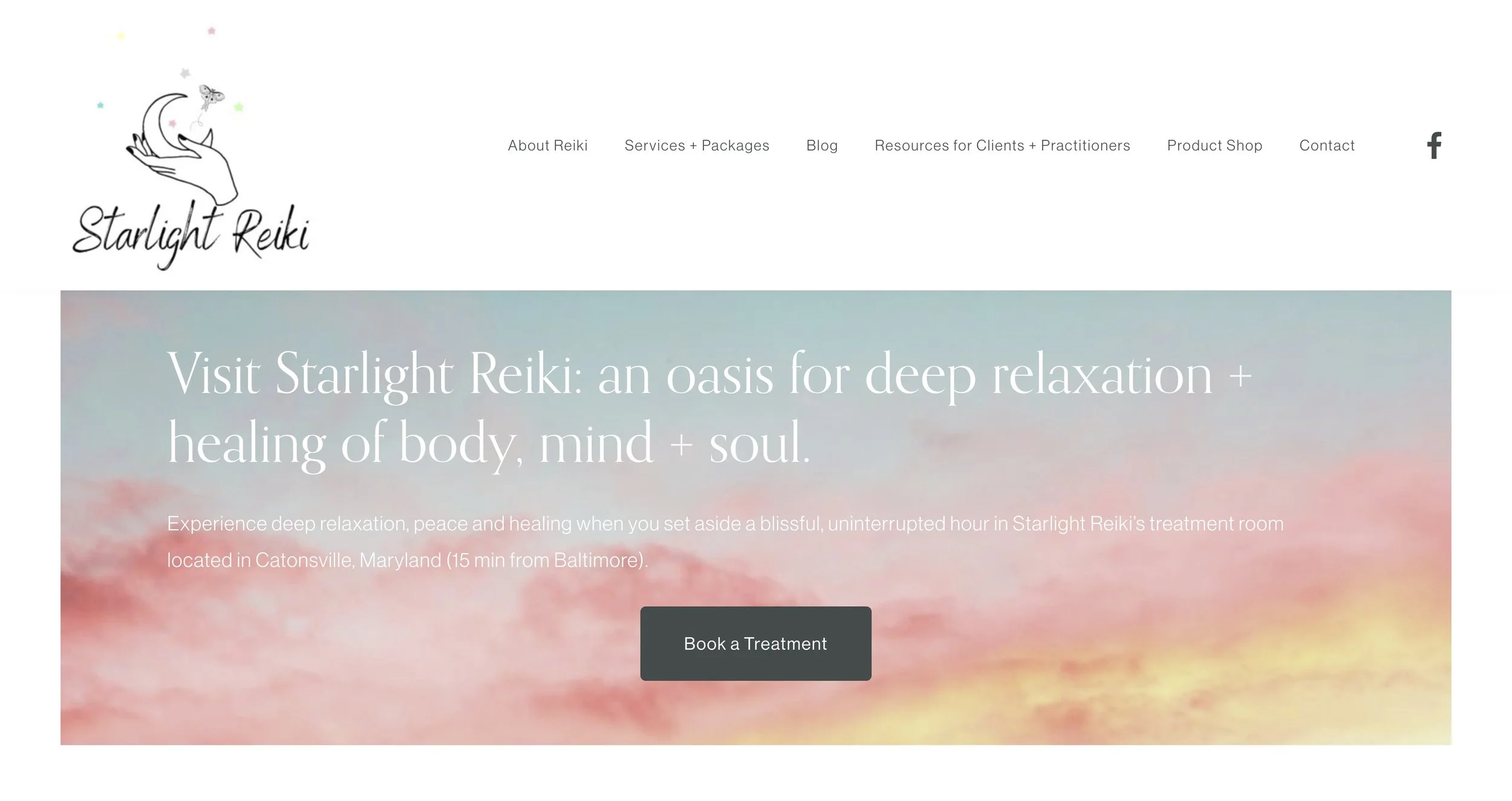
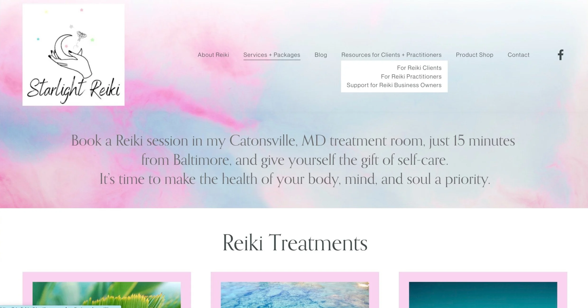
Before
On our original website our top navigation is taking up a very large amount of space and it just isn't the best use of that real estate on the website.
So what I was thinking is a few things.
Website Change One - navigation
I minimized the number of navigation options and shortened the titles on the navigation options.
website Change two - social media links
The second thing which I did, I took out the social media links in the top navigation. Again, coming back to the fact that like those are prime real estate on the website, we wanna make sure that only the most important things in there are in there. And I would say that following on social media probably isn't the most vital thing that we want the person to do.
website Change three - logo
The other thing is, well I love the logo. But, the one downside of this logo is that it is very large, it is a square logo. And so I feel like we would be best served by using that little graphic potentially somewhere else on the website but not in the actual logo because it just makes the whole logo take up a huge amount of space.
Before
The other thing about the logo on the original website is that it isn't a transparent background logo and therefore if we ever have this logo specifically where there is a background image, then it doesn't look super professional having the white border around it. So that's why I went for just a simple text, simple plain text based logo on the redesign. I think that the script-writing and the original logo was beautiful. So if you can get that logo just with a transparent background, and only the text, that would be perfect!
The other thing which I changed on the redesign is I put a call to action button for our most important call to action in the top right of the navigation.
That is typically where you'll find the most important thing that the person should do on the website. And so I have a book now button there.
Above the fold - the banner image
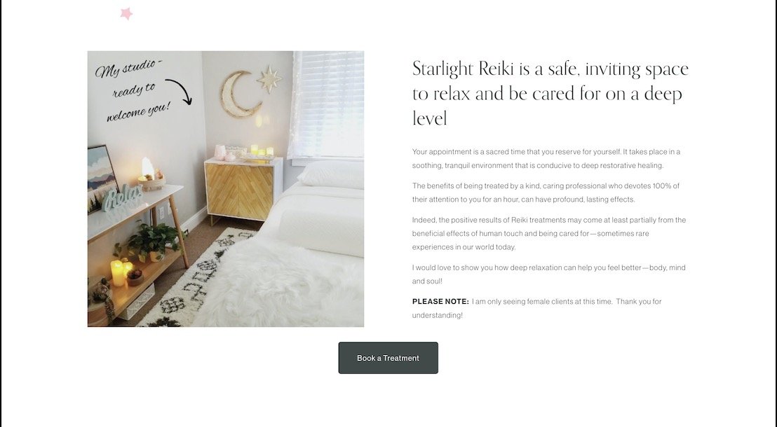
Now the next thing which I did was change the banner image.
Again, thinking about the fact that when someone comes to a physical lo location, they want to know what the physical location looks like. So I went online, I went on to Unsplash and I grabbed a copyright free stock photo.
Of course I think it's very important that you use an actual image of your space, but I wanted to show you, this is the kind of idea of an image that I think would fit really, really well as your banner in the top navigation.
So if it is possible to take a photo like this at your space, that would be fantastic.
The thing to note about this image specifically, it might not look like the most exciting image in the world. It has a lot of blank space happening in the image, but I think it's actually very important that we shoot an image in this way to make sure that we actually have the space to have the most important thing, which in this case is our title & tagline text and call to action button - to stand out!
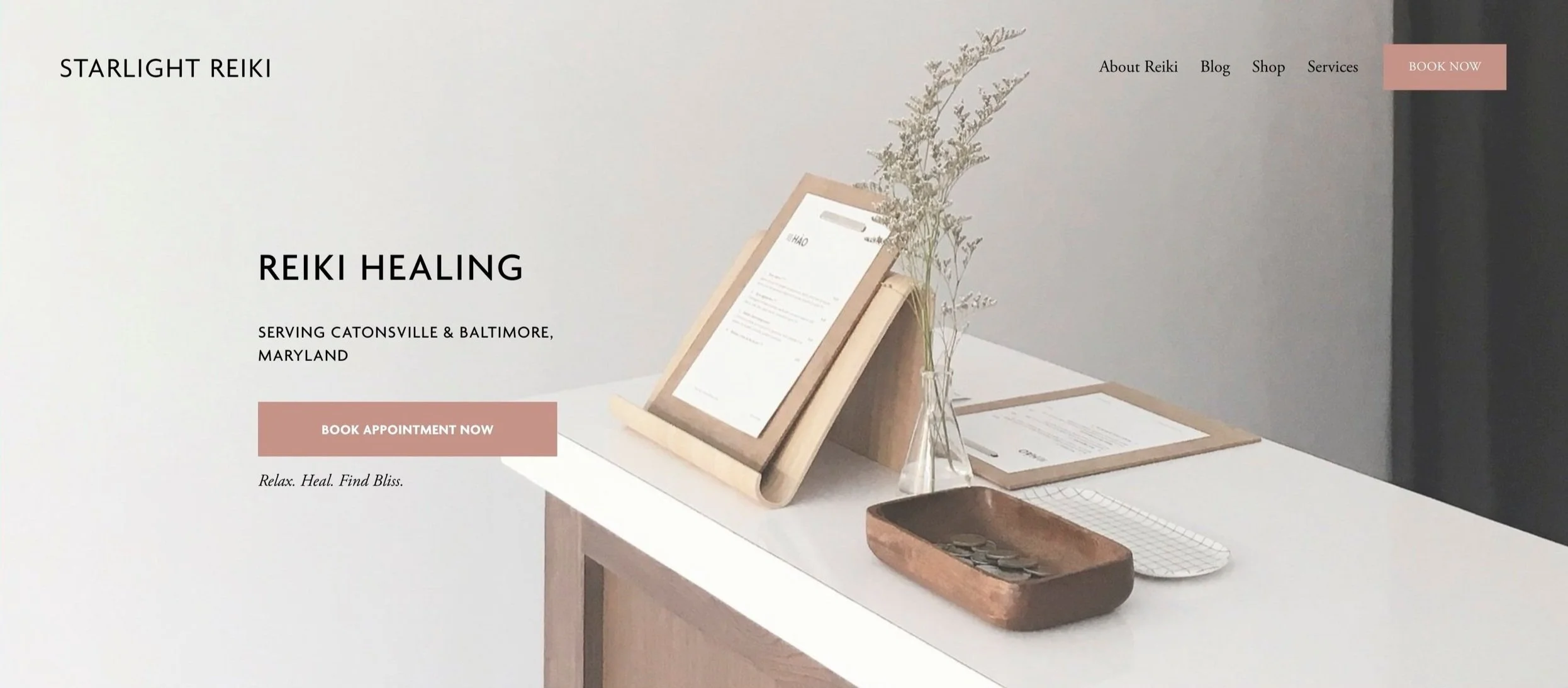
After
Match the branding with how you want people to feel
The next thing that you'll notice here is I really significantly changed up the vibe and the branding of the website too.
Now hear me out on this one.
When it comes to something like reiki healing, we're talking a lot throughout this website about like stress relief and relaxation and healing and finding bliss and all those things. And what I noticed in the current branding is it had a very youthful, vibrant, fun and playful sort of vibe to it.
Also looking to make improvements to your site? Grab my FREE training - 4 simple steps to double your site sales to get on your way! 👇

In branding an idea that you have brands that fit into different seasons of the year.
So the old branding to me really looked like a spring kind of vibe. Very youthful, vibrant, bright colors, those sorts of things.
But then when I thought about exactly what this business is offering, they're offering healing, relaxation, stress relief, which to me feels like a different season than spring.
So I went for something that was still the same idea and concept of colors, but a bit more muted and a bit more neutral, which to me felt more like relaxing than bright, bold and a wide variety of colors.
Keep your website color palette small
The other thing I did was I minimized the number of colors happening on the website.
It is generally best practice to have one to three colors on your website.
If you do by the way want more information on choosing colors for a website, I have a video on just that - you can check it out here:
So in terms of number of colors that I'm noticing on the old website, we have in the logo a yellow pink green blue. Then when it comes to our images, we have a variety of colors happening in those too. And then when I scroll to the very bottom, we're getting a variety of colors in the images and then also here we have a dark green color and then a bright blue book of treatment as well.


And now I think it is fantastic that Amy made the decision to make her call to action button really stick out. I think that is wonderful. But I just want to tone down the number of colors that we have going on the website so we're hitting our best practices.
So you'll notice on the new redesigned website, I didn't just think about the colors in terms of the buttons and text and everything, but I also thought about it in the actual colors of the images that I was using as well. I really made sure that the color scheme was consistent between the images and also the buttons and text on the website too.
The order of information on your homepage matters
Next, let's talk about the order of items which I put here on the homepage.
So first we have specific quick, very easy-to-understand details about what exactly this is, where it is and you know what to do next. This is your title, tag-line and hero image.
That is the first, and most important thing any homepage should have.
The next thing I have is more images of the physical space.
Now of course you would need to take images that actually fit the physical space. One pro tip which I have for you here when it comes to taking photos of the physical space is that whilst it's good to get wider shots it's also fantastic, especially if we don't have the most beautiful space in the world to take images of beautiful details.
You might have noticed this in Airbnb rentals, if it's not the most amazing drop-dead professionally designed space in the world, what they do is they'll often do closeups on some specific items in the space - it’s a good hack!
So say this photo here , pretty much anywhere, no matter if your space has been professionally designed or not, you could get a photo in your space that looks like this. So I encourage you, if you can get these big beautiful images of your space, fantastic, do that. And if not, definitely make use of doing some of these like more closeup photos because it can look really beautiful and look really professional even if maybe you don't have a professionally designed space.
So again, think about showing someone what they're going to walk into before they actually walk in the door by showing them the space on your website.
Options and prices - keep it simple
Now the next thing I have is the actual options and the prices. So we have the details on the different packages. Now one thing I noticed on the original website was we had a wide, wide, wide variety of packages and I really encourage you to slim down the options.

Try to choose three or four different options that someone can choose between. The fewer options that you have the easier for someone to make a decision.
So I just streamlined down to three different options here.
With all of the options, we have a specific title, we have details on how long the treatment is, and then we have the actual price which they could click on to actually book that service.
The key here being to actually make use of the Squarespace scheduling options that allow people to actually book the appointment online. That is going to significantly increase the conversion rate of people actually booking.
Now the next thing someone might be wondering is where exactly is the center and how do I get there?
So I have gone ahead and put a map.
There were the things which I was thinking about when I put this map on the website.
One, the typical like Google map style map is just not the most beautiful thing in the world and wouldn't kind of fit the aesthetic of the whole website. So inside Squarespace I chose the option for the blue map. So it's just sort of like white, gray and blue, which again is fitting the aesthetic of the website. So that was a conscious decision.
The next thing also, which was also conscious was making sure that I had this, instead of it just being a square, you wouldn't have actually seen Baltimore in the right hand corner. And I think that's important because I could imagine Amy is getting a lot of clients from the city to come out to cantons. So I wanted to make sure that the map showed Baltimore in the image and therefore that it's actually not so far from me here.
Of course I also put the address, which is super important.
And then we also put the opening hours as well.
I also there mentioned that appointments are available either online or in person in your specific location.

Now I noticed on the original website we had a wide variety of photos that had different clouds and beautiful sunsets and colors to them. And so I wanted to pull that into the website because I have a feeling that Amy, was loving that.

This photo here is still the clouds, it's still similar to what Amy had before, but I felt that it fit the aesthetic and colorway of the overall website a bit more than if we had like a variety of different photos of sunsets and clouds and colors.
I used the image here, with the FAQs to add a bit more visual interest to the section so it wasn't just boring text.
A Frequently asked questions section
I added a frequently asked section because there are a few things that people are going to wanna know when they come to work with Amy.
I actually made up the content and the information here - but you get the idea! Things that answer the questions we posed at the very beginning. And I was thinking about what exactly would I wanna know before I booked a Reiki session.
Things like…
Is it like massage?
Am I getting naked?
Am I wearing something?
What should I be wearing?
When should I arrive
Testimonials give you credibility
Now the next thing I have is some testimonials - these really give credibility to your service, so it’s always a good idea to add these to any site.

Let people get to know you
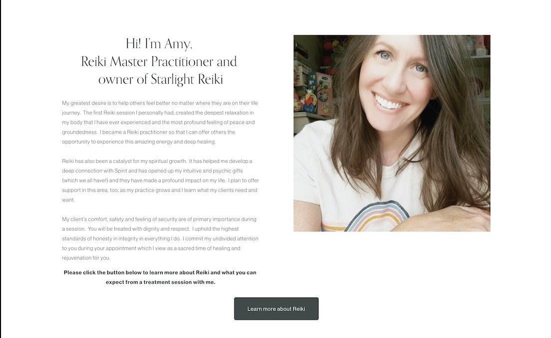
And then we go into a bit about Amy. So I feel like this is super important. I love the fact that Amy has an image of herself here, in the original section. It is so important.
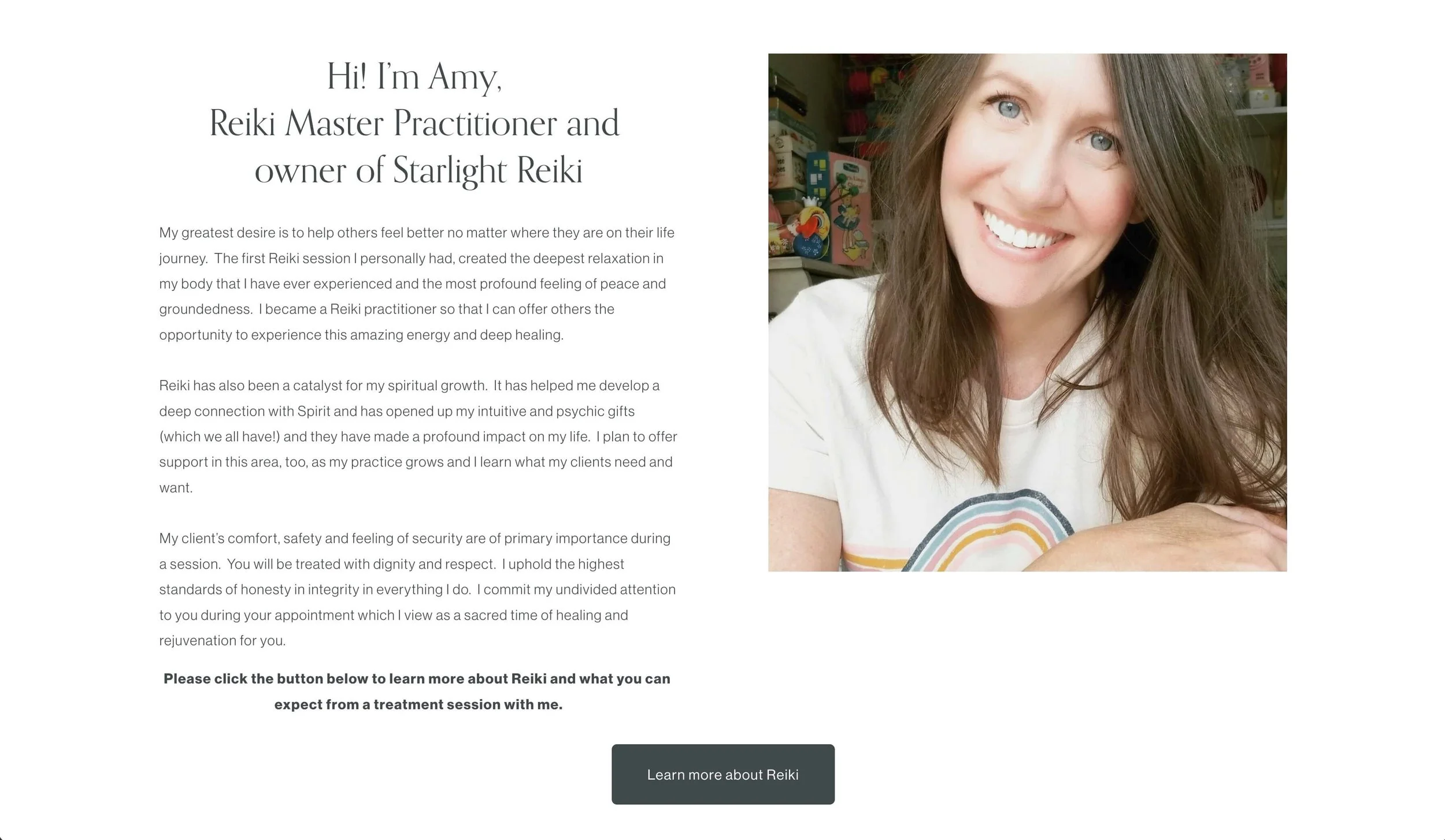
For the redesign I tweaked this image a little bit. The original image had some books or board games or something in the background and I felt like it, didn't quite fit with like the vibe and the aesthetic of the website. So I went ahead and I removed the background behind Amy in the image. And I put a gray background, which it fit the image, which I chose here on the left.
Now, if at the point that you get a super professional photo shoot done, then fantastic, I think that we can really use a like very large photo happening maybe like replacing this candle image here. But for the time being while we are using this one here, I think Amy looks so lovely, so friendly, and very trustworthy when I see this image here. So I think that is fantastic.
Good quality images matter
When I grabbed the photo off Amy’s website, I didn't get it in the highest quality, so I wanted to keep the image smaller on the page as opposed to larger. If I didn't have the full quality, the worst thing would be to have a blurry photo on the website. So it's better to have smaller rather than blurry. So I went ahead and made it smaller and just something else.
Now if this website were for a much larger spa, then I don't think that it's important to have the details of all the like estheticians or masseuses or whatever it is on the website. But because it's very clear to me that this is like a very small business from going through the website, I really wanted to make sure that we did have the details from Amy there.
These little details and bio and information on how you got into the practice is fantastic.
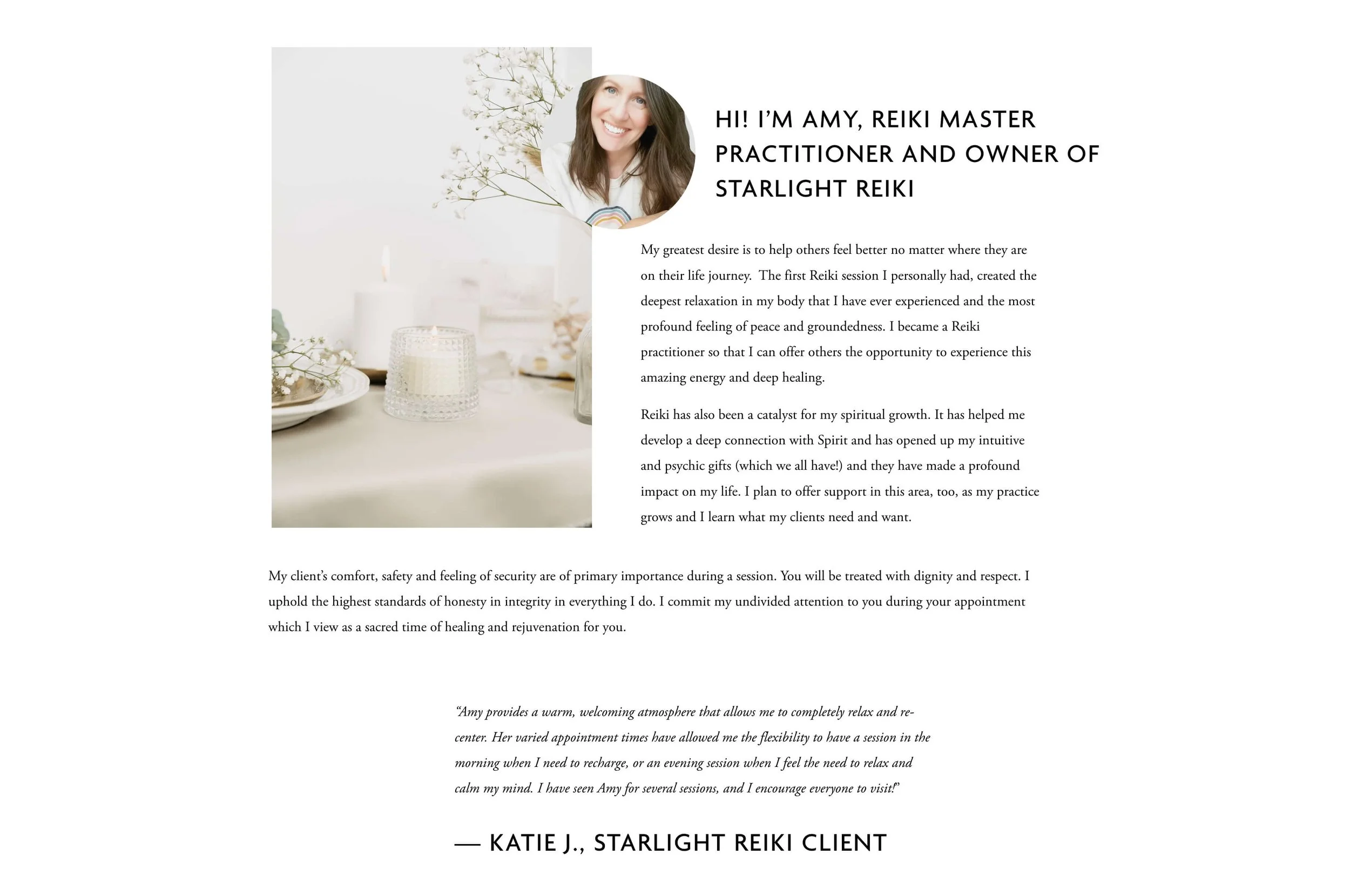
Now you'll notice also when I came to the design of this section had I just put the three paragraphs one after the next, after the next, we would've had the third paragraph coming much lower than the photo and the visual on the left-hand side, which I wasn't loving.
So I went ahead and I took the last paragraph and I spread it across the width so that it fit the same width as the image to the end of the other paragraphs of text. That's also something to think about if you're ever redesigning a website watching this to keep that in mind too.
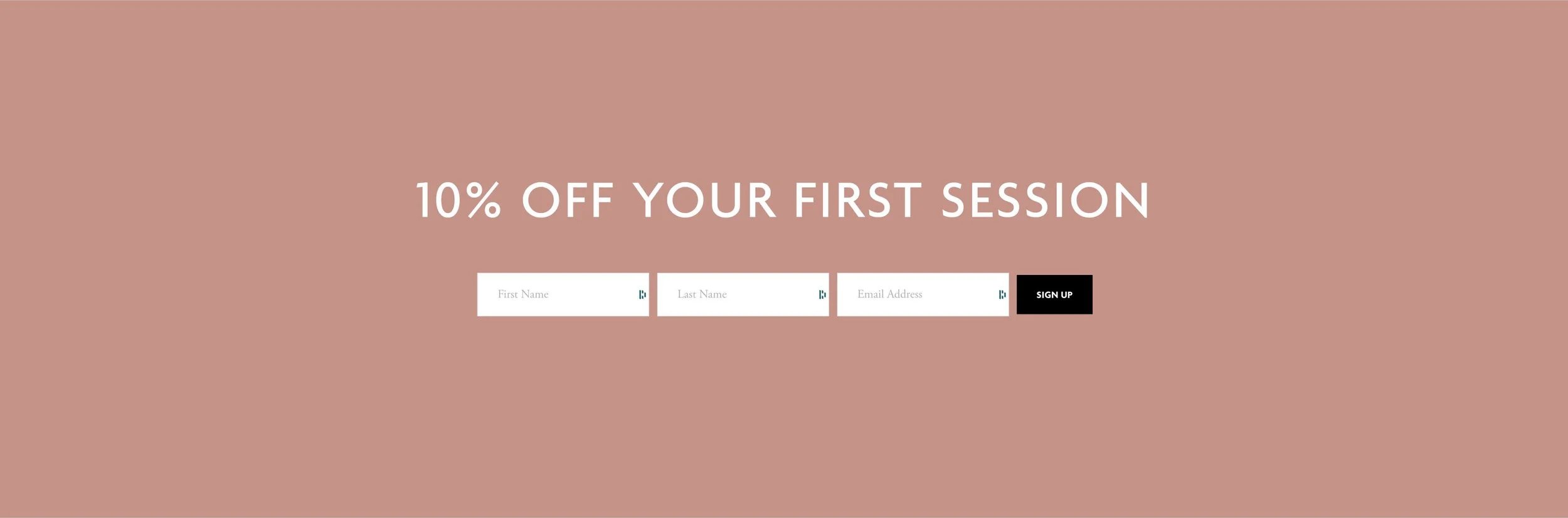
Don’t forget a final call to action
Now I have one more testimonial on the page here and then I went down to the actual main call to action on the website here. Amy did a fantastic job on her original website of having a call to action at the bottom of the section at the bottom of the page.
One extremely common thing which I see on people's websites is there's no specific reason or purpose or benefit to the person to opt-in to their email list.
Give people a reason to opt into your list
Very often I go onto websites talking about like join my newsletter. But the honest truth is that no one wants to join a newsletter. They only want to get on your email list if there is some benefit for them.
So I went ahead and I thought through a benefit for the person and very easy if you're offering some sort of product or service would just be 10% off, whatever the thing is.
So I went ahead and again, big and bold. It's extremely clear. Doesn't take a whole lot of explanation. Just 10% off your first session, first name, last name, email address, sign up, very simplistic.
For the full before and after - make sure to check out the video on Youtube!
Now I'm guessing if you read all the way to here then you were also interested to up-level your website designs, but how exactly are you supposed to do that?
Just one YouTube video like this of me showing you how I designed something isn't necessarily going to make you a professional, but lucky for you, I created an entire video describing how I would go about learning website design if I had to start all over again.
So be sure to watch this video next to catch how I would go from going from newbie to complete professional web designer step by step.