4 incredible website design examples you need to check out this month | August edition
Prefer to watch?
HERE’S THAT VIDEO FOR YA!
MENTIONED IN THE VIDEO...
Rather read all about it?
HERE’S WHAT WE CHATTED ABOUT IN THE VIDEO…
Feeling fresh out of web design ideas?
Trying to find creative inspiration, but feel like every single website you come across these days kind of looks the exact same?
Maybe you're wanting to see how the pros do it! Building a site that not just is visually engaging, but also actually effective for the business.
That is exactly what you're gonna get in today's video! A fantastic helping of creative inspiration from some of the best designers out there today!
I'm gonna show you four amazingly creative and unique websites, all built by past web design students of my Square Secrets™️ & Square Secrets Business™️ courses!
4 must-see website design examples for website design ideas and inspiration
Website design example #1:
Erin Summer | By Kurly Creative
This website is no less than amazing. The minute the page loads, you can tell exactly what it is about, and it's easy to see the whole vibe of the business and what they offer right away!
It says:
"Joyful, colorful designs with a dash of whimsy and wonder! Discover the latest art prints designed with heart, soul, and a sense of humor.
*And rainbows."
Below that, it has that big "Shop art prints" button.
They've clearly answered:
Who they are
What they offer
Where to go next (A.K.A the call-to-action leading visitors to take the steps you are hoping they will on your site!)
All right there in the first section without having to scroll down the page! Genius!
Oh, and remember that 60-30-10 color rule video I did for web designers recently?
Yeah...this website totally breaks that rule. But in the most perfect way possible!
When you first start off as a web designer, it's good to have all these little rules and best practices to be following to keep your designs on track while you develop your eye and skill level. But once you've reached the level of expertise Kurly Creative has, you can go bending or breaking any rule you want, because you are just that good!
(It's the whole, 'learn the rules so you can break them' thing!)
Scrolling down the page a bit, we have a quick little write up about the studio, then we go straight into showing off the actual art prints themselves, including how to shop them.
We have a little bit of social proof where you see the brand partners listed, which is fantastic.
Website design example #2:
Victoria's Stories | By Kurly Creative
This awesome website is by that same talented student who's work we were just drooling over! A second example of a creative online shop website done super super well!
Again, it's super clear what's being offered, and even with two very similar clients with similar vibes and even similar offerings (art prints), our the ever talented Kate behind Kurly Creative has still managed to create a completely unique-to-them site!
(This time with a focus on travel lovers across the globe!)
It ticks all the boxes with a solid social proof area, an option to shop the prints right there at the top of the home page, as well as acurated selection of featured prints based on themes like Greece, Italy, etc.
The call to action and what to expect in terms of pricing can't be missed, and the whole know-like-trust factor is instantly upped by seeing photos of the creator/photographer herself through the design!
Such a fun website! And while there is a ton going on in terms of design, at no point is it ever 'too much' because while it is playful and full of life, it's also broken down into super easy to digest sections so the visitor doesn't get overwhelmed, and can easily take in every part of the design.
I especially love the way Kate has chosen to divide up the different sections with an interesting wavy background edge as opposed to just a regular horizontal line (straight lines are perfect for many websites if it matches the brand's vibe, but in this case, the more squiggly the better!)
She's also placed something super bold and dynamic right beside the newsletter subscribe section leading your eye straight to the thing they want you to be doing on the page!
Website design example #3:
Pediatric Speech Stars | By Porta Blu Design
Okay, so the next two websites that I have for you are designed by Porta Blu Designs!
This first one was created for a speech and language therapist and is just so exceptionally well done!
She's most often working with children, and her images, colors, fonts, and fun little background elements all make it clear that she's a very child-focused business.
Trust is obviously a huge factor when it comes to choosing a professional to work with your children, and so she's made wonderful use of the brand photography to introduce visitors to their new therapist and put a friendly face to the name!
So often I see businesses use language on their website like "me" and "I" yet never actually show who "me" or "I" is!
Right after introducing herself, there's a can't-miss section on "how I can help" followed by the different options for working with her depending on your needs.
My absolute favorite is this giant call to action she has with the image of the therapist pointing directly at the consult form, making it very clear that that is the next step vistors should be taking in order to work with her!
Next we've got a bit of social proof with some kind words from past therapy clients, with her Instagram feed built right in at the bottom! (Which is great if that is somewhere you regularly engage with your audience and potential clients!)
The creative decisions behind this design make it clear that this is a service for kids, but it also takes into account that an actual adult will be the one reading the site and booking the service!
Website design example #4:
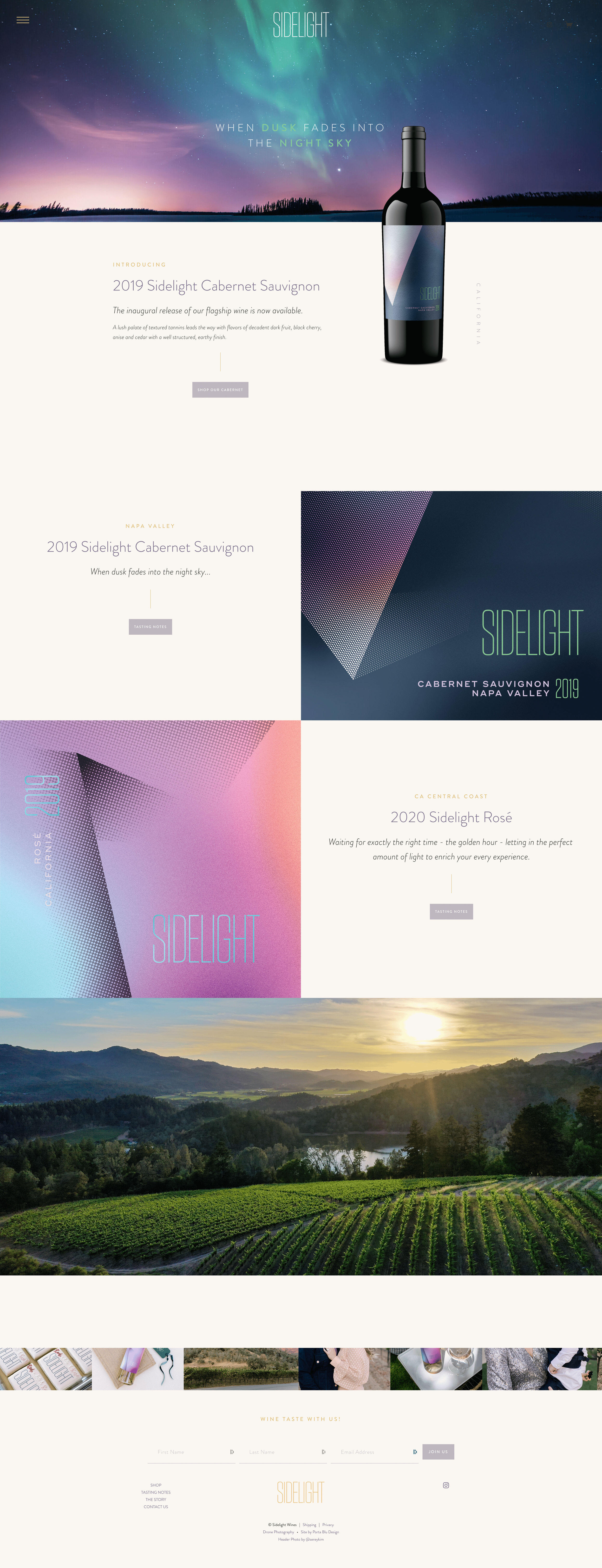
Sidelight Wines | By Porta Blu Design
This site designed for Sidelight Wines by past student Erin of Porta Blu Design is just gorgeous!
Again, very clear what exactly we can purchase on this website...some beautiful wines!
I think having the giant mockup of the wine bottle is fantastic and that the fact that the colors in the website perfect match the bottle's label as a well as the gorgeous background image of the night sky is just brilliant.
Every single section has an option to be shopping their wines, and you can even see exactly where your wine has been grown!
If you click into one of the wine offerings themselves, you'll find even more gorgeous, high-end mockups of the product as well as a super clear description of the wine and how to shop them.
Erin has created a very simplistic shopping process, making it super easy on site visitors to be adding a bottle to their cart!
I feel like each of these websites I showed you have truly gone above and beyond in terms of actual strategy behind the gorgeous design!
Each website makes it super clear what the company offers, who exactly they serve with their offerings, and the overall vibe of their products/service and what it would be like to work with them!
If you're also looking to take those first steps towards building your own web design business so you can create work as fantastic as this for clients, then your next step is to learn to build strategy infused websites!
Building pretty websites is one thing, but building sites that will grow your clients' businesses is quite another!
When you can master this, and prove to your client with RESULTS that their website design investment with you had an amazing return, THAT'S when you'll get those raving reviews!
If you want to learn more about website strategy, check this out!


