7 Website design trends to inspire you in 2023

Prefer to watch?
Here’s the video!
Mentioned in the Video:
Get 10% off Squarespace by using code PAIGE10*
*That’s an affiliate link - my margarita fund thanks you kindly!
Rather read all about it?
Designing your new site but fumbling for ideas? Wanting it to look on trend, but you don't even know what is trendy on websites right now? I've noticed a lot of changes in the web design space in just a few short months and today I'm relaying what I'm seeing. So let's get started!
Website Design Trend #1 - Non -white background color
For the longest time, white was the background or base color of choice for websites. It was clean & simple & honestly, pretty easy to design with a white background.
These days the trend is definitely towards non-white backgrounds and base colors. Some websites are going REALLY bold with black backgrounds, but more commonly I'm noticing a faint version of one of the brand’s colors as the background, often a beige or neutral tone.

Stunning example of an off-white background by past course student Freya Rose Tanner
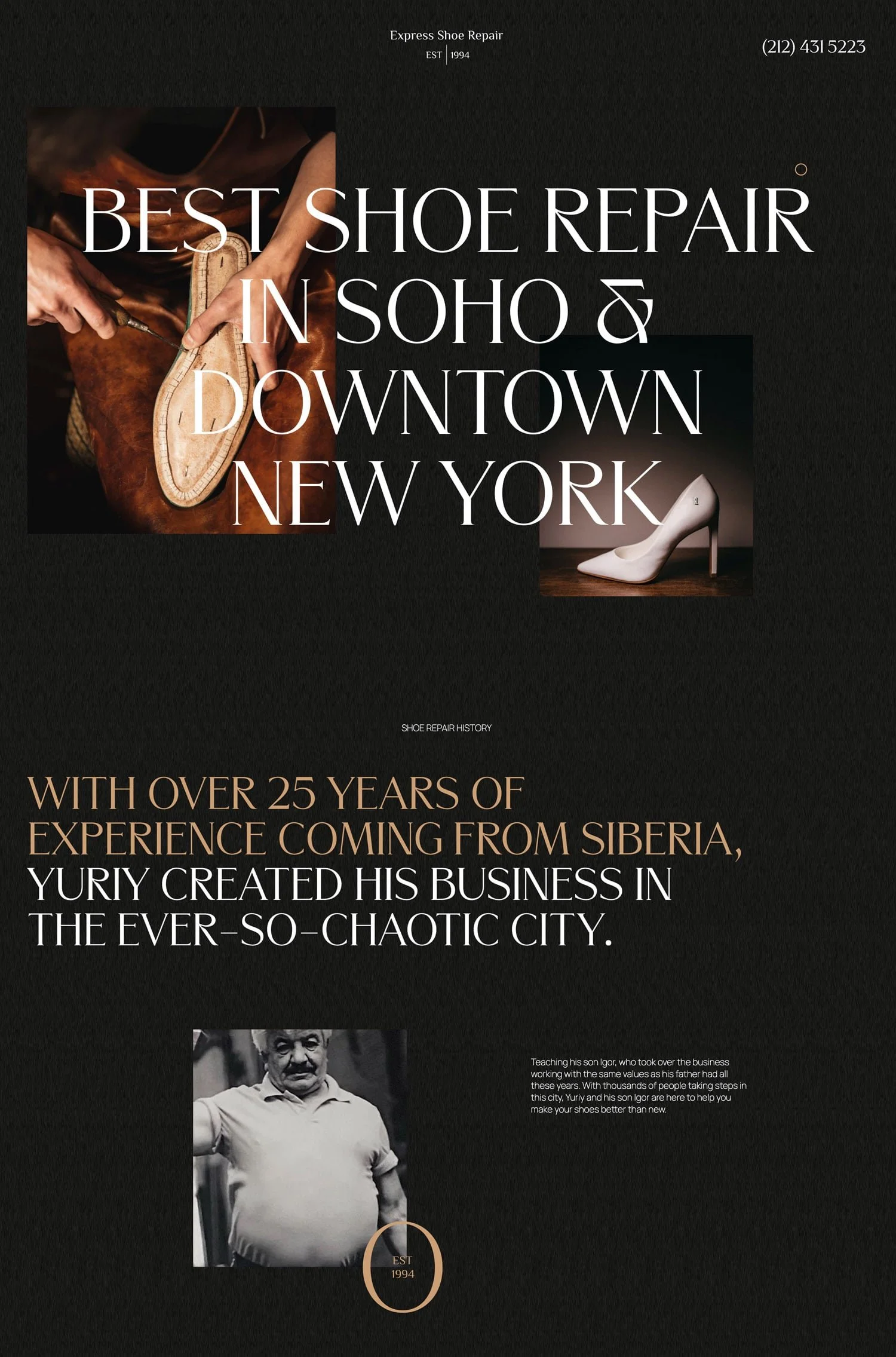
Fabulous example of a black background for Express Shoe Repair by Digital Design NYC
When done correctly this makes the whole site look cohesive and the brand really tight, but going for a non-white site background is a harder-to-pull-off trend for beginners to web design, so just keep that in mind if this is your first or second site design ever, maybe save attempting this trend for a coupla websites in! (Oh and grab the free workbook below to help you on your way!)

Website Design Trend #2: Scattered small images
This one is good news for you if your site photos aren't QUITE of a highly professional level, because for the past few years, full-width photos on the site were the standard and meant, some really crisp, pro-level photography was essential to make an on-trend, modern website.
While of course great photos are still important, incredible photos have thankfully become slightly less important because of this trend.
I'm seeing a lot of sites use smaller photos that are sprinkled throughout the page or banner and are dispersed throughout the site as a compliment to the typography. Type is more often taking center-stage, so while I'd still love for you to have super sleek photos on your site, if you don't or if you're a web designer who was just given some rather terrible photos by your client, you can make use of this trend to still create a stunning site, without the photos needing to be as much the center of attention as they were before. Which brings me to trend #3…
Squarespace’s new Fluid Engine Editor makes creating asymmetric scattered image layouts easy - catch my full Squarespace tutorial here!
Gorgeous example of scattered images in this template by Tonic Site Shop
Website Design Trend #3: A focus on fonts!
Fonts which are bold and unusual are on-trend, as is making one or two words on the page massive, and a much more liberal use of large fonts throughout the site in the headings. The other trend I'm seeing is editorial fonts.
What do I mean by that?
I mean typefaces that are specifically chosen to evoke a sense of editorial or journalistic aesthetics on a website. These fonts are often inspired by traditional typography used in newspapers & magazines.

Lovely example of making fonts the main event by Jenna Kutcher
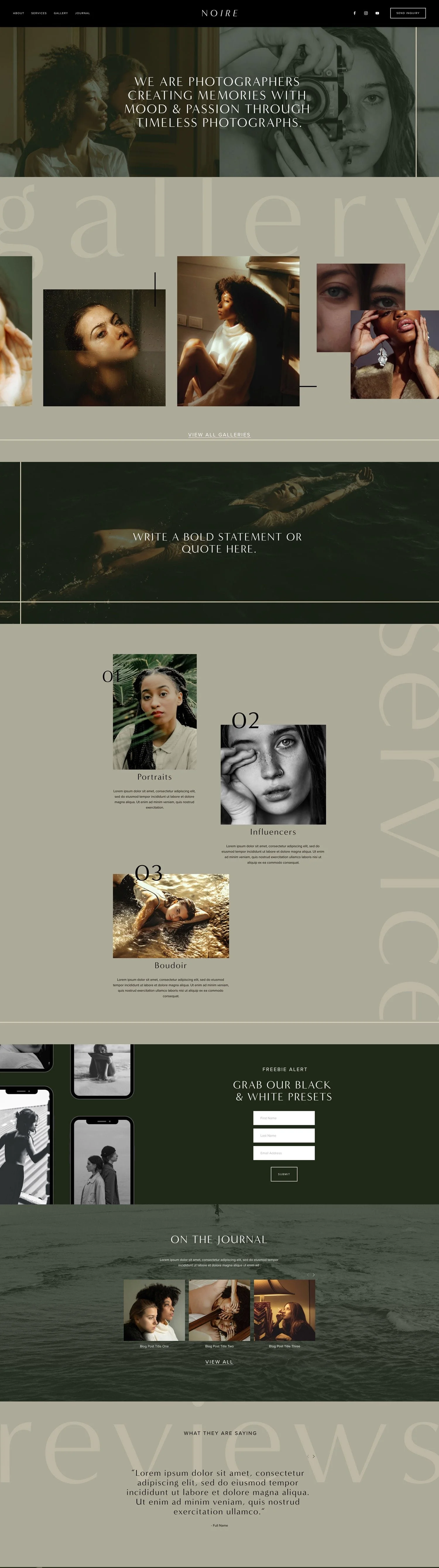
A totally different vibe that uses fonts in a fabulous way is the Noire Squarespace template by Big Cat Creative
When you see a site with editorial fonts, the site overall conveys the style associated with editorial content.
Oh and if you happen to be using Canva for graphics and Squarespace for your site and you want to know what fonts are in both systems so you can keep your brand looking consistent between your site and graphics, I wondered that too and then put together a giant list of all the fonts which are in both.
Click below to get my guide to all the fonts which are both on Canva & Squarespace!

Website Design Trend #4: Lines in your design
This one is the opposite of thinking "outside the box" it's quite literally boxing in your content. Lines & boxes are in, neatly organizing your content into little boxes or drawing attention & adding a bit of design style flare with a beautiful line.
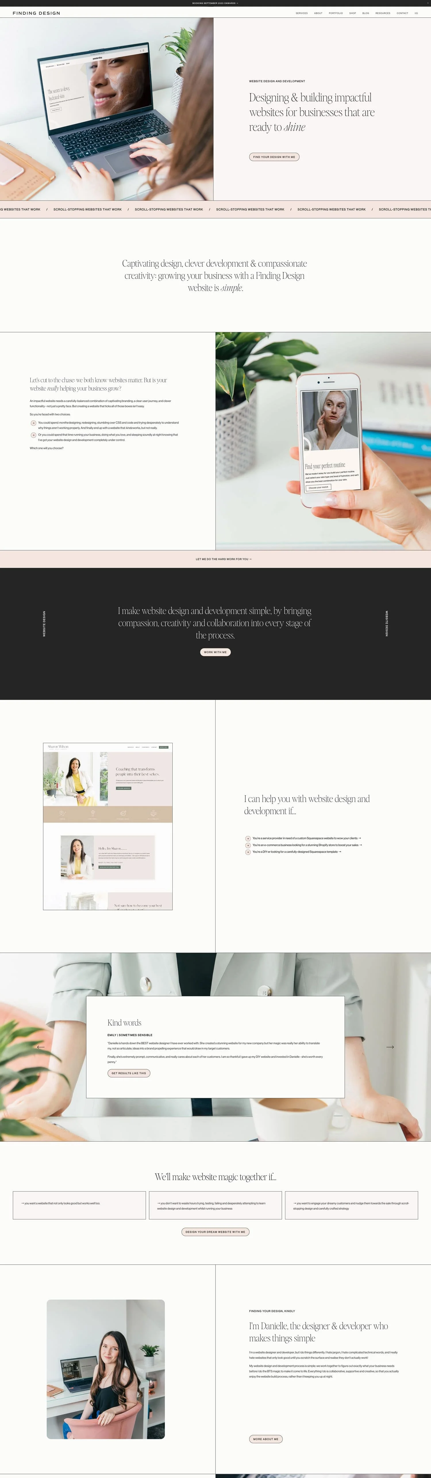
The gorgeous site of Finding Design is a great example of using lines to create an elevated design
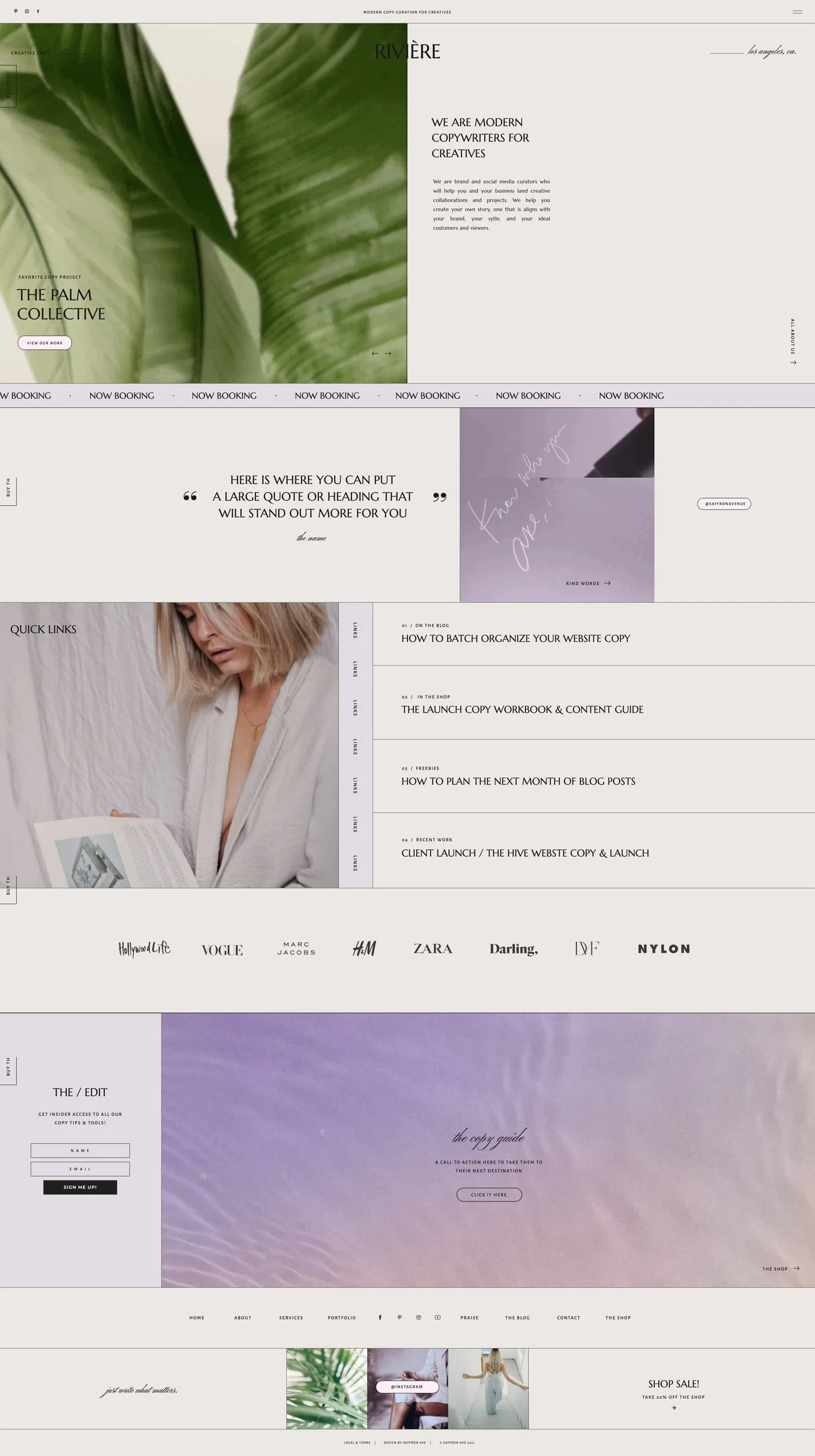
The riviere template by Saffron Avenue is another beautiful examples of lines in design
This trend is so easy to implement. Add a background or banner image with some lines in it, or when you're designing a photo in Canva, pop an unexpected line in there.
You can also easily add borders to your sections now in Squarespace (you can check out my complete beginner tutorial for Squarespace here)!
Website Design Trend #5: Curved and circular design features
This next trend is maybeeee getting a little over-used for my taste, but a trend video wouldn't be complete without it. I think calling it a fad might actually be more appropriate.
I'm talking about ovals & circles & rounded edges.
A lot of site-building platforms released features recently to make this trend possible inside the site editor without needing to first tweak say a photo in something like Canva or Adobe, and since then I'm seeing this everywhereee. Photos are cropped into ovals or have rounded edges on the whole photo or on a few corners, or alternatively, I'm seeing a lot of circled lines beginning to appear around words the designer wants to highlight.
It's cute, but I predict this trend is just so overused at the moment, that it might make its exit soon.

The Olive Bloom Showit template by Superhero design uses the curves and circles trend sparingly & beautifully
Website Design Trend #6: Animations and scrolling effects
This next one ... it's honestly NOT great for website usability and it can totally confuse your site visitors, but even with the downsides, I'm seeing it quite a bit right now.
And honestly, when done minimally I think it can be okay, but I have seen some sites take this too far. I'm talking about unusual scrolling effects.
I think we can actually look to Apple for where this one started, a few years ago they were doing this on their product pages and it seems to have stuck.
What we expect to happen when we scroll through a site is that the page scrolls down to the next section.
Now what's often happening though is as we scroll, the background appears to stay stagnant, but the content over top moves, or one side of the page moves but the other stays still.
This can be okay, but the point at which you're scrolling and the website is suddenly scrolling sideways, then up then down, etc. is definitely when this has gone too far where I'd say.
Even though it might look cool, I don't think your website visitors are going to thank you much.
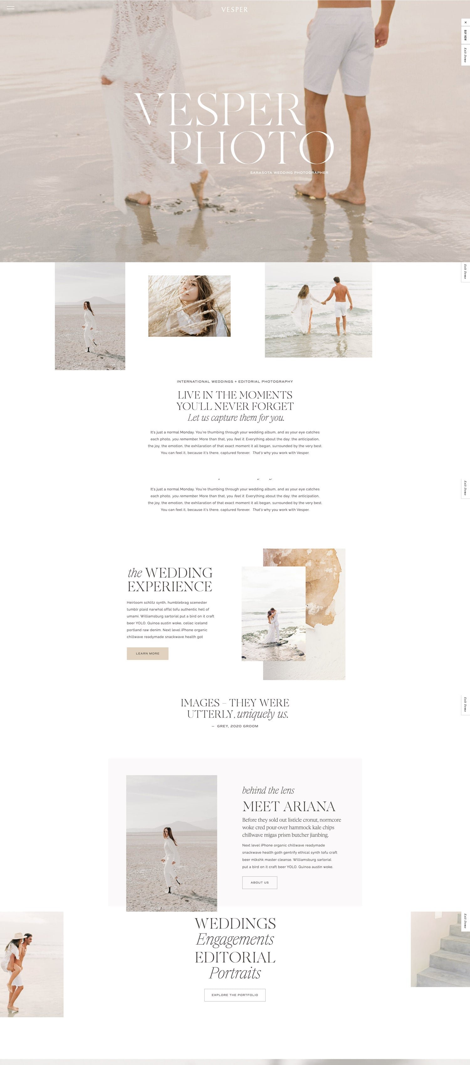
Website Design Trend #7: Asymmetric Layouts
This next one has been a trend honestly for a little while, but it doesn't show any signs of slowing down.
What's that?
Asymmetric Layouts and unaligned items on the page.
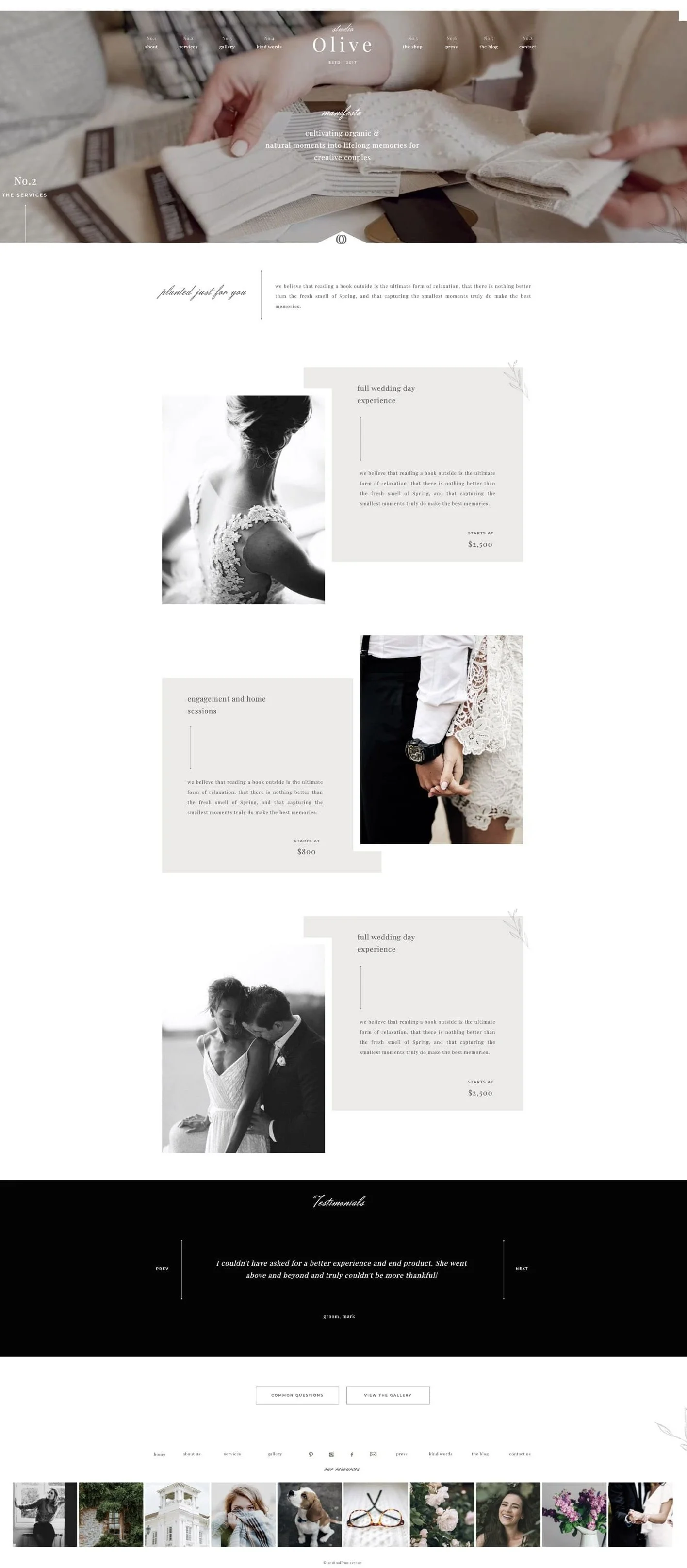
The Olive template by Saffron Avenue (yep them again!) uses the asymmetric trend beautifully

The Feminine Alchemy website by Freya Rose Tanner is a great example of asymmetric elements amongst a bunch of our other trends - beautiful work by this lovely past student of Square Secrets Business™
Before it was all about structure and following the grid and laying out items on the page in a very clear way. Now we've broken free of boring and went for something a little more creative.
I have to admit, I'm still a big fan of this trend. I think it both adds visual interest, is creative, while not being too confusing like the odd scrolling trend #6.
So have fun with it, throw an image here and a bit of text there, and have a few images near-by each other, but don't feel like you need to make them symmetrical or the same size.
Basically, to nail this trend, don't stick just to the grid.
So how do you go about implementing these into your site design?
AND How much of a difference do they really make?
Watch this video next where I do a website makeover on a DIY'ed website and make it look professional. 2,000 people watched it already and loved it and I think you will too!