
Squarespace website examples that don't look like Squarespace
Prefer to watch?
Here’s tHAT VIDEO FOR YA!
Rather read all about it?
Feeling uninspired? Needing new modern website design ideas? Wanting to see some Squarespace sites which look nothing like Squarespace sites to get the creative juices flowing? Scroll all the way until the end to endless inspiration for your future site designs!

Beautiful, Unique, Modern!
This is a Squarespace website, but it does not look like a Squarespace website. We see a sliding banner at the top and some really amazing use of fonts happening here.
We see our photographer herself, this is Jess based in San Diego. We have some icons, then we go through the different types of photography that she does, and then we also have her featured and awards section.
I think this is super well done and the fact that a lot of times when you get these different awards, there's a lot of different colors happening with the logos that really can hurt the website design itself. Here, they've made it all white, it really blends well into the website while showcasing that social proof, which looks amazing.
Then we have a full width banner image there, a little bit of an overlay, some kind words, and then we can use these little toggles here to scroll through the actual testimonial as well, which looks fantastic.
Then as we come down and we hover over these different words, the relevant image changes, which looks fantastic. And then you can click to see bits of portfolio pieces.
Then we have more examples just immediately coming to this website, like, you know, this is an exceptional photographer.
Then we have the most important bit happening right here now, booking 2023, 2024 which is super helpful in terms of the actual business and more photos of her herself.
Then a little video aspect is added there and they pulled in the Instagram feed. And the great thing about this Instagram feed is it like it matches the quality of the website.
I find so many times people’s Instagram feeds don't quite live up to the website, and so sometimes when they pull it in it doesn't look great. But this one looks fantastic.
Amazing Squarespace website which definitely does not look like a Squarespace website.

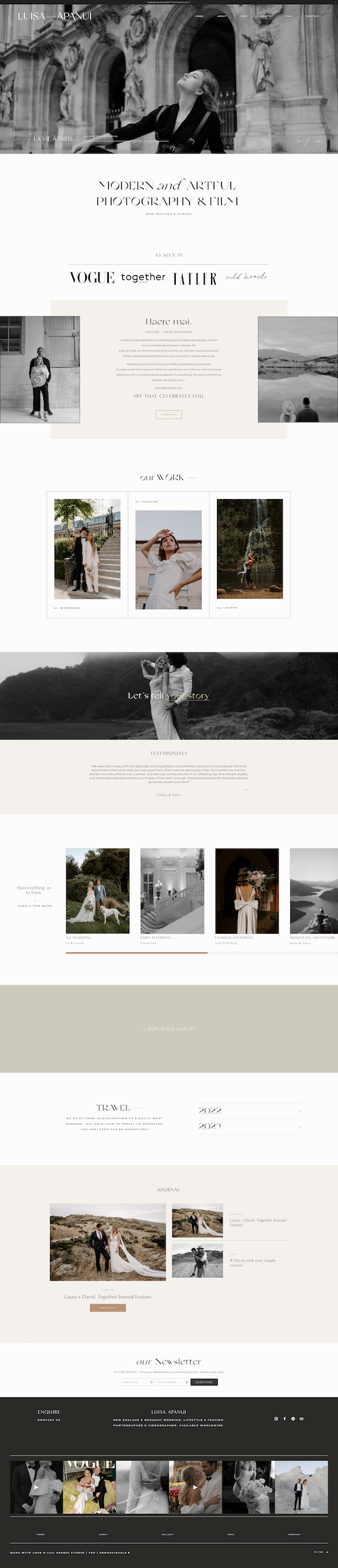
Now this website is also a photographer website, also built on Squarespace, but definitely a different vibe happening here.
Again, incredible use of different font types and the contrast happening between the heading & sub-heading.
We have the social proof “as seen in” and the photos of the actual couple themselves. We go down to their work. If you hover over the different items they pop-up.
Further down we see a beautiful little video and some sliding testimonials.
Then we can see a slider where you can move over and you can see the different pieces and blog posts happening there.
Then I love the blank space and how exceptionally well done this is.
When it comes to building websites lot’s of designer just don’t use blank space enough. This section is really just so well done with beautiful, gorgeous color in the background. Plus a little bit of creativity happening there with the font too. Everything just looks so, so good and so elevated and creative and beautiful.
Then we get into some of the practical stuff, the newsletter, and beautifully designed footer as well.
The color, the spacing - it just looks super gorgeous.
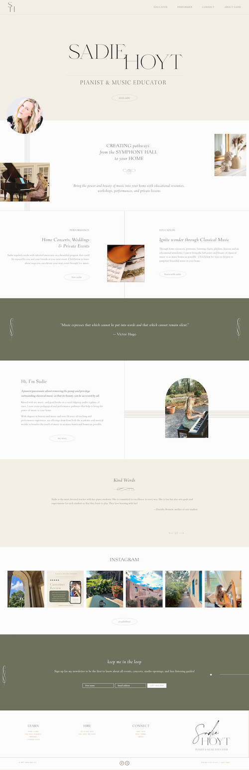
Sadie is a pianist, and a music educator.
Her website is simplistic, clean, beautiful, with lots of blank space happening here & really standout beautiful texts which makes this website so exceptionally gorgeous.
We have a photo of Stacy, and some images coming in on the side. I feel like a couple years ago, it was the thing where everything was just big banner images everywhere and just as large of an image as you could have. Whereas now it's kind of like little bits of sprinkling of images, sort of unaligned down the page with a real focus on the text and maybe some design items like the lines happening down here on the left, which again feels a lot like a music score as well, which is very appropriate.
And then again, couple little images happening here, but then really a focus on the text and the icons. Again, this feels very musical to me & making use of this same little icon throughout the entire website looks fantastic.
And then down into the footer area we have again such simplicity & consistency that just make this website so beautiful.
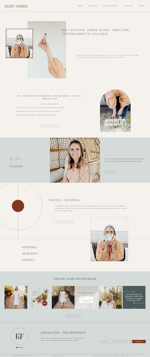
Carrie is an energy healer, a grief guide, and a spiritual life coach.
We see a few overlapping images happening here & a very different font choice from previous websites which give it a bit of a unique taste to it.
Then we have an image of Kerry and some graphic design elements further down the site. It's really wonderful, especially if your client doesn't have fantastic photos for your website (I mean, Kerry does), but this is a really great example of how you can add visual interest to a section of the page.
So you can add various graphic elements on the page without necessarily having a ton of like extremely professional photos.
Then we have another photo of Sadie, which overlaps the two sections with some text that turns italicized when hovering over - so beautifully done!
The Instagram feed is pulled in, and then we have a beautiful call to action for the newsletter in the footer there as well.

This website very clearly indicates what they do. They're doing paper and stationary for weddings.
They use this postcard-like stamp image, so a little bit like travel inspired & they talk about the type of clients that they have:
sophisticated, spirited and modern.
Again, great use of blank space on the page, not filling everything to the absolute brim with clutter everywhere.
Also, such a wonderful use of fonts & typography. We have a bit of uppercase and we have a lowercase, italics, and some dashes in between - it just looks fantastic, and so it's also very clear and in terms of SEO - this is perfect, you know exactly what they do: they do save the dates, fully custom, invitations, menus, place cards, et cetera.
Then there’s a slider and they've done the images very beautifully with the rounded corners. Just a little bit of creativity happening there. It's wonderful.
Then we have the portfolio gallery, and some overlapping text looks fantastic.
And I really love the overlapping of the two different color sections. It looks very creative.
The inquiry button: Now this is really beautifully done in that it stands out. It has a circle around it (which just goes to show you don’t need a big red or orange or yellow button that really like ruins the design).

Now if you're noticing a consistent skill level in these websites, it's actually because they were all built by one person, my amazing past Square Secrets Business™ student Emily.
She's an exceptional designer, she has this creative, modern website vibe which her clients love. They love it so much she actually hit 6 figures in her web design business!
She was just like me, she had moved abroad for love and had no job options in Europe, so she decided to learn web design online and took my courses. She legit went from clueless about how to build websites to a 6 figure web designer in 2 years time.
To hear her story and learn exactly how she did it and her advice for new designers, watch this video next!
You’ll Also Love...
4 incredible website design examples you need to check out this month | August edition
15 best example Squarespace websites • coaches & consultants edition
15 best example Squarespace websites • health & wellness edition
20+ best example Squarespace websites • web designer edition
20 best example Squarespace websites • service-based business edition