7 trendy website section designs to copy
Prefer to watch?
Here’s the step-by-step video!
Mentioned in the Video:

Rather read all about it?
Here are those show notes...
Do you go to build a website and get stuck goin’ round n round, seeking website inspiration, and not finding it, struggling n giving up?
Well friend, this one’s for you!
No matter if you're building a website for yourself or this is your 50th site for a client, coming up with new ideas can be a challenge.
So today, I'm gonna share with you seven website layouts, which are totally on-trend. So your website will be the talk of the town.
Let's get into it.
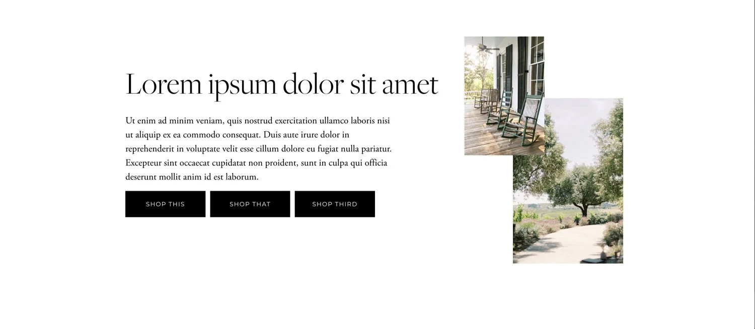
Okay, so this first section here is perfect for the top banner hero area of a homepage.

So we have some images displayed in a really creative way.
Typically back in the day, you would find it was like just one image across the entire banner area, and that was a typical thing, and maybe you put a white box over it with some text, but this is a little bit more modern, more trendy.
We have some images, they're kind of unaligned on the page, and then we have an overlapping bit where we have our header, a little bit of text to explain exactly what it is, what we do, that sort of thing.
And then we have our call to action.
So this is a really beautiful design perfect for the top area of a homepage.
The second section design for you could also be used one a homepage as the top (hero) section.

So in this one, we are making use of a beige background, which is very on-trend right now!
I'm noticing a lot of websites that are not doing the typical white background anymore, but they have some sort of base color.
It's a bit harder to pull off so not suggested if you're brand new to website design, but if you have a little bit of experience with website design, it can look amazing if you basically just have the entire background of your website as one (non-white) color.
So we have the beige background on the left. We have an image on the right, and then going to the full width of the page, we have another image overlaying, and then some text which crosses over our image, and again, a call for action.
So this is a really beautiful section design. It also follows our best practice in that our eyes automatically go from left to right on the page.
By the way… if you're struggling to figure out what exactly you should put on your homepage, what copy you should write, then my homepage content planner will help massively.

Next up, I have here what I would envision to be a section on the homepage or about page which gives an overview of who you are.

So we have “meet…” and then the name of the business “Celine Creative”. I have some images of some ladies there. I imagine that these are women working at Celine Creative.
The text is just slightly overlapping with the background section, which I think looks fantastic and is super trendy right now.
We have a bit of header text, and then we also have our paragraph of text. So this is also a perfect design for if there's a section on your page where you need a bit more text.
I find often templates and like examples, don't tend to have that much space for text, whereas this one is really great and allows you to write a bit more if needed!
Whilst being still really visually interesting and not just like wall-to-wall boring text.
And of course if you wanted to make use of this design for a section other than an about area, you could obviously change the “meet”, and then add content and CTA according to your content.
Next up this is another fantastic section designed for, again, a space on the page, which might need a bit more text.

So in this one we have our header, we have a variety of different images - you'll notice the images that I chose all have a similar style and vibe and colorway, so they all kind of feel like they fit together.
Now, I do have the text overlapping the image at the very bottom there, but I've been very conscious when I designed this to make sure that that image had white space in the area, or that there was enough contrast, so you could still read the text that's going over the top of it, and also it's not overlapping too much.
I find that this style here, having a variety of different images just kind of like dropped and sprinkled over the page is also super trendy right now - so it’s a great option!
(And also has the benefit of allowing plenty of space for you to add a chunk of text if you need)
Next up, I'm imagining on your homepage, you might wanna list out the variety of different service that you have so people can then click in to learn more about that service - so here are a few options for that section type.

Here I have some very big, bold, beautiful text at the top.
I'm really noticing that that's a trend right now is some really overly large, text on a page. It looks beautiful.
Then I have three images. I have cropped these all to a similar shape using the “Shape tool” in Squarespace to make this happen. Then I overlaid a button, so it's going a bit over top of the bottom of the image. Again, it doesn't cover up any important aspect of the image. It's very easy to read.
And then I have a little bit of text at the bottom of each one to sort of give a little description of that service.
For the buttons we would obviously name this something different than service one, service two, service three, but whatever the name of your service is, that would be perfect!
Now this next design is another idea of how you could present your services on your homepage.
So we have two overlapping images happening here. On the right-hand side, we have a large bit of heading text. We also have a bit of description text, and then we have three buttons that give calls to action.
So maybe you have like;
Shop templates
Shop courses
Book a Consult
You wanna make sure that the text is of a similar length for all of your buttons, so they look good together.
So again, this is another beautiful way, very simplistic, but honestly, sometimes people really overkill it when it comes to website design - so defs keep it simple where you can!
And now for the final section inspiration - this one was designed to display services when there is more information to share about each one.

I’ve used a very abstract background image, and I've lightened it up from the original image so it works well in the color palette and as a background.
This section design is perfect if each service needs a longer description.
So I have option one, option two, option three and then in the header text I’d suggest naming it whatever the package is.
Then you would give the details of the actual service and then a call to action. I would probably change the actual text on the call to action to be something appropriate to whatever needs to happen next.
So maybe that's “book a consultation call” or “get started” or “book now” or whatever you think the best fit call to action is.
Alternatively, if it does need more of a description, you could do something like learn more.
So I hope the three different designs for the services area give you some ideas of the different ways that you could design sections to fit however much content you have!
But trendy isn’t the only thing that matters - we also wanna be strategic & ensure our site is going to make sales!!
And all 7 section designs stop you needing to google “trendy website designs” on a quest for inspiration!
Now, even though you have some ideas, you still might not be successful in putting together a site if you don't know the web design best practices that you should follow…
So watch this video next where I will walk you through a site redesign project.
I will show you the before and the after of the website and explain exactly what decisions I made and why!